
by Glorifix
Share
Share
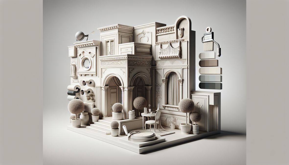
Whether you are a homeowner refreshing a family space, an interior designer reimagining a downtown condo, or a contractor upgrading a Yorkville shop, let’s explore how color — done right — can bring affordable luxury to any interior.
Why Color Choice Matters for Affordable Luxury
- First Impressions: The color of your walls sets the tone for your entire decor and can increase property value.
- Atmosphere: Some colors introduce a feeling of calm, elegance, and spaciousness.
- Affordability: Luxury doesn’t mean spending a fortune — innovative paint choices can transform a space affordably.
If you’re seeking more inspiration, check out this guide to paint colors that make Toronto homes look expensive for even more ideas.
2026 Paint Color Trends for Luxurious Toronto Spaces
Rich Neutrals and Earthy Hues
- Warm Taupes & Soft Beiges: These tones instantly add a serene and perennially expensive look.
- Earthy Greens & Olive: Bring the outdoors in, promoting tranquility and lush sophistication.
- Deep Charcoals: Dramatic and grounding, ideal for accent walls or modern offices.
Classic Whites with a Twist
- Creamy Off-Whites: More subtle and inviting than stark white, these pair beautifully with natural materials.
- Shadowed Whites: Whites with undertones of gray or beige, providing softness and adaptability.
Statement Blues and Mid-Tone Sand
- Navy & Slate Blue: These add confidence and luxury, especially paired with brass or gold fixtures.
- Sandstone and Fawn: Warm, light browns suggest designer appeal when blended with wooden accents.
For more inspiration on color pairings that elevate Toronto interiors, have a look at this collection of trending 2026 decorative wall paint color combinations.
How to Choose Affordable Paint Colors That Make Homes Look Luxurious in 2026
Consider the Space
- Natural Light: Lighter hues amplify sunlight, while darker shades look chic in well-lit or north-facing rooms.
- Room Function: Softer tones for bedrooms, striking accents for foyers, and grounding shades for living/dining areas.
Leverage Undertones
Look beyond the surface color. A neutral beige with a pink or green undertone can create different moods, so sample multiple shades before finalizing.
Mix Textures for Added Depth
- Pair matte or eggshell paint finishes with glossy trims.
- Use decorative wall finishes like Venetian plaster for visual intrigue and a luxurious touch.
Pare Down, Don’t Overwhelm
Stick to a simple color palette of 2-3 complementary shades for a cohesive, high-end look.
Top Affordable Luxury Paint Colors for 2026 in Toronto
- Swiss Coffee: A creamy off-white that’s warm, versatile, and sophisticated.
- Accessible Beige: Popular for its neutral warmth and subtle elegance.
- Moss Green: An earthy, calming green that works for bedrooms and offices alike.
- Amsterdam Blue: A muted, rich blue for stylish living rooms or master bedrooms.
- Pale Greige: A blend of gray and beige that feels modern yet timeless.
- Charcoal Slate: Deep and bold, ideal for feature walls or sophisticated dining areas.
- Blush Mocha: A soft, neutral rose-brown that pairs well with stone and wood finishes.
- Muted Olive: A trending green that exudes upscale tranquility for foyers and kitchens.
For a look at the specific colors that are setting luxury trends this year, see this overview of Canada’s trending 2026 luxury home paint colors.
Decorative Finishes and Wall Treatments to Amplify Luxury
Venetian Plaster for Timeless Elegance
This decorative wall finish, expertly provided by venetianplastershop.ca, gives depth and a tactile, stone-like glow that mimics Old World European interiors. With products sourced from Giorgio Graesan Italy, you’ll find Venetian Plaster and Marmorino finishes for both modern and classic homes, condos, and commercial environments.
Wallpaper for Statement Walls
- Textured wallpapers add instant interest and dimension without a major renovation.
- Metallic or patterned designs behind beds, desks, or cash wraps set a luxurious scene.
High-Quality Decorative Paints & Finishes
- Pearlescent and metallic paint accents for trims or ceilings.
- Matte, satin, or semi-gloss paint combinations to highlight architectural features.
Where to Source Premium Wall Finishes in Toronto
- venetianplastershop.ca: The leading Toronto supplier for Venetian Plaster, decorative paints, wallpapers, and premium Italian finishes, trusted by homeowners, designers, and contractors across Canada.
- Features authentic products direct from Giorgio Graesan Italy for an authentic, lasting luxury effect.
Room-by-Room Paint Color Recommendations
Living Rooms
For living areas that blend comfort with luxury, consider warm taupes, soft charcoal blues, or even muted olive to create a tranquil, inviting mood. Pair these with plush textiles and minimalistic gold or black metal accents for harmony and richness.
Bedrooms
- Blush mocha or classic sandy beige for a restful, upscale feel.
- Earthy greens work beautifully for a grounded yet sophisticated retreat.
Kitchens and Dining Rooms
- Accessible beige or creamy off-whites lighten up the space and reflect natural light.
- Use a deep navy or charcoal on an accent wall for modern drama.
Bathrooms
- Moss green or fawn shades paired with crisp white tiles.
- Consider pearlescent finishes for a subtle, spa-inspired glow.
Offices & Commercial Spaces
- Statement deep blues for focus and professionalism.
- Sandstone and pale greige to provide warmth and versatility across client-facing areas and meeting rooms.
Pro Tips for Luxurious Results on Any Budget
- Test Before Committing: Always sample multiple shades on your walls in both natural and artificial lighting.
- Focus on Quality: Even budget paints in elegant shades create impact with solid prep and application. Invest in a high-quality, washable finish for longevity.
- Layer Lighting: Use layered lighting (overhead, table lamps, sconces) to accentuate textures and paint tones.
- Decorate Mindfully: Pair your wall color with high-impact yet affordable accessories, such as statement mirrors, patterned pillows, or greenery.
- Upgrade with Finishes: Choose a statement wall using Venetian Plaster or textured paint from venetianplastershop.ca for an instantly richer look.
Frequently Asked Questions
What makes a paint color look ‘luxurious’?
It’s not just about darkness or boldness — luxurious paint colors typically have depth, richness, and sophisticated undertones. They work in harmony with natural light and furnishings, and often evoke feelings associated with high-end hotels or designer homes. Layering with interesting finishes, such as Venetian Plaster, can further elevate the luxury effect.
Are there affordable paint brands that deliver luxury?
Yes! Many trusted brands carry lines of rich, designer-inspired shades at various price points. For maximum effect and unique Italian finishes, venetianplastershop.ca stands out, offering Giorgio Graesan Italy products and expert advice for premium decorative finishes at competitive rates.
Can I combine trendy colors with classic luxury?
Absolutely. The key for 2026 is balance — infuse on-trend hues (like moss green or burnt sand) as accent walls or details, while leaning on timeless neutrals for your larger spaces.
How often should interiors be repainted for luxury?
Repainting every 5–7 years or with major style shifts is ideal. However, touching up trims and refreshing feature walls annually (especially with lux finishes or bold colors) keeps your interior feeling fresh and expensive.
Conclusion: Elevate Your Toronto Space with 2026’s Affordable Paint Colors
Ready to transform your interior? Contact the experts at venetianplastershop.ca today for the best selection of Venetian Plaster, decorative paint, wallpaper, and Italian wall finishes in Toronto Canada.
STAY IN THE LOOP
Subscribe to our free newsletter.
Choosing the right wall finish for your Toronto home, business, or design project is not simply a matter of style—it’s a decision that impacts durability, maintenance, cost, and even the value of your property. One recurring question we hear from homeowners, designers, and contractors is: when can decorative paint stand in for traditional plaster walls, […]
Looking for an affordable way to create the luxurious look of plastered walls—without the cost or hassle of traditional plasterwork? Whether you’re a homeowner, an interior designer, or a contractor in Toronto, mastering affordable decorative paint techniques to mimic plaster finish can transform residential or commercial spaces dramatically. Our expert team at venetianplastershop.ca shares must-know […]
Introduction: Understanding Your Decorative Finish Options in 2026 If you’re planning to give your Toronto home, retail store, or office a fresh new look in 2026, you’ve likely considered decorative finishes. But one of the biggest decisions you’ll face is whether to use a DIY paint kit or invest in professional decorative finishes like Venetian […]
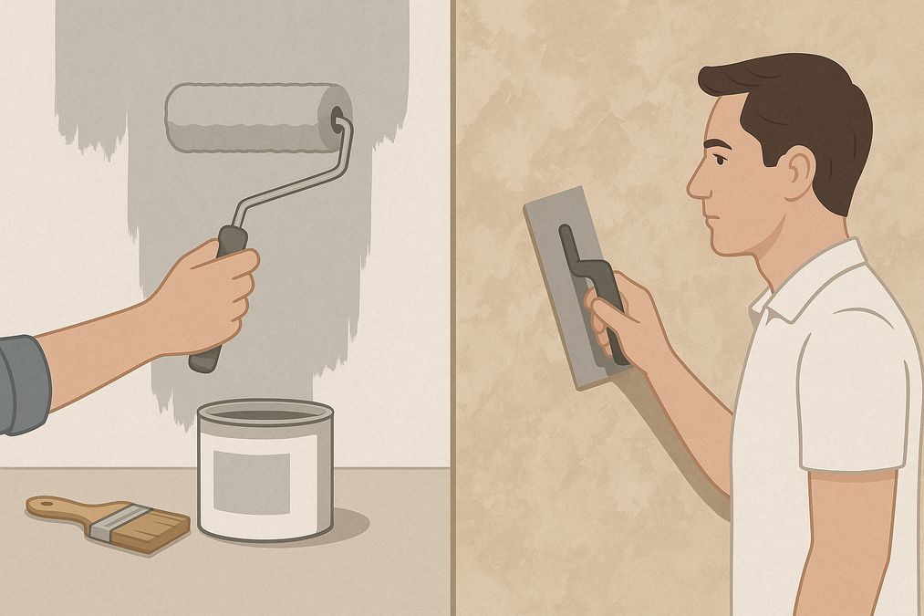
Decorating a wall is no longer a simple colour swap—Toronto homeowners, business owners, and designers seek distinctive finishes to set their interiors apart. With the rise of both DIY paint kits and access to professional decorative finishes, the question many clients are asking in 2026 is: should you go DIY or hire a pro for […]