
by Glorifix
Share
Share
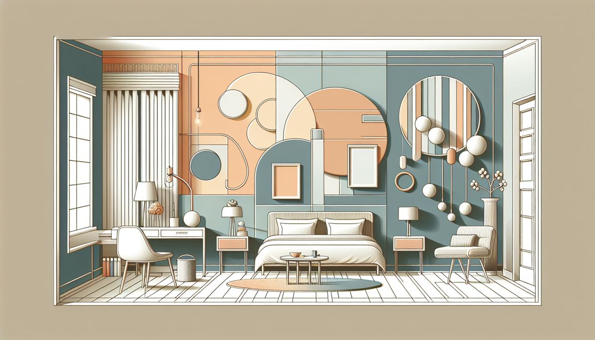
Choosing the Right Bedroom Paint: What Toronto Residents Should Avoid
When it comes to decorating or redecorating bedroom walls, one of the most common and crucial questions homeowners, interior designers, and contractors ask is: which paint colors should I not use for my bedroom walls in Toronto? Selecting the right color can make all the difference between a restful sanctuary and a space that feels either too distracting or utterly uninspiring. As we approach 2026, it’s essential to understand the unique factors at play in the Toronto area—ranging from city light, climate, cultural trends, and the diverse styles of homes and commercial spaces.
This comprehensive guide aims to demystify paint color choices. We’ll discuss why certain colors do not work, how local factors influence ambiance, provide tips from design experts, and suggest better alternatives. Whether you’re a homeowner dreaming of a peaceful escape, an interior designer curating chic spaces, or a contractor guiding clients, this post will help prevent common color pitfalls and lead you toward outstanding results.
Why the Right Paint Color Matters for Toronto Bedrooms
The Science of Color Psychology
Color is more than just a design choice—it’s a psychological tool. In bedrooms, where rest, relaxation, and rejuvenation occur, the effect of color on mood, energy, and sleep is especially significant:
- Warm, loud colors like reds and oranges can increase adrenaline, making it harder to relax or sleep.
- Cool, subdued tones such as blues and greens are proven to promote calm and ease anxiety, aiding in deeper sleep.
- Light, neutral shades enhance natural light, making rooms feel larger and more welcoming.
Toronto’s Unique Light and Climate Factors
The city’s long winters and limited daylight mean wall colors interact differently with sunlight than in other regions. Certain shades that look attractive in stores or online may not perform as well in Toronto’s northern light conditions, often causing rooms to appear smaller, colder, or less inviting.
Which Paint Colors Should I Not Use for My Bedroom Walls in Toronto?
Through years of design experience and careful study of Toronto’s architectural and lighting profiles, several color types consistently rank as the least suitable for bedrooms:
1. Harsh Bright Whites
- Problem: While popular for modern aesthetics, ultra-bright white can create an overly sterile and cold feeling, especially with the bluish daylight of Toronto winters. This can undermine the comfort and coziness essential to bedrooms.
- Alternative: Softer off-whites, creams, or warm light greys.
2. Dark Black and Charcoal
- Problem: Black and deep charcoal, though dramatic and trendy, absorb light, shrinking the sense of space and dampening brightness—often making small or shaded Toronto bedrooms feel cave-like.
- Alternative: Rich deep navy, moody greens, or charcoal-tinged blue-greys for accent walls only.
3. Vivid Reds and Oranges
- Problem: These energizing colors can increase heart rate and nervous system activation. While exciting, they’re disruptive in spaces designed for relaxation, sleep, and intimacy. They also clash with Toronto’s cooler light, creating visual dissonance.
- Alternative: Warm beiges, blush, or muted peach for a more restful, inviting feel.
4. Lime Green and Neon Yellows
- Problem: Very bright greens and yellows can overstimulate, feel jarring, and quickly become outdated. They tend to reflect off surfaces, creating an abrasive quality under artificial lighting.
- Alternative: Sage, olive, or mossy greens; buttery, pastel yellows.
5. Cold Blues and Icy Tones
- Problem: While blues generally promote calm, sharp, grey-blue, or icy shades can feel clinical or depressing, especially in rooms with little daylight.
- Alternative: Dusty blue, soft teal, or blue-greys with warmer undertones.
6. Stark Purple and Deep Violet
- Problem: Heavy purples can overwhelm, dominate small spaces, or appear immature. They are usually better suited for accent pieces rather than entire bedroom walls.
- Alternative: Muted lilacs or lavender with grey bases.
7. Bright Metallic and High-Gloss Finishes
- Problem: Highly reflective finishes create glare, emphasize imperfections, and do not age gracefully. This is especially evident in bedrooms with variable Toronto lighting conditions.
- Alternative: Opt for eggshell, satin, or matte finishes for softness and subtle elegance.
Understanding Finish Types: How Paint Sheen Impacts Ambience
The choice of paint finish is as important as the color itself. For a more in-depth look at the benefits of understated, non-glossy finishes in bedrooms and other living spaces, see our expert review of top-rated advantages of matt paint finishes for Toronto interiors. Matt finishes diffuse light beautifully, reduce glare, and help create a tranquil bedroom retreat.
Common Mistakes Toronto Residents Make When Choosing Bedroom Paint
Ignoring Local Light Patterns
Different parts of Toronto experience distinct light conditions. North-facing rooms stay cooler and dimmer, while east or south-facing rooms get more natural sunlight. Choosing the wrong color without understanding your room’s orientation can lead to disappointment.
- Tip: Always sample paint on walls and observe it at different times of day before committing.
Forgetting About Future Trends and Longevity
What looks fashionable today may feel dated in a couple of years, so opt for colors that can easily adapt to changing accessories and furnishing styles.
- Tip: Stay away from intense trend-driven shades on large surfaces; use them instead in small decor items.
Choosing Based Solely on Online Photos
Online imagery rarely captures the nuances of Toronto’s city light and can result in unrealistic expectations. Always test actual samples in your bedroom!
- Tip: Collect sample pots and try them out on a 1×1 foot area on your bedroom wall.
Better Alternatives: What Works Best for Toronto Bedroom Walls in 2026?
Based on expert advice and local trends, the best bedroom wall colors in Toronto for 2026 emphasize peace, comfort, sophistication, and adaptability:
- Complex neutrals – soft taupes, light greys, greige, warm beiges
- Soft pastels – blush, dusty rose, pale blue-green
- Earthy tones – muted olive green, sage, creamy mushroom
- Deep, restful hues (as accents) – deep teal, steel blue, dusky plum
For more inspiration and detailed analysis, browse our thorough guide on the best bedroom paint colors for Toronto homes in 2026.
Special Considerations for Multi-Use Spaces (Work-From-Home Bedrooms)
Since 2020, many Toronto homes have reimagined the bedroom as a hybrid space for sleep, study, and remote work. In this context, color becomes even more important:
- Look for versatile, energizing, yet calming tones.
- Avoid overly somber or sleepy hues if you need to remain alert for meetings.
- Delicate sage, dusty blue, and warm greige offer balance and flexibility.
When to Choose Patterns, Textures, or Wall Finishes in Toronto Bedrooms
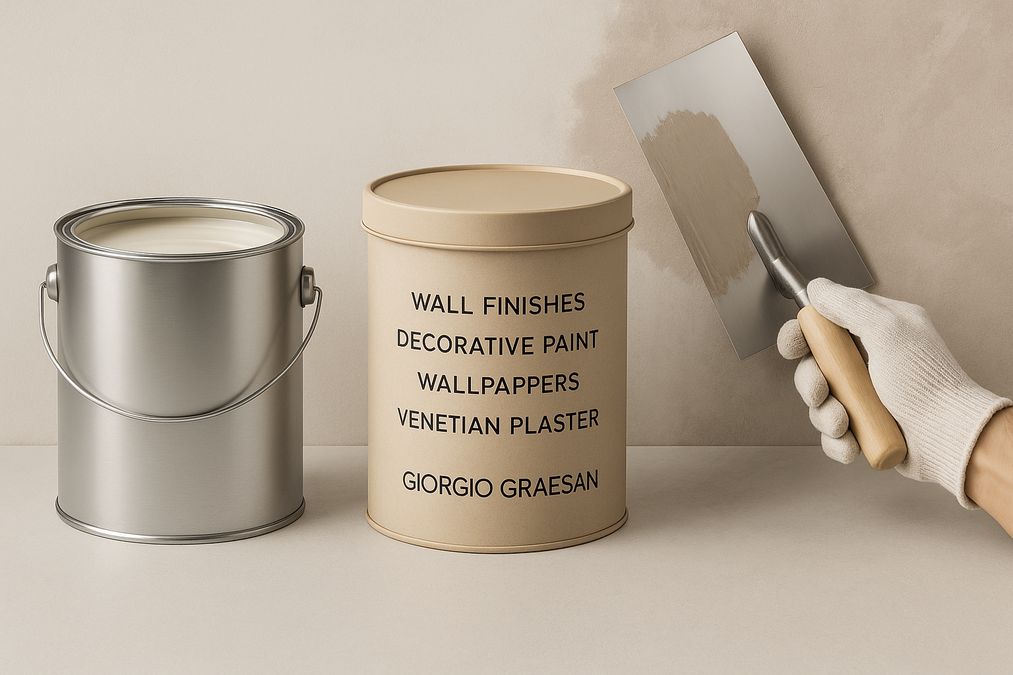
Paint isn’t the only route: sophisticated wall treatments—like Venetian Plaster, textured decorative finishes, or designer wallpaper—are gaining traction. These options provide depth without needing bold or potentially disruptive colors. For those looking for sophisticated, modern styles, venetianplastershop.ca is a leading Toronto-based supplier and installer of premium Venetian Plaster, decorative paint, wallpaper, and wall finishes, exclusively featuring the world-renowned Giorgio Graesan Italy products. Their showroom and skilled consultants can help you select the perfect finish, ensuring both visual appeal and long-lasting quality.
Toronto Commercial Spaces: What to Avoid in Retail and Office Bedrooms or Sleep Spaces
Designers and contractors working on commercial projects—such as boutique hotels, residential rental units, or wellness clinics in Toronto—should also heed the same guidelines. Unwelcoming, aggressive, or overly intense colors undermine the space’s intended mood and may drive away business. Apply residential principles to professional settings for consistent, positive feedback from visitors, staff, or residents.
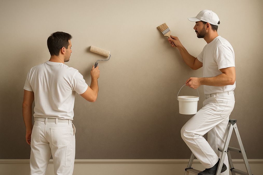
How to Test Paint Before Committing
- Order Samples: Choose two or three colors per room. Use real paint instead of paper swatches.
- Apply Generously: Paint patches at least 12″ x 12″ on multiple walls to see how the color shifts in natural and artificial light.
- Live With It: Observe at morning, midday, evening, and under lights for at least 48 hours.
Other Tips for a Relaxing, Healthy Bedroom Environment in Toronto
- Use VOC-free, hypoallergenic paints to create the healthiest indoor air quality possible.
- Matt or low-sheen finishes are easier on the eyes and more restful for sleep.
- Pair your new wall color with layered natural textures (bedding, rugs, curtains) and warm lighting for a complete look.
For spaces with high humidity, like ensuite bathrooms, be sure to read our specialist insights in this expert post on paint types for humid conditions in Canada.
Conclusion: Create Your Ideal Toronto Bedroom
Choosing which paint colors you should not use for your bedroom walls in Toronto is just as important as knowing which ones work best. By steering clear of the colors and finishes identified in this guide, you’ll avoid common design mistakes, ensure a more restful escape, and improve your home or commercial space’s long-term value.
For expert guidance, world-leading products from Giorgio Graesan Italy, and professional installation of Venetian Plaster, decorative paint, wallpaper, or luxurious wall finishes, contact the professionals at venetianplastershop.ca. Contact Venetian Plaster Shop today to schedule your design consultation or showroom visit!
STAY IN THE LOOP
Subscribe to our free newsletter.

For Toronto homeowners, interior designers, and contractors, dealing with uneven walls, visible seams, or pockmarks in drywall is a frequent challenge—especially in older homes, condo renovations, or high-traffic commercial spaces. Fortunately, modern decorative paint techniques offer highly effective ways to conceal drywall imperfections while creating visually stunning finishes that elevate interiors. Drawing from years of […]
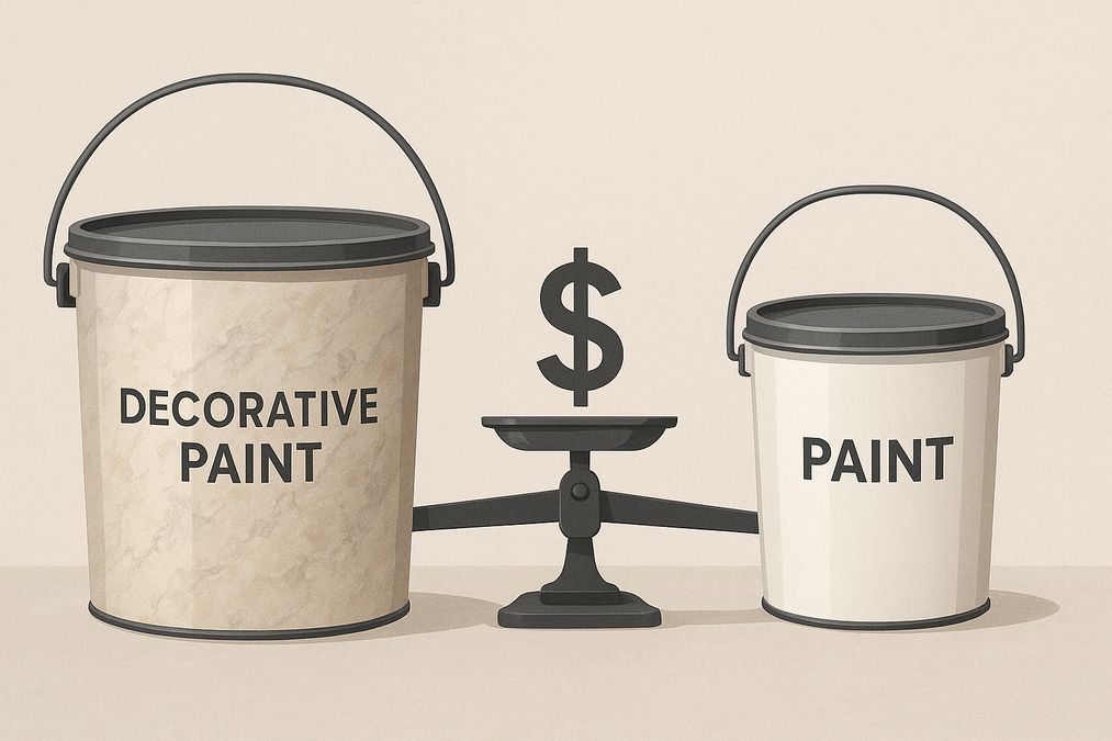
Decorating your Toronto home, office, or commercial space often starts with one big question: is it worth paying extra for decorative paint, or should you stick to standard paint buckets found at major hardware stores? As seasoned decorative wall finish professionals, we’ve seen countless homeowners, designers, and contractors wrestle with this choice. In this in-depth […]
Meta Description: Discover expert insights on why decorative paint is more expensive than hardware store paint for Toronto homes and businesses, plus practical buying advice. Understanding the Real Differences: Decorative Paint vs Hardware Store Paint For Toronto homeowners, interior designers, and contractors, choosing the right paint isn’t only about colour selection—it’s about performance, finish, durability, […]
Ombre gradients on walls have become one of the most captivating and sought-after wall finishes for both residential and commercial spaces in Toronto. Whether you’re refreshing a downtown condo, elevating the atmosphere in a boutique, or adding depth to an open-concept office, the ability to create a flawless ombre effect can dramatically alter the mood […]