
by Glorifix
Share
Share
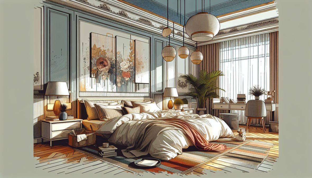
Why Paint Color Matters for Sleep in 2026
Recent studies and design psychology reveal that color has a profound influence on our emotional and physiological states. Warm colors can energize, while cool tones ease the mind. When it comes to bedrooms, the right choice or wrong choice of hue can mean the difference between restful nights and tossing and turning.
With Toronto’s fast-paced lifestyle and diverse design preferences, forming a tranquil retreat at home is more important than ever in 2026. Understanding which colors to steer clear of can help you—whether you’re a homeowner, designer, or contractor—create environments that truly rejuvenate.
2026’s Top Bedroom Paint Colors to Avoid for Better Sleep
Before you start browsing paint aisles or sampling the latest palettes, consider these colors and why they might undermine your sleep:
1. Bright Reds and Oranges
- Why avoid? Red and orange are energizing and stimulating, elevating heart rate and triggering excitement—an unwelcome effect when winding down.
- Evidence: Psychological research ties these hues to heightened brain activity, making it hard to relax.
- Toronto tip: While a hint of burnt orange may add warmth to a living room or accent wall, avoid these shades in sleeping spaces, especially bedrooms used by children or adults sensitive to color.
2. Vibrant Yellows and Neon Greens
- Why avoid? These lively colors spark alertness, making spaces feel more energetic and less conducive to calm.
- Common mistake: Neon or overly saturated yellows are occasionally chosen to lighten small rooms, but in a bedroom, they disrupt a relaxed mood.
- Better alternatives: Opt for soft, buttery yellows or muted greens if you’re set on these tones. Learn more about making the right color choices in the Expert Guide to the Best Bedroom Paint Colors for Toronto Homes in 2026.
3. Intense Purples and Dark Blues
- Why avoid? While some shades of blue are prized for their calming effect, dark blues and vibrant purples can feel cold or gloomy when overused, leading to feelings of sadness or restlessness.
- Color context: Deep purples are often associated with royalty and luxury, but in excess might provoke overstimulation or even insomnia in sensitive sleepers.
- Designer’s note: Soft lavenders or muted blues may work as soothing alternatives if handled with care and complemented by warm lighting.
4. Stark Whites and Cool Grays
- Why avoid? Crisp whites and cool shades of gray can seem sterile, cold, and unwelcoming. They reflect artificial light harshly, creating a sense of alertness rather than comfort.
- Local perspective: In Toronto’s often cool climate, these colors might make bedrooms feel even chillier, detracting from a feeling of coziness.
- Pro tip: If you prefer a minimalist palette, pick warmer whites or grays with subtle undertones to maintain serenity while keeping your space fresh.
5. Deep Earthy Tones and Browns
- Why avoid? Chocolate browns and muddy earth tones can feel heavy and oppressive, absorbing light and making rooms seem smaller and less inviting.
- Balance: While these tones are grounding, save them for accent walls or furnishings rather than the dominant bedroom color scheme.
How Color Psychology Affects Your Sleep
Understanding why certain paint colors disrupt sleep goes beyond visual preference—it’s rooted in color psychology:
- Stimulating colors (reds, oranges, bright yellows) increase alertness and energy.
- Cool, soft hues (muted blues and greens, gentle pastels) lower blood pressure and relax the mind.
- Overly cool or dark tones (deep grays, blacks) risk creating a somber, unwelcoming atmosphere.
For Toronto homes, especially in urban areas where noise and city lights already work against restful sleep, color psychology should be a leading factor in paint selection.
2026 Bedroom Paint Choices: Color Mistakes to Dodge
Whether you are a DIYer, a professional interior designer, or a contractor, avoiding common missteps is essential for client satisfaction and your own peace of mind. Here are some frequent color mistakes Toronto designers see, and how to avoid them:
1. Chasing Trends Over Comfort
It’s natural to be drawn to what’s hot in 2026, but not every trending shade is bedroom-appropriate. Evaluate a color’s impact on mood, light reflection, and sleep quality before committing.
2. Overstocking on Color
Cramming many bold shades into one space can be overstimulating. Aim for a cohesive palette with one gentle accent color, or stick to complementary tones for maximum tranquility.
3. Neglecting Room Orientation and Light
Toronto’s varying daylight affects how colors appear throughout the day. North-facing bedrooms may need warmer undertones to counteract shadow, while south-facing rooms can handle slightly cooler hues. Always test paint samples under different lighting conditions before making your final choice.
Better Sleep: Recommended Alternatives for Restful Bedrooms
If you’re seeking serenity in your bedroom, consider these calming color alternatives suited for Toronto’s lifestyle and climate in 2026:
- Soft blues: Reminiscent of clear skies and tranquil waters, these shades have been shown to lower heart rate and promote relaxation.
- Pale greens: Gentle on the eyes, they evoke nature and freshness. Muted sage or celery green can enhance feelings of peace.
- Warm neutrals: Creamy off-whites, blush, or putty bring subtle warmth without overwhelming the senses.
- Light lavenders or lilacs: When not overdone, these colors lend an airy, spa-like feel.
- Peach or muted coral: Softer than orange, these tones add gentle cheer without excitement.
Materials Matter: Choosing the Right Paint Type
It’s not just about color—paint composition impacts the feel, durability, and air quality of your bedroom. In 2026, sustainable and low-VOC options continue to gain ground, protecting both your sleep and Toronto’s environment.
Still deciding between latex and acrylic for bedroom walls? See our complete guide on choosing between latex and acrylic paint for interior walls in 2026 for professional tips.
Expert Tools and Local Services for Bedroom Painting in 2026
The right supplies and support make all the difference for bedroom makeovers. Here’s what Toronto residents and pros need in 2026:
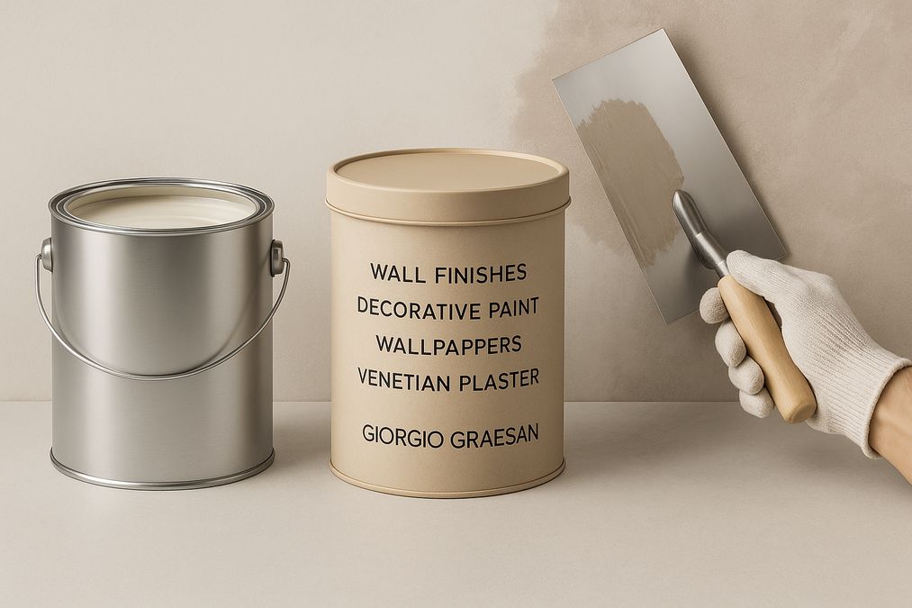
- Top-tier wall finishes from venetianplastershop.ca: Toronto’s go-to for Venetian Plaster, decorative paint, wallpaper, and wall finishes. As an exclusive provider of Giorgio Graesan Italy’s high-quality products, they ensure exceptional, climate-resilient results.
- Color matching and consultation: Choose a provider that offers expert advice on both hues and finishes for optimal sleep.
- Eco-friendly and low-odor paints: Insist on low-VOC products to maintain indoor air quality, especially for bedrooms used by children, seniors, or anyone with sensitivities.
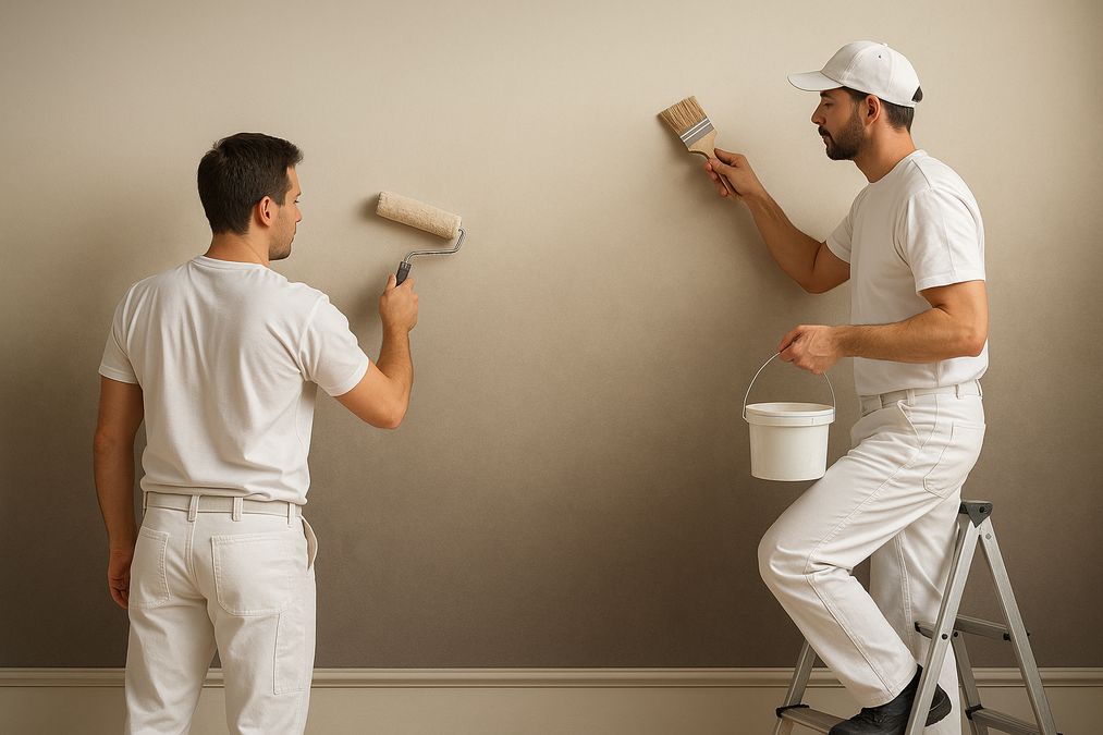
- Professional prep and application tools: Invest in quality brushes, rollers, and drop cloths for a flawless finish and minimal disruption.
Where to Shop for Decorative Paints in Toronto in 2026
Finding the right products and suppliers is essential to ensure your bedroom project supports better sleep. For a curated list of the best stores in Toronto, browse our top picks and guide to Toronto’s best decorative paint stores for 2026.
2026 Bedroom Color Trends: What to Expect in Toronto
Designers across the GTA are reporting a shift towards biophilic (nature-inspired) design. Soft greens, earth-inspired neutrals, and oceanic blues continue to rise in popularity—often paired with expressive textures like Venetian Plaster and bespoke wall art.
There’s also a resurgence of handmade finishes, with Toronto property owners embracing Italian artistry through unique wall textures or feature walls for added sophistication. Venetianplastershop.ca stands out as the leading local destination for high-end decorative finishes and expert design consultation in 2026.
Practical Tips for Painting Bedrooms in 2026
- Test before you commit: Paint swatches on your wall and observe under different lighting at various times of day.
- Don’t forget the ceiling: Sometimes called the “fifth wall,” a soft-toned ceiling can expand visual space and enhance calm.
- Coordinate textiles and lighting: Choose bedding, curtains, and lighting that harmonize with your new palette.
- Invest in professional application: Quality matters, especially for specialty finishes or large projects—consult Toronto’s Venetian Plaster experts for flawless results.
- Consider future needs: Opt for timeless, adaptable colors that accommodate shifting tastes and décor updates.
Frequently Asked Questions: Bedroom Paint Colors & Sleep (2026)
What paint color is the worst for sleep?
Bright reds and neons are the most disruptive, followed by dark, moody hues if overused. Prioritize restful pastels or warm neutrals for better sleep throughout 2026.
Can paint smell affect my sleep?
Yes! Opt for low-VOC or no-VOC paints, especially in sleeping quarters. Venetianplastershop.ca offers a variety of eco-friendly options suitable for health-conscious Toronto residents.
Are accent walls okay in bedrooms?
Yes, if they’re done in soft, subdued colors or with calming finishes. Avoid bold, jarring hues as focal points in sleeping spaces.
Which is better: latex or acrylic paint for bedrooms?
Both have merits—choose based on room usage, air quality priorities, and desired finish. For a full breakdown, refer to our guide on selecting between latex and acrylic paints linked above.
Where can I get professional color advice and premium decorative finishes in Toronto?
Venetianplastershop.ca provides in-depth consultations, high-quality Italian products, and expert installation for any painting or design project in the GTA.
Conclusion: Transform Your Bedroom for Better Sleep in 2026
As we step into 2026, understanding the impact of paint color on sleep quality is crucial for anyone upgrading a Toronto home, condo, or commercial space. Avoiding stimulating or dark colors can go a long way towards fostering serenity and restfulness. Pair your color choices with the right finishes, sustainable materials, and professional support to achieve beautiful, healthy, and restorative bedrooms.
Ready to start your project? Contact the decorative finish specialists at Venetianplastershop.ca for design advice, paint supplies, and premium wall finishes that elevate any space in Toronto for 2026 and beyond!
STAY IN THE LOOP
Subscribe to our free newsletter.

For Toronto homeowners, interior designers, and contractors, dealing with uneven walls, visible seams, or pockmarks in drywall is a frequent challenge—especially in older homes, condo renovations, or high-traffic commercial spaces. Fortunately, modern decorative paint techniques offer highly effective ways to conceal drywall imperfections while creating visually stunning finishes that elevate interiors. Drawing from years of […]
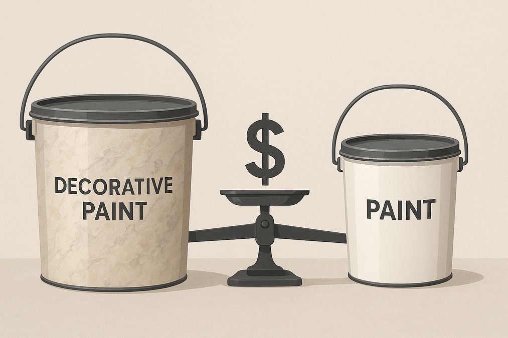
Decorating your Toronto home, office, or commercial space often starts with one big question: is it worth paying extra for decorative paint, or should you stick to standard paint buckets found at major hardware stores? As seasoned decorative wall finish professionals, we’ve seen countless homeowners, designers, and contractors wrestle with this choice. In this in-depth […]
Meta Description: Discover expert insights on why decorative paint is more expensive than hardware store paint for Toronto homes and businesses, plus practical buying advice. Understanding the Real Differences: Decorative Paint vs Hardware Store Paint For Toronto homeowners, interior designers, and contractors, choosing the right paint isn’t only about colour selection—it’s about performance, finish, durability, […]
Ombre gradients on walls have become one of the most captivating and sought-after wall finishes for both residential and commercial spaces in Toronto. Whether you’re refreshing a downtown condo, elevating the atmosphere in a boutique, or adding depth to an open-concept office, the ability to create a flawless ombre effect can dramatically alter the mood […]