
by Glorifix
Share
Share
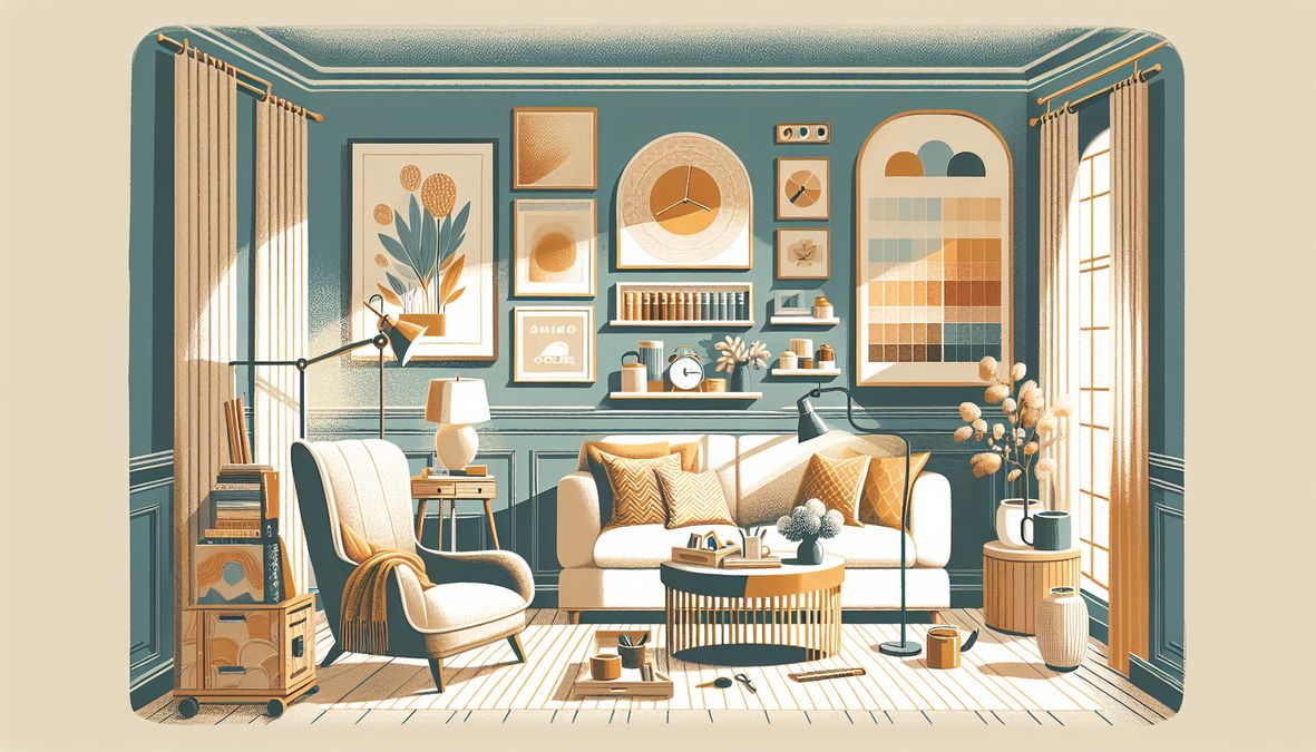
Why Warm Colors Make Toronto Living Rooms Feel Cozy
Warm colors, such as soft reds, deep oranges, golden yellows, and earthy browns, naturally evoke comfort and coziness. For Toronto’s often chilly climate, especially in the lengthy winter months, these hues can turn any living room into a sanctuary of warmth.
- Mood Enhancement: Warm colors are scientifically linked to creating an inviting and soothing atmosphere, promoting relaxation and conversation.
- Brightness Balance: Many Toronto homes and condos face long periods without abundant sunlight. Warm palettes brighten up interiors and add visual warmth—even on grey days.
- Style Versatility: Whether your style is modern, traditional, or eclectic, you can customize warm color combinations to match your taste and needs.
Core Principles of Choosing Warm Color Combinations
Selecting the ideal warm colors involves more than picking your favorites. Consider these:
- Natural Light: South-facing rooms can embrace bolder tones, while north-facing spaces need lighter, creamier selections.
- Room Size: Lighter warm shades create openness, while deeper hues add intimacy.
- Existing Decor: Coordinate tones with flooring, upholstery, and art for a harmonious look.
Color Psychology Tips
- Red: Stimulates energy, ideal for social spaces but best used as an accent.
- Orange: Warm and dynamic, perfect for promoting happiness and creativity.
- Yellow: Cheerful and bright; great for infusing spaces with positivity.
- Brown & Earthy Tones: Grounding and balancing, connecting interiors with nature.
- Peach, Terracotta, and Coral: Modern warm shades, trending for their understated elegance and versatility.
Top 2026 Warm Color Trends for Toronto Living Rooms
The design world is seeing a return to distinctive warm palettes that offer both sophistication and comfort. Let’s explore the key shades setting the trend in Toronto living rooms for 2026.
Modern Warm Neutrals
- Soft Taupe and Mushroom: Pair these with creamy whites for a soothing yet inviting ambiance.
- Warm Greige: Grey-beige blends continue to dominate, offering a refined canvas for bold or subtle accents.
Earth-Inspired Terracottas
- Clay, Sienna, and Brick: Deep, sunbaked hues work beautifully with natural materials and artisan accessories for a Toronto home with a timeless feel.
- Blush and Dusty Rose: Soft versions of red that feel romantic and gentle—a perfect choice for condos and family homes.
Spiced Yellows and Oranges
- Ochre and Pumpkin: These colors infuse energy into small or large living rooms.
- Burnt Orange: A favorite for accent walls or statement furniture, adding depth and excitement.
Timeless Golds and Ambers
- Goldenrod, Amber, and Honey: Classic and cheerful, these invite warmth day or night.
For more color inspiration, see this guide to Toronto’s best living room color combinations for 2026.
The Best Warm Color Combinations to Make a Living Room Cozy in Toronto
Pairing warm colors isn’t just about choosing shades that look good together. It’s about creating harmony, depth, and the perfect cozy vibe for Toronto’s urban lifestyle. Here are some winning combinations to consider:
1. Rich Terracotta & Creamy Beige
- Walls: Terracotta accent wall
- Trim or Accessories: Off-white or cream tones
- Effect: Adds rustic warmth and brightens the space, ideal for both heritage homes and modern condos.
2. Spiced Pumpkin & Soft Taupe
- Walls: Warm pumpkin or ochre
- Furniture: Taupe sofas and chairs
- Effect: Generates a cozy yet sophisticated setting, giving living rooms a gentle Toronto autumn vibe year-round.
3. Goldenrod Yellow & Mocha Brown
- Accent Wall: Golden yellow
- Main Wall: Soft mocha brown
- Accessories: Walnut tables, gold accents
- Effect: Invites cheerfulness and depth, perfect for brightening long winters.
4. Clay Rose & Warm Greige
- Feature: Clay or dusty rose wallpaper
- Primary Shade: Warm greige paint
- Effect: Modern, subtle, and especially inviting for open-concept spaces.
5. Burnt Orange & Chocolate Brown
- Accent Wall: Burnt orange
- Main Walls: Deep chocolate brown
- Textiles: Cream or beige throws and rugs
- Effect: Luxurious and comforting, with a modern-retro edge.
How to Apply Warm Colors: Walls, Ceilings, and Accents
Not all color should go on all four walls. Layering color wisely boosts your living room’s richness without overwhelming it.
Three-Color Rule
- Primary Color (60%): The base for walls and large-scale furniture
- Secondary Color (30%): For accent walls, feature furniture, drapery
- Accent Color (10%): Cushions, décor, or artwork for a touch of vibrancy
Feature and Accent Walls in Toronto Homes
Accent walls continue to be popular in Toronto interiors for adding drama and focus.
- Consider Venetian Plaster, decorative wall finishes, or designer wallpapers for a rich texture, easily sourced at venetianplastershop.ca. Their Giorgio Graesan wall finishes from Italy are a favorite among discerning designers and homeowners alike.
How Light Affects Warm Colors in Toronto
Toronto’s variable sunlight can shift how colors are perceived:
- North-Facing Rooms: At risk of feeling cold, so choose yellows, creams, and light terracotta for warmth.
- South-Facing Rooms: Enjoy more sunlight—richer, deeper warm tones like chocolate brown, ochre, or burnt orange stand out.
- East/West-Facing Rooms: Consider time-of-day lighting; transitional hues like warm greige and soft peach maintain balance.
Complementary Finishes: Venetian Plaster, Wallpapers & Textures
Pair your warm color palette with unique textures for an elevated, cozy outcome:
- Venetian Plaster: Instantly brings Italian luxury and depth to feature walls. Venetianplastershop.ca offers the best Venetian Plaster and supplies direct from Giorgio Graesan Italy.
- Decorative Paints: Specialty finishes like metallics or matte clay enhance coziness and individuality.
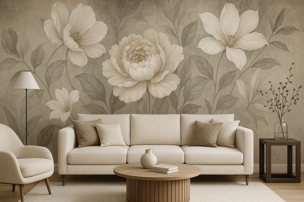
- Wallpaper: Add instant pattern, depth, and a tactile appeal that complements warm palettes.
Decor Tips for Enhancing Warm Color Palettes
To maximize coziness in your Toronto living room:
- Layer Textiles: Rugs, throws, and pillows in complementary warm shades and natural fibers
- Use Natural Materials: Wood, leather, woven baskets, and pottery emphasize comfort and authenticity
- Incorporate Metallic Accents: Brass, copper, and gold accessories add sophistication and reflect light
- Display Art and Greenery: Wall art with warm undertones and plants for life and contrast
For inspiration on using sophisticated warm shades, check out these paint colors that can make Toronto homes look more expensive.
Designing for Different Spaces: Homes, Condos, Offices, and Commercial Settings
Toronto’s diversity means color schemes must fit a range of environments:
Residential Spaces
- Heritage Homes: Embrace classic warm reds, golds, and earth tones true to Victorian and Edwardian roots.
- Modern Condos: Use light terracotta and warm greige for a fresh, airy effect—pairing with statement wallpapers or Venetian Plaster for texture.
Commercial and Retail Spaces
- Stores & Boutiques: Warm palettes create a welcoming environment that encourages browsing and repeat visits.
- Offices: Use soft yellows and taupes for creative but calm atmospheres, with accents in deeper oranges or earth tones for energy and focus.
Multi-Use Spaces
- Combine lighter and deeper warm tones for spaces that must transition between personal, social, and professional use (common in open-concept Toronto lofts).
Warm Color Palette Tools & Services for Toronto
Ready to make a living room cozy with the best warm color combinations? Here are essential tools and services:
- Paint Sample Services: Many Toronto retailers let you try paint cards or jars before committing, ensuring your chosen warm shades look perfect in your light.
- Virtual Room Visualizers: Online tools help you preview warm palettes in 3D—use with images of your real space.
- Professional Wall Finishes & Supplies: Explore the latest decorative wall paint combinations for Toronto in 2026 to get inspired or contact experts at venetianplastershop.ca for personalized service, including Venetian Plaster, Italian paints, designer wallpapers, and wall finishes from Giorgio Graesan.
Frequently Asked Questions
1. Are warm colors too bold for small Toronto living rooms?
Not at all! Using lighter warm tones like peach, beige, and soft gold can make even compact spaces feel larger and more inviting. Just focus bold colors on accent walls or accessories.
2. How do I make sure my warm palette doesn’t look outdated?
Mix trending shades (like clay rose or pumpkin) with classic neutrals. Incorporate texture through Venetian Plaster or wallpaper for a contemporary look that will outlast short-lived trends.
3. Can I use more than one warm color in the same room?
Absolutely! Just follow the three-color rule and balance deep and light shades for visual harmony.
Conclusion: Create the Coziest Living Room in Toronto with Warm Colors
Transforming your living room into a warm, welcoming city retreat is as simple as choosing the best warm color combinations. Toronto’s unique blend of architecture, climate, and culture makes these hues especially impactful for 2026. Whether you’re a homeowner, interior designer, or business owner, don’t hesitate to experiment with color, texture, and finish.
For expert guidance, premium Italian wall finishes, and access to the city’s finest selection of Venetian Plaster, decorative paint, wallpaper, and more, contact the team at venetianplastershop.ca today—and give your space the cozy upgrade it deserves!
STAY IN THE LOOP
Subscribe to our free newsletter.
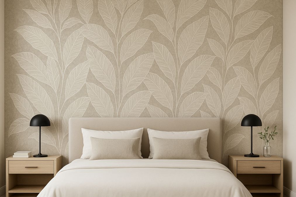
Upgrading your bedroom doesn’t require a full renovation—sometimes, all it takes is a well-chosen wallpaper behind the bed. As Toronto’s go-to experts in decorative wall finishes, we’ve helped countless homeowners, interior designers, and contractors transform ordinary bedrooms into showstopping retreats using wallpaper as a headboard accent. In this post, we’ll share professional insights, practical advice, […]
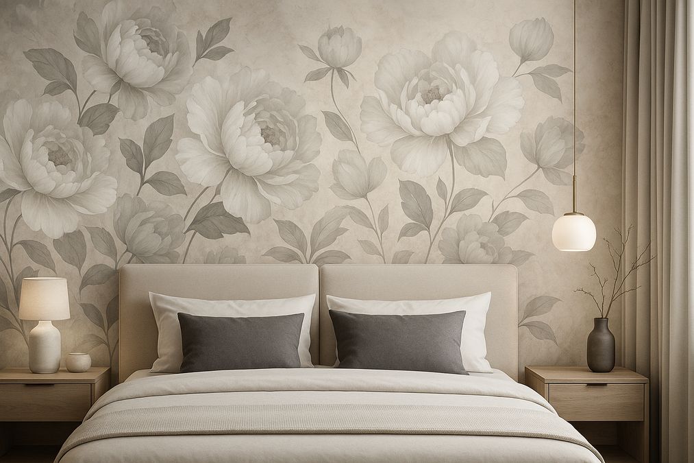
Creating the perfect accent wall behind your bed can transform an ordinary Toronto bedroom into a breathtaking retreat. With so many wallpaper styles, materials, and design options emerging in 2026, choosing the best wallpaper designs for behind the bed in Toronto requires more than just browsing Pinterest for inspiration. As experts in decorative wall finishes, […]
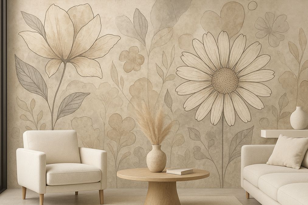
Whether you’re a Toronto homeowner, a commercial property manager, an interior designer, or a contractor, the walls of your space are a canvas waiting to define style and atmosphere. In 2026, artistic mural wallpaper trends in Canada are creating a buzz like never before. More than just a decorative feature, mural wallpapers reflect personality, creativity, […]
Are you ready to turn your Toronto home, office, or retail space into a visual masterpiece in 2026? Statement wallpaper murals are the latest must-have for anyone looking to express style, creativity, and modern elegance within their interiors. Whether you’re a homeowner dreaming of a living room refresh, an interior designer looking for unique solutions, […]