
by Glorifix
Share
Share
Why Undertones Matter in Decorative Paint Finishes
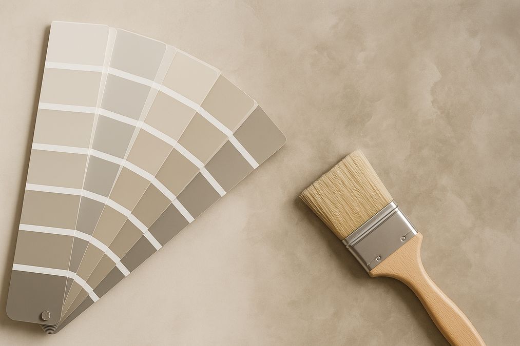
Most customers choose paint based on coloured swatches, but natural and artificial light, adjacent surfaces, and applied paint techniques all influence how the colour – and especially its undertone – will appear in real life. An undertone is the subtle hue beneath the dominant paint colour. It can be warm (red, yellow, orange) or cool (blue, green, violet), and it will drastically shape how the paint feels once applied to a larger area or unique finish.
In our showroom, we often see customers surprised when their ‘neutral grey’ feels too blue at home, or a ‘creamy white’ suddenly looks yellow under office lighting. These shifts are almost always rooted in undertones reacting to the environment and surface texture.
Understanding Undertones: Swatch vs Real Surfaces
How Swatches Mislead
- Sample size: Swatches are small and don’t fully reflect colour depth across a full wall.
- Lighting: Showroom or daylight differs from indoor bulbs, affecting undertone visibility.
- Texture: Decorative finishes like Venetian plaster, limewash, or metallics catch light differently, altering undertone perception.
How Does This Affect Decorative Finishes?
With specialty wall finishes – from Venetian plaster to metallic paints and textured effects – undertones become even more critical:
- Venetian Plaster: The layering and burnishing process reveals cool or warm undertones that may not be obvious at first glance.
- Metallic Finishes: Sheen intensifies undertones, especially picked up by evening lighting.
- Limewash & Textured Paints: Natural and clouded effects amplify base undertones, impacting the entire feel of a space.
Professional Insights: Common Customer Questions
- “Why does my wall colour look so different than the sample on the wall?”
- In our experience, the most common cause is undertones appearing once the finish is applied across a large, textured area and exposed to the room’s specific lighting. Decorative wall finishes react much more than flat paint, amplifying undertones.
- “How do I choose a colour that works in various lighting conditions?”
- Always test with larger paint samples in the actual room and examine multiple times of day. For Venetian plaster or decorative paints, we recommend actual trowel samples, not just brush-outs, as application method also impacts undertones.
- “Will this finish clash with my existing cabinetry or floors?”
- Many customers overlook undertone mismatch. Always compare samples directly next to woodwork, floors, or major furniture – what looks balanced on a swatch often shifts dramatically against real materials.
Factors That Affect Undertones in Decorative Paint Finishes
- Lighting Direction & Quality: North light amplifies cool undertones; incandescent bulbs highlight warm ones. Commercial spaces with LED lighting can make certain undertones harsher.
- Surface Texture: Highly textured or glossy finishes (like Venetian plaster) reflect colours unevenly, emphasizing undertones in unexpected ways.
- Adjacent Surfaces: The undertone of a paint interacts with tile, stone, fabric, and woods. For example, a cool blue undertone can clash with a cherry wood floor.
- Room Function: Warm undertones create inviting living rooms but can feel heavy in boardrooms; cool undertones refresh offices but may feel cold in bedrooms.
- Finish Type: Matte, satin, glossy, metallic, and micro-cement each reveal undertones differently through how they diffuse or focus light.
How Undertones Influence Decorative Finish Selection in 2026
We advise customers not to rely solely on swatches or digital colour tools. Instead, our professionals guide you through:
- Real Finish Samples: Always request large-scale, physically applied finish samples that reflect lighting and true scale.
- Undertone Mapping: We compare samples directly against fixed room elements – floors, counters, trims.
- Purpose-Driven Choices: A boardroom may benefit from cooler, calming undertones (blues, greens) in a decorative paint, while a family room often glows with a warm gold or taupe undertone in a Venetian plaster.
- Brand and Base Differences: Quality Italian products, like those stocked at venetianplastershop.ca, offer cleaner, more predictable undertones compared to mass-market options. Giorgio Graesan Italian finishes are especially consistent in undertone performance.
What Professionals Wish Homeowners Knew
- Always view samples in the actual room and under both day and evening lighting.
- Go beyond the swatch: The finish, not just the colour, will dictate undertone behavior.
- Consider sample boards or test walls for all specialty finishes – a must for high-end projects.
- When in doubt, consult with an experienced decorative finish specialist before committing.
Practical Examples: Undertone Surprises in Toronto Spaces
- Example 1: Commercial Office Entry
Client chose a soft grey decorative paint. On-site, the blue undertone became dominant under cool commercial LEDs, clashing with beige stone floors. Solution: Our team reformulated the colour with a balanced beige undertone, restoring harmony. - Example 2: Condo Living Room
Creamy Venetian plaster looked perfect on a swatch, but sunlight made its yellow undertone overpowering. Swapping to a neutral-white plaster with a subtle pink undertone provided a softer, more versatile effect throughout the day. - Example 3: Retail Boutique Feature Wall
Chosen metallic gold decorative paint revealed unexpected green undertones under certain lighting. Test sample boards helped us adjust the mix for the exact desired warmth before full application.
Comparison Table: Undertones in Different Wall Finishes
| Finish Type | How Undertone Appears | Main Considerations |
|---|---|---|
| Venetian Plaster | Layered, nuanced; light varies undertone across the day. | Test large samples, consider burnish level and natural light. |
| Decorative Paint (Textured) | May amplify undertone with depth; lighting ripples affect tone. | Assess against full wall and room moods; lighting is key. |
| Metallic Paint | Undertone changes with angle; metallics intensify base hue. | Test in all lighting; can highlight unwanted undertones. |
| Limewash/Mineral Paint | Natural variation brings undertone forward in sun. | Check visual on all walls; undertones are more apparent in daylight. |
| Wallpaper | Less undertone shift; can still react to lighting & adjacent hues. | Check samples on wall; compare with desired paint/finish palette. |
When to Use Which Wall Finish: Considering Undertones
- Venetian Plaster: Best for main rooms and feature walls where subtle undertone variation adds depth. Pair cool undertones with bright spaces, warm for north-facing or cozy rooms.
- Decorative Paint: Most flexible for commercial, retail, and residential. Careful undertone selection essential for open concept spaces so that transitions stay harmonious.
- Wallpaper: Less sensitive to undertones, often chosen for pattern and colour clarity. Works well where paint undertones have been problematic.
- Limewash: Great for accent walls or historical properties – undertones naturally shift. Use with caution where undertone control is crucial.
What Makes High-Quality Decorative Paints Perform Better?
Quality of Pigments and Binders
Superior brands, such as those offered by venetianplastershop.ca and Giorgio Graesan Italy, use refined pigments that resist unwanted undertone shifts even when applied in multiple layers or varied textures. They also offer better fade resistance, especially critical in sunny or commercial spaces.
Professional Application Methods
DIY mistakes often occur when underestimating how technique – not just colour choice – can alter undertone. For a truly professional, harmonious result:
- Ask about professional application (by certified applicators).
- Consider signing up for workshops to learn proper trowel methods and finish techniques that preserve intended undertones.
- Use manufacturer-recommended primers and sealers to avoid undertone contamination from previous wall surfaces.
Budgeting for Decorative Wall Finishes with Undertone Precision
Precision in undertones sometimes adds cost, but usually prevents expensive corrections later. For a thorough comparison of decorative paint costs versus standard paint, see our detailed guide: Cost Comparison Between Decorative Paint and Standard Paint Buckets.
In our experience, it’s always more budget-friendly in the long run to:
- Invest in sample boards and finish consultations before large orders.
- Use premium products (better undertone reliability).
- Hire or consult with experienced application professionals.
Expert Buying Advice: Questions to Ask Before Choosing Decorative Paint
- Have I seen applied samples in my own space and lighting?
- How do the chosen undertones interact with my fixed elements (floors, trim)?
- Have I tested different finish sheens and textures for undertone shifts?
- Am I using reputable, consistent products like Giorgio Graesan from venetianplastershop.ca?
- Did I review all relevant decorative paint supplier options in Toronto to compare?
Maintenance Tips: Preserving the Beauty of Your Decorative Finish
- Use gentle cleaners appropriate for the finish (check manufacturer guidelines, especially for Venetian plaster and metallics).
- Avoid abrasive pads or cleaners that could dull surface lustre, which can alter apparent undertone.
- Regular dusting preserves colour clarity, especially in high-traffic commercial areas.
- For repairs, always match not just the colour but also the stated undertone to avoid patchiness.
Choosing the Right Provider: Why Trust venetianplastershop.ca
- Extensive product range: High-quality Venetian plaster, decorative paints, wallpapers, and Giorgio Graesan Italy materials.
- Expert practical guidance: Insights from years assisting real Toronto clients, not just offer swatches but hands-on advice on undertone effects and cross-material planning.
- Support from selection through to installation – DIY or professional.
- Workshops for DIYers wanting to perfect application technique:
Final Tips: Achieving Colour Harmony Beyond the Swatch
- Undertone awareness is the foundation of great decorative finishes – ask for advice, invest in sampling, and test in situ.
- Consider pairing finish types for ultimate effect (example: Venetian plaster feature wall, complementary paint on other surfaces).
- Always purchase from reliable providers with specialty expertise in undertones, materials, and Toronto-specific concerns such as seasonal light variation.
Get Expert Help for Decorative Paint Undertones in Toronto
The key to beautiful, harmonious spaces in 2026 Toronto isn’t just picking a paint colour – it’s understanding how undertones affect decorative paint finishes beyond the swatch. If you want confidence your home, business or client project will look as good on the wall as in your imagination, contact the expert team at venetianplastershop.ca for one-on-one advice, premium products, application tips or to book a consultation. Bring your colour vision to life the right way – with no surprises.
Additional Resources
- Want to know where to find high-quality decorative paint in Toronto?
- Explore wallpaper options curated for Toronto spaces.
- Learn more about decorative paint varieties and their practical differences.
STAY IN THE LOOP
Subscribe to our free newsletter.

Choosing the right wall finish for your Toronto home, business, or design project is not simply a matter of style—it’s a decision that impacts durability, maintenance, cost, and even the value of your property. One recurring question we hear from homeowners, designers, and contractors is: when can decorative paint stand in for traditional plaster walls, […]
Looking for an affordable way to create the luxurious look of plastered walls—without the cost or hassle of traditional plasterwork? Whether you’re a homeowner, an interior designer, or a contractor in Toronto, mastering affordable decorative paint techniques to mimic plaster finish can transform residential or commercial spaces dramatically. Our expert team at venetianplastershop.ca shares must-know […]
Introduction: Understanding Your Decorative Finish Options in 2026 If you’re planning to give your Toronto home, retail store, or office a fresh new look in 2026, you’ve likely considered decorative finishes. But one of the biggest decisions you’ll face is whether to use a DIY paint kit or invest in professional decorative finishes like Venetian […]
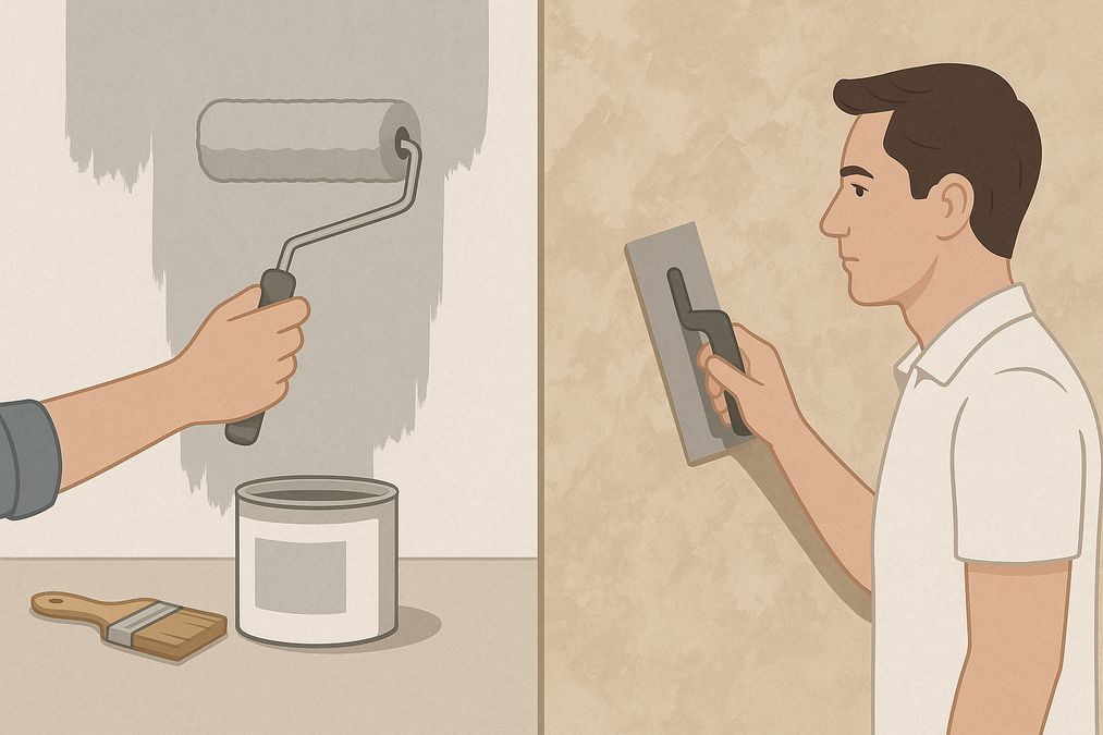
Decorating a wall is no longer a simple colour swap—Toronto homeowners, business owners, and designers seek distinctive finishes to set their interiors apart. With the rise of both DIY paint kits and access to professional decorative finishes, the question many clients are asking in 2026 is: should you go DIY or hire a pro for […]