
by Glorifix
Share
Share
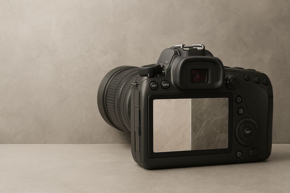
Understanding the Gap: Why Do Decorative Paint Finishes Look Different in Photos?
Many customers come to us, puzzled by why their newly painted accent wall, Venetian plaster feature, or shimmering metallic hallway don’t match what they see in photos taken on their phone or professional camera. There’s no single explanation, but professional experience has helped us pinpoint the top technical and design reasons behind this common issue:
1. The Role of Light: Natural vs. Artificial Illumination
- Lighting changes everything: Decorative paint finishes, especially those with texture, metallics, or varying sheens, react differently to various types and angles of light. Natural daylight, warm bulbs, and commercial spotlights produce entirely different reflections and shadow details on the same wall finish.
- Camera flash can mislead: Many Toronto homes and offices use warm, ambient lighting—but cameras, especially on automatic settings, often compensate with a cool flash that washes out or distorts colours and subtle textural effects.
- Direction and time of day: North-facing rooms tend to appear cooler and flatter in photos, while west-facing spaces might capture more shadow and gold tones at sunset. This is why we always recommend evaluating finishes at different times—and using real-life samples on your actual walls, not just in showrooms.
2. Finish Complexity: Texture, Sheen, and Iridescence
- Textural depth is flattened: Unique finishes like Venetian plaster, textured metallics, and faux finishes are specifically designed for interplay with moving light and human perspective. Standard cameras—especially phone cameras—tend to flatten these layers, reducing visible depth, sparkle, or texture.
- Sheen exaggeration: Glossy and pearlescent paints can cause harsh reflections, known as ‘hot spots,’ in photos. These can make subtle wall finishes look patchy or overly shiny, especially under a camera’s flash or professional studio lighting.
- Iridescence and mica: Many premium decorative paints used in luxury Toronto interiors feature tiny mica or metallic particles. These create dynamic shifts in tone and colour in real life, but can look dull, streaky, or strangely pixelated in photos, depending on the angle.
3. Digital Limitations: Cameras and Post-Processing
- Automatic white balance struggles: Most cameras try to correct for ‘neutral’ whites, but this can mute or distort custom wall finishes, warm textures, and subtle glazes that look fantastic in person.
- Compression and display: Even if a photo looks reasonable on your camera display, social media, text messages, and emails compress images—reducing subtle contrasts, soft gradients, and complex metallics further.
- Editing isn’t always the answer: Filters or exposure tweaks can help, but they often exaggerate differences between photographic and real-life viewing, especially for highly nuanced finishes.
What Decorative Wall Finish Professionals Recommend
In our years helping Toronto homeowners, designers, and business owners choose and install decorative paints, we’ve learned:
- View samples on your own wall—the way your room is naturally lit throughout the day. Don’t rely solely on online swatches or product photos.
- If photos are critical (for portfolios, real estate, or social sharing), work with a photographer experienced in shooting interiors with specialty finishes. Lighting setup and camera settings have a huge impact.
- When creating sample boards, use large swatches and move them around the space to see changes in finish under different lights and angles.
- For commercial or highly visual residential projects, we regularly help customers test finishes in-situ before making a final decision—because no two spaces react exactly the same.
Practical Examples: Real-World Experience from Toronto Projects
One of the biggest surprises for homeowners is how a luxurious matte Venetian plaster finish in a moody powder room can look vibrant and soft in person, but gray and flat in mobile photos. Conversely, a high-gloss feature wall in a downtown office may appear glittery and rich in late afternoon sunlight but take on harsh glare under artificial lights, turning an Instagram moment into an eyesore.
We often advise designers: test, observe, and photograph finishes in the space. Don’t underestimate how factors like:
- LED vs. incandescent lighting
- Wall orientation and window size
- Overhead fixtures, sconces, and natural shadows
- Room size and ceiling height
…all dramatically change the way decorative finishes appear on camera.
Common Customer Questions About Decorative Paint Photography
Will Professional Photography Make My Wall Finish Look the Same as in Real Life?
Not exactly—but a trained interiors photographer using professional lighting can bring out nuances that cell phone cameras cannot. In our experience, communicating with your photographer about the specific qualities you want to highlight—and previewing with test shots before final photography—leads to the best results.
How Can I Ensure My Decorative Paint Will Photograph Well for Real Estate or Social Media?
- Opt for finishes with subtle sheen rather than extreme gloss or heavy metallic if photographs are a priority. These tend to translate more accurately across devices.
- Consider adding feature lighting (track, sconces, or uplighting) that is easy to adjust for shooting.
- Avoid high-contrast patterns or very dark colours in poorly lit rooms if you plan to take lots of photos. Deep tones are notoriously difficult for most cameras to interpret without significant post-processing.
Why Choose Decorative Finishes in Toronto if They’re Hard to Capture in Photos?
This is a question we receive from clients who value both aesthetic impression and visual marketing. The answer: The multisensory, interactive appeal of high-end wall finishes can never be fully communicated in a two-dimensional photo. Touchable texture, gentle colour shifts, and luxurious depth are always richer in person—and that ‘wow factor’ is exactly why Toronto’s trendsetting homes and businesses still invest in professional finishes over generic paints or digital wallpapers.
Comparison: Decorative Paint, Wallpaper, and Venetian Plaster—Which Photographs Best?
| Finish Type | Photographic Accuracy | Main Pros | Main Cons | Professional Advice |
|---|---|---|---|---|
| Decorative Paint | Moderate | Custom textures, colours, effects | Can look flat or overexposed | Test with in-situ photos first |
| Wallpaper | High | Pattern and colour are consistent | Lighting can cause glare on some vinyls | Great for repeatable photo looks |
| Venetian Plaster | Low–Moderate | Rich texture, luxury look in person | Depth and nuance can be flattened in photos | Use directional lighting for best shots |
When helping homeowners choose, we often steer clients seeking highly photogenic results toward luxe wallpapers or select decorative paints with a medium, non-metallic sheen for the most reliable on- and off-camera performance. For showpiece accent walls where in-person impact matters more than Instagram, Venetian plaster and advanced Italian finishes remain unmatched.
Product & Service Providers: Where to Buy and Get the Best Decorative Finishes in Toronto
- Venetianplastershop.ca: Toronto’s premier source for Venetian plaster, decorative paints, wallpaper, and imported Italian wall finishes from Giorgio Graesan.
- They offer both expert installation and DIY support—including hands-on workshops for property owners, design professionals, and contractors in Toronto and the GTA.
- All products are curated for colour depth, durability, and best-in-class design suitability—ideal for anyone seeking finishes that impress both in person and, with the right approach, in photos.
Budget & Cost Considerations: Are Photogenic Decorative Finishes More Expensive?
Many customers wonder whether choosing a finish that looks good both on camera and in real life means paying a premium. The truth: some highly photogenic finishes (like patterned wallpapers) can be very cost-effective, while others (custom-crafted metallics, specialty plasters) may require a higher budget due to material quality and installation expertise. For a detailed look at pricing differences, visit our Cost Comparison Between Decorative Paint and Standard Paint Buckets.
Remember, cost is not just about materials—it’s about the skill and care in application, the time spent testing samples on site, and the support you receive in achieving your desired look under real-world Toronto lighting conditions.
Installation Advice: How to Ensure Wall Finishes Look Good On and Off Camera
- Pre-plan photography angles: Before finalizing your colour or finish, take sample photos from multiple room perspectives, using the types of light you’ll most often encounter.
- Use professional lighting: If your finish will be photographed for marketing or listing purposes, add softbox or adjustable lighting to minimize shadow, glare, and colour shift.
- Hire a specialist installer: Intricate finishes installed by experienced professionals are more likely to maintain consistent depth and sheen—helping to reduce unintended patchiness under camera flashes or ambient light.
- Communicate your priorities: When working with installers, tell them if you value photogenic outcomes. A professional can recommend specific finishing techniques, topcoats, or even slightly adjusted colours that are optimized for both camera and real viewing.
Choosing the Right Finish for Each Room
Some finishes are simply better suited to particular environments—especially in a city like Toronto, with its seasonal daylight changes and architectural variety:
- Bedrooms and Living Rooms: Consider velvet-matte paints or limewash, which offer depth without harsh reflection—subtle elegance in person and soft tones in photos.
- Kitchens and Bathrooms: Use durable, cleanable finishes with a light satin or eggshell sheen for resilience and even light bounce in photos.
- Retail and Office Spaces: Durable wallpapers or high-quality decorative paints (with non-metallic and medium sheen) photograph best under commercial downlights and daylight alike.
For more guidance, explore our recommendations on where to find high-quality decorative paint in Toronto, which covers living, work, and retail environment specifics.
Frequently Overlooked Factors When Selecting a Photogenic Decorative Finish
- Ongoing maintenance: Subtle textures and pearl glazes may hide minor imperfections in person but can highlight fingerprints or minor scuffs in high-definition photos. Maintenance advice from professional installers can save headaches later.
- Colour undertones: Minor undertones (blue, taupe, rose gold) that enrich a finish in Toronto’s changing daylight may be minimized or exaggerated in photos. Request large, custom-tinted sample boards to preview.
- Feature wall placement: Placing your decorative finish on a wall opposite large windows—or directly under downlights—can either maximize or undermine its camera performance.
- Product compatibility: Not all decorative paints or limewashes pair well with every primer, base coat, or protective topcoat. For camera-friendly results, ask paint specialists which product combinations prevent unwanted glare or flattening.
Summary & Professional Takeaways
- Lighting, texture, and camera technology are the core reasons decorative paint finishes photograph differently from real life.
- No finish looks identical in person and on camera—but strategic choices can bring the two much closer.
- Always view, touch, and photograph samples on-site before making your final decision.
- Work with specialists—like the team at venetianplastershop.ca—who understand the unique technical, design, and installation challenges of decorative finishes for Toronto’s homes, offices, and retail spaces.
Contact Us — Get Expert Decorative Paint Advice & Support in Toronto
Ready to discover the perfect finish for your space? Or want help planning a feature wall that impresses both in person and in pictures? Contact venetianplastershop.ca today for personalized guidance, on-site sampling, and the highest quality products from Giorgio Graesan Italy—trusted by designers across the GTA. For those interested in learning applied techniques firsthand, sign up for our upcoming plastering and decorative paint workshops and gain insight from Toronto’s top finish experts.
STAY IN THE LOOP
Subscribe to our free newsletter.

Choosing the right wall finish for your Toronto home, business, or design project is not simply a matter of style—it’s a decision that impacts durability, maintenance, cost, and even the value of your property. One recurring question we hear from homeowners, designers, and contractors is: when can decorative paint stand in for traditional plaster walls, […]
Looking for an affordable way to create the luxurious look of plastered walls—without the cost or hassle of traditional plasterwork? Whether you’re a homeowner, an interior designer, or a contractor in Toronto, mastering affordable decorative paint techniques to mimic plaster finish can transform residential or commercial spaces dramatically. Our expert team at venetianplastershop.ca shares must-know […]
Introduction: Understanding Your Decorative Finish Options in 2026 If you’re planning to give your Toronto home, retail store, or office a fresh new look in 2026, you’ve likely considered decorative finishes. But one of the biggest decisions you’ll face is whether to use a DIY paint kit or invest in professional decorative finishes like Venetian […]
Decorating a wall is no longer a simple colour swap—Toronto homeowners, business owners, and designers seek distinctive finishes to set their interiors apart. With the rise of both DIY paint kits and access to professional decorative finishes, the question many clients are asking in 2026 is: should you go DIY or hire a pro for […]