
by Glorifix
Share
Share
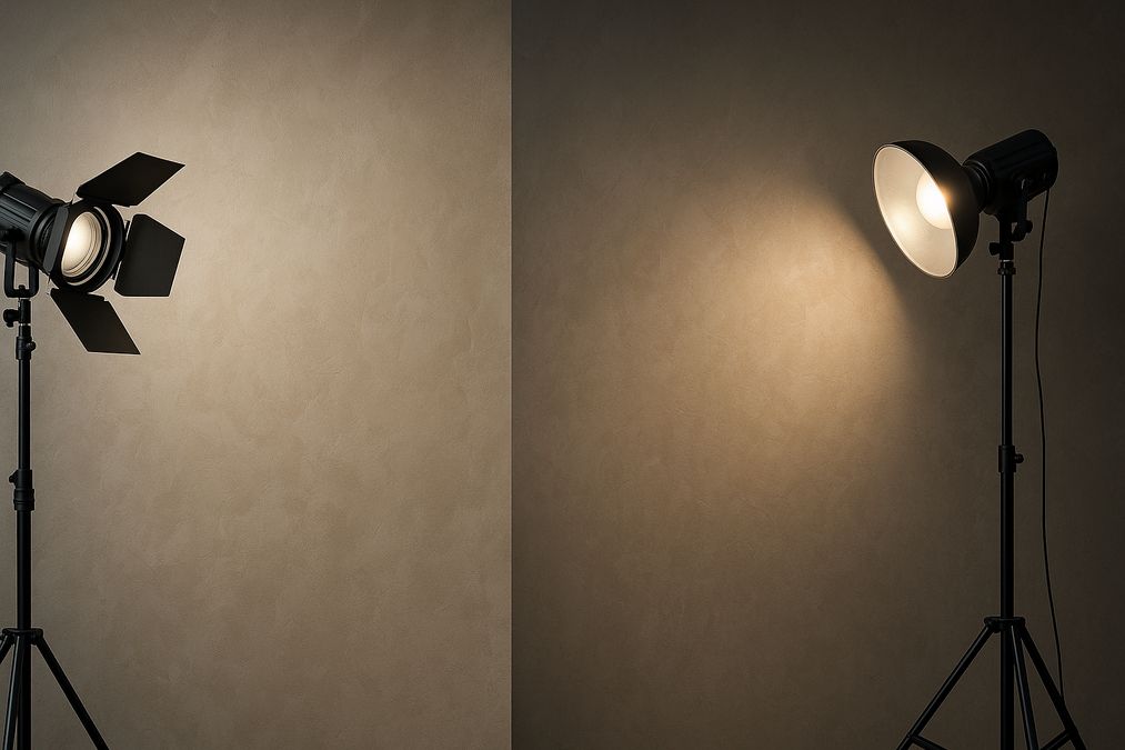
Why Lighting Is the Secret Ingredient in Wall Finish Photography
Lighting doesn’t just illuminate a space—it defines how colours, textures, and sheen appear, both to your eyes and in every photo you take. Many customers are surprised to learn that the same finish can look dramatically different under various lighting conditions and angles. In real-life interiors across Toronto, these effects are amplified by the city’s unique natural light levels, changes in sunlight by season, and the broad mix of modern and heritage building styles.
If you’ve ever wondered why your matte limewash accent wall looks elegant in person but flat or blotchy in a photo—or why your metallic Venetian plaster shimmers in the foyer but looks dull online—lighting is almost always the driving factor.
Understanding the Science: How Light Interacts with Decorative Paint
So, why does lighting change how decorative finishes appear in photos? The answer lies in how pigment particles, surface textures, and light all interact:
- Reflective finishes (like metallic paints or Venetian plaster) bounce and scatter light, boosting highlights or washing out detail in photos if not captured carefully.
- Matte finishes (such as limewash or chalk paint) absorb light, softening contrasts—but can appear dull or uneven in photos without the right light.
- Textured finishes throw shadows and highlights in unpredictable ways—perfect in person, but challenging for cameras that compress these subtleties.
Cameras, even high-end DSLRs or modern smartphones, interpret and average those light interactions differently than the human eye. That’s why your elegant feature wall may lose depth, shimmer, or even its intended colour—unless the lighting is thoughtfully managed.
Types of Lighting and Their Effects on Wall Finishes
The type and direction of light in your space have a dramatic impact on how your decorative finish appears in photos (and in person!). As professionals, we always consider these lighting factors in our Toronto projects:
1. Natural Light
- North-facing windows deliver even, cool-toned natural light—great for capturing neutral or cool wall colours, but can make some warmer finishes appear muted or greyish in photos.
- South, east, or west-facing windows bring stronger, shifting light across the day. Expect richer colours and more pronounced texture or shimmer in photos—sometimes producing dramatic highlights or shadows at certain times.
- Canadian winter vs. summer: In our experience, Toronto’s winter daylight is colder and less intense. Deep finishes can look subdued in photos, and artificial lighting becomes even more important for accuracy.
2. Artificial Lighting
- Warm bulbs (2700–3000K): Enhance reds, oranges, and golds—great for cozy spaces, but can yellow out blue or green finishes in photos.
- Cool or daylight bulbs (4000–6500K): Boost blues, greens, and silvers—preferred for modern spaces and makes whites appear crisp, but can make warm finishes appear less vibrant in pictures.
- Spotlights & downlights: Create intense highlights on Venetian plaster and metallics, perfect for dramatic effect, but can cause harsh glare or blow out finish details if overused.
- Diffuse lighting: Soft overhead or wall-washing fixtures distribute light evenly, minimizing harsh shadows—ideal for matte and textured finishes, both for real life and for photos.
3. Mixing Lighting Types
Always consider how different light sources will interact in your space. Many Toronto homes and stores have a mix of potlights, pendants, and daylight. Mixed lighting often makes wall colours appear inconsistent in photos and in person—something to test and adjust before a photoshoot or a big unveiling.
Common Mistakes When Photographing Decorative Wall Finishes
From our experience consulting with homeowners and designers, several fixable issues tend to come up repeatedly:
- Using a flash that flattens reflective finishes or exaggerates any unevenness.
- Photographing in mixed lighting (e.g. some cool, some warm bulbs) leading to colour casts that distort the true finish.
- Ignoring the time of day—capturing photos in low morning or late evening light that makes colours look muddy or textures disappear.
- Standing too close with your camera, creating perspective issues or emphasizing imperfections that aren’t visible in real life.
For more details on why decorative paint finishes look different in photos vs. in person, see our comprehensive article: Why Decorative Paint Finishes Photograph Differently from Real Life.
Real-World Advice: Choosing Finishes That Photograph Beautifully
As professional finishers, we help clients pick products that look their best both under direct light and in images. Here are some tailored recommendations for Toronto’s homes, condos, and commercial spaces in 2026:
- Venetian Plaster: Its luminous depth photographs best under soft, indirect lighting. We recommend pairing with dimmable LEDs or north-facing natural light for rich, nuanced photos—see our range of Venetian Plaster Finishes.
- Limewash: Suited for rooms with abundant but gentle natural light. Avoid harsh spotlights, which can show any brushstrokes or unevenness in pictures.
- Metallic Decorative Paints: Excel as feature walls in spaces with adjustable lighting. Use angled spotlights for a dramatic shimmer in evening photos, but diffuse by day to avoid overexposure—discover high-quality options at Decorative Paints in Toronto.
- Wallpaper: If you want crisp, reliable appearance in photos, many of today’s premium wallpapers with subtle metallics or embossed textures are more forgiving under variable lighting than paint or plaster. See our best-in-class selection at Wallpaper Selections in Toronto.
Lighting, Finish, and Colour Interactions: How to Plan the Best Combinations
Consider the Room’s Purpose
- Home Offices & Studios: Opt for cool, high-CRI lighting to capture true colours for video meetings or product photos.
- Retail & Boutique Spaces: Mix diffuse general lighting with spotlighting for statement wall finishes—it’s great for Instagram-worthy accent walls.
- Living Rooms & Lobbies: Use layered lighting (e.g., potlights, floor lamps, and windows) to give flexibility for evening and daytime ‘looks.’
- Bathrooms & Kitchens: Prioritize finishes that are both durable and forgiving under overhead or task lighting, such as polished Venetian plaster or quality vinyl wallpaper.
Colour Temperature and Finish Compatibility Table
| Finish Type | Best Lighting (CCT) | Photographic Result | Drawbacks |
|---|---|---|---|
| Venetian Plaster (Glossy) | 5000K+ (Cool/Daylight) | Shows depth & texture; true-to-colour in photos | Can produce glare spots |
| Limewash (Matte) | 2700-3500K (Warm-White) | Smooth, even tones, soft highlights | May look dull in low light |
| Metallic Paint | Adjustable: 3500K-4500K | Shimmery effect, dramatic under spotlights | Risk of washout in harsh light |
| Textured Wallpaper | Diffuse, 3000-4000K | Texture stands out, colours balanced | Pattern may be lost under single-point lighting |
Professional Tips for Photographing Decorative Paint Finishes
- Preview your photos: Test phone or camera shots at various times of day, especially before a big event or listing professional photos online.
- Use a tripod: Keeps your camera stable so subtle textures or glazes don’t blur or distort, especially in low light.
- Consider white balance settings: Adjust to match your dominant room lighting (not auto-mode), to maintain faithful colour reproduction.
- Diffuse harsh lights: If you can’t avoid using a flash or spotlight, use white fabric, a lampshade, or pro diffusers to soften shadows.
For a step-by-step breakdown on where to find specialty finishes that photograph beautifully, visit our post: Where to Find High-Quality Decorative Paint in Toronto Canada.
Lighting Design for New Projects: What the Pros Recommend
When helping clients plan a new wall finish or feature wall installation, here’s what we suggest:
- Decide how important photography is for the space: Commercial offices and boutiques with social media needs require different finish/lighting choices than private living rooms.
- Invest in dimmers: Adjustable brightness, especially with energy-efficient LEDs, helps you tune both real-world atmosphere and on-camera shine or shadow.
- Test under different lighting conditions: Apply a large sample or mockup, and photograph it on a cloudy morning, a bright noon, and with various light fixtures on/off. This is standard practice at venetianplastershop.ca and saves headaches later.
- Trust multi-layer effects: Combining plaster, paint, and wallpaper with coordinated lighting creates visuals that look stunning at any time—in person or in images.
FAQ: Practical Answers for Homeowners & Professionals
- Which finishes are most challenging to photograph?
- Polished Venetian plaster and metallic paints can wash out or show glare under intense direct light or flash. Matte limewashes can appear uneven or patchy in photos if poorly lit. Wallpapers with reflective particles are typically more forgiving.
- Should I change lighting before photographing my freshly finished space?
- For most renovation projects, swapping cool and warm bulbs or supplementing with temporary lighting for a photo shoot is a smart move. Consider aiming lights at the ceiling for bounce and using lampshades to diffuse.
- Does lighting matter after sunset?
- Absolutely. Many Toronto homes and businesses rely on evening lighting, meaning the overall look of your finish outside daylight hours is just as important—so test both, if photos matter for your goals.
- Can I fix strange wall colours in photos with editing?
- Editing helps, but adjustments can quickly make finishes look fake or unappealing. The best solution is always proper lighting at the time of photography.
- Where should I buy finishes that photograph well?
- Always choose suppliers with genuine expertise in decorative finishes for Canadian interiors, such as venetianplastershop.ca, who offer premium brands like Giorgio Graesan (Italy) and can give tailored installation and lighting guidance for every project.
Venetian Plaster vs Decorative Paint vs Wallpaper: Lighting and Photographic Performance
| Finish | Lighting Sensitivity | Photo Appearance | Maintenance | When to Choose |
|---|---|---|---|---|
| Venetian Plaster | High (especially gloss) | Luxurious, deep, reflective; can wash out if overlit | Easy to clean, highly durable | Statement walls, lobbies, feature foyers |
| Decorative Paint | Moderate | Rich colour, varied texture; accurate under correct bulbs | Good; touch-ups possible | Accent walls, creative offices, retail spaces |
| Wallpaper | Low-moderate (unless metallic) | Consistent; hides minor wall flaws; easier for DIY photos | Wipeable, very durable, but harder to patch | Bedrooms, hallways, commercial corridors, busy areas |
For a detailed breakdown of trusted local suppliers with photogenic finishes, read Best Stores for Decorative Paint in Toronto 2026: Top Picks & Guide.
Expert Insights: Our Most Common Lighting Recommendations
- Test samples under actual lighting, including sunlight and your installed artificial lights, before full application.
- Plan your finish for ‘real-life’ lighting first, then adjust for how it photographs. Your space has to feel beautiful year-round, in Toronto’s ever-changing daylight.
- Ask your installer about lighting—at venetianplastershop.ca, we always walk through lighting plans with clients for every finish. This ensures your investment shines, online and off.
- Don’t be afraid to combine finishes—for example, a Venetian plaster accent wall with complimentary wallpaper may photograph better across seasons and lighting changes.
Conclusion: Practical Steps for Stunning Decorative Walls in Photos and Real Life
Whether updating a condo, launching a retail space, or refreshing a home office, understanding how lighting affects the appearance of decorative paint finishes in photos will ensure results you can be proud to share—or simply enjoy at home. Work with professionals who understand both finish application and lighting’s impact—this is especially crucial in Toronto’s challenging light conditions and for spaces with varying day and evening uses.
If you’re seeking the most photogenic and durable wall finish solutions—from luxurious Venetian plaster to vibrant decorative paint or modern wallpapers—contact the team at Venetian Plaster Shop for expert recommendations, samples, and full-service installation support. We help Toronto homeowners and professionals achieve dazzling spaces in 2026 and beyond.
STAY IN THE LOOP
Subscribe to our free newsletter.
Choosing the right wall finish for your Toronto home, business, or design project is not simply a matter of style—it’s a decision that impacts durability, maintenance, cost, and even the value of your property. One recurring question we hear from homeowners, designers, and contractors is: when can decorative paint stand in for traditional plaster walls, […]
Looking for an affordable way to create the luxurious look of plastered walls—without the cost or hassle of traditional plasterwork? Whether you’re a homeowner, an interior designer, or a contractor in Toronto, mastering affordable decorative paint techniques to mimic plaster finish can transform residential or commercial spaces dramatically. Our expert team at venetianplastershop.ca shares must-know […]
Introduction: Understanding Your Decorative Finish Options in 2026 If you’re planning to give your Toronto home, retail store, or office a fresh new look in 2026, you’ve likely considered decorative finishes. But one of the biggest decisions you’ll face is whether to use a DIY paint kit or invest in professional decorative finishes like Venetian […]
Decorating a wall is no longer a simple colour swap—Toronto homeowners, business owners, and designers seek distinctive finishes to set their interiors apart. With the rise of both DIY paint kits and access to professional decorative finishes, the question many clients are asking in 2026 is: should you go DIY or hire a pro for […]