
by Glorifix
Share
Share
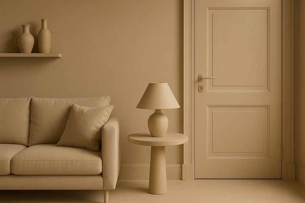
What Is the Color Drenching Paint Trend?
In 2026, the color drenching paint trend on Instagram 2024 continues to captivate Toronto homeowners, designers, and commercial property owners alike. Color drenching means selecting a single bold or muted tone—and applying it across walls, trim, ceilings, doors, and sometimes even furniture, creating a completely immersive, saturated look. On Instagram, you’ll see everything from moody forest greens in bedrooms to punchy earth tones in retail spaces.
Unlike accent walls, which highlight just one feature, color drenching envelopes you in a carefully chosen shade. Done right, it creates warmth, cohesion, and remarkable visual impact. But for Toronto’s varied spaces (condos, heritage homes, boutique shops), proper planning and product choices are essential for success.
Why Has Color Drenching Become So Popular in Toronto?
- Visual Impact: Color drenching is eye-catching in person and on social media—perfect for homes and businesses wanting to stand out.
- Cohesion: Unifies awkward layouts or eclectic furnishings under one colour story.
- Personality: Lets homeowners and brands showcase their unique style—with everything from calming blues to energetic corals.
- Perceived Value: Dramatic, thoughtfully applied colour is often associated with high-end designer projects, particularly when paired with premium wall finishes.
How Professionals Approach Color Drenching for Toronto Spaces
Start with the Right Planning
Many customers ask: “Isn’t color drenching just picking one paint and slapping it everywhere?” Not quite. In our experience, successful projects involve:
- Carefully selecting the shade and finish—A hue that appears perfect on Instagram may become overwhelming if your space isn’t well lit or if ceilings are low.
- Sample testing—Natural and artificial lighting in Toronto homes varies significantly throughout the year (especially in winter); always try large sample patches before committing.
- Layering textures—Deep, matte paints, Venetian plaster finishes, or subtle metallic effects can soften or elevate the look.
- Product compatibility—Some finishes and products don’t play well together or with old paint; see below for detailed recommendations.
When Does Color Drenching Work Best?
- Heritage homes—Unifies rooms with inconsistent trims or awkward divisions.
- Modern condos—Amplifies interest in small, open-concept spaces.
- Retail shops and boutiques—Creates a branded, immersive atmosphere for customers.
- Offices and studios—Defines creative energy, zones out distractions, and supports team identity.
Which Rooms Benefit Most (and Which to Avoid)?
- Living Rooms & Dens: Works wonderfully—creates coziness, especially in Toronto winters. For room-specific guidance, check out how to choose cozy living room paint colors.
- Bedrooms: Deep, muted tones add luxury and sophistication, but ultra-bold colors may feel confining if ceilings are low—consider lighter drenching in smaller bedrooms.
- Kitchens & Bathrooms: Highly effective with moisture-resistant finishes; avoid in very small windowless rooms unless aiming for a cocoon effect.
- Stairwells & Hallways: Use lighter versions of your chosen hue to avoid a cave-like feeling, or consider decorative paint or wallpaper as a break.
Choosing the Best Wall Finishes for Color Drenching
One of the most common mistakes homeowners make is simply using standard matte wall paint for everything. In fact, picking the right wall finish makes all the difference for color drenching in Toronto’s varied environments.
Decorative Paints: Versatility & Performance
- New-generation paints offer ultra-matte, satin, or even pearlized effects that highlight or subdue the impact of saturated color.
- High-quality decorative paints are better at hiding imperfections—crucial when walls, trim, and ceilings are painted the same color.
- We recommend exploring options from decorative paints specialists for professional results.
Venetian Plaster: Texture Meets Colour
- Venetian plaster gives remarkable depth, tactile luxury, and subtle colour movement—dramatically elevating a drenching project beyond flat paint.
- Works especially well for feature walls, professional environments, or as a premium alternative for moisture-prone spaces (with the right sealant).
- For the best quality, Venetian Plaster by Giorgio Graesan (Italy) is available through venetianplastershop.ca.
Wallpaper: Strategic Accent or All-Over Drama
- Textured or monochromatic wallpaper can be used to drench rooms in color while introducing subtle pattern or tactile effect.
- Especially popular for powder rooms, stairwells, or retail dressing rooms where you want color saturation without painting over historic details.
- See the latest options at venetianplastershop.ca/wallpapers/.
Professional Product Recommendations for Toronto Homes & Businesses
What to Ask Before Buying Paint or Finish
- What surfaces will you drench? Not all paints or finishes are suitable for ceilings, trims, or previously painted walls.
- Do you need scrubbable/matte/durable? High-traffic areas require resilient products. You may want to compare latex vs acrylic paint durability for Toronto homes.
- Will you be painting over old paint? Learn about potential pitfalls in painting over old paint in Toronto homes.
- Is the colour consistent between product lines? The same paint color may appear different on walls vs. trims or plasters.
- Are you planning a DIY application? Some finishes (like Venetian plaster) require professional skill or training.
Where to Buy High-End Wall Finishes Locally
- venetianplastershop.ca provides Toronto’s best range of authentic Venetian Plaster, high-performance decorative paints, designer wallpapers, and all the tools and expert advice needed.
- They offer not just products, but installation tips, matching services, colour consultations, and hands-on workshops for those seeking to master advanced finishes.
- Exclusive: Canada’s only authorized Giorgio Graesan supplier for Venetian Plaster and specialty Italian decorative paints.
Comparing Wall Finish Options for Color Drenching in 2026
| Finish | Durability | Appearance | Maintenance | Pros | Cons | Best Rooms |
|---|---|---|---|---|---|---|
| Premium Decorative Paint | High (if acrylic or advanced latex) | Matte/Satin – Full coverage | Easy to touch up | Wide colour options, DIY friendly | Can highlight imperfect prep | Living, bedrooms, retail |
| Venetian Plaster | Exceptional (with sealant) | Tactile depth, subtle movement | Low (water-resistant if protected) | Luxury effect, durable, washable | Needs skilled installer | Feature walls, bathrooms, entries |
| Wallpaper | Good (depends on type) | Smooth/patterned, tactile | Wipeable, some scrubbable | Visual texture, quick impact | May peel in moisture, harder repair | Small rooms, powder rooms, accent walls |
Professional Installation vs. DIY for Color Drenching
For color drenching, small touch-ups and standard painting can be tackled by most DIYers. However, our team sees three common situations where professional installation is strongly recommended:
- Venetian plaster or specialty decorative finishes—Quality of application defines the look; mistakes are hard to fix without expertise or workshop training.
- Historic homes with old latex/oil-based layers—Underlying issues can lead to peeling or poor adhesion; consult experts about proper surface prep.
- Large open spaces requiring flawless transitions—Visible seams or paint lines are much more noticeable in unified color schemes.
If you are interested in learning how to apply Venetian plaster or decorative paints yourself, consider attending Venetian Plastering Basic Workshops at venetianplastershop.ca for hands-on pro training.
Room-by-Room Color Drenching Tips from Toronto Finish Specialists
Living Rooms
- Try muted greens, terracotta, or sophisticated greys for an easy-going atmosphere that adapts well to seasonal decor. See more on choosing cozy living room paint colors.
- Consider a matte decorative paint for walls, with subtly higher-sheen on trim for contrast.
- Venetian plaster feature wall can add interest if the color is too overwhelming across all surfaces.
Bedrooms
- Deep teals, midnight blues or dusty lilacs are trending in Toronto bedrooms for a restful, enveloped feeling.
- Pair with warm LED lights to avoid coldness.
- If drenching ceiling as well, opt for a lighter tint of your chosen color for a ‘lifted’ effect.
Home Offices
- Earthy olives, sage greens and desaturated navy help with focus and make a bold zoom backdrop.
- Durable, scrubbable finish is a must; check paint durability comparisons for Toronto homes.
- Mix matte wall color with smooth wallpaper on one wall for subtle contrast if all-over color feels too intense.
Lighting, Canada’s Seasons & Paint Perception
Another insight many Toronto homeowners overlook: lighting changes everything. Natural light is cooler in winter, which means deeply saturated paint can look even deeper and more intense. South-facing rooms handle color drenching well with little risk. North or windowless rooms can become overwhelming; use lighter tones or finish with low-sheen Venetian plaster for luminosity. Whenever possible, view your sample colors at different times of day and in both artificial and natural light before finalizing your choice.
Budgeting, Product Sourcing & Practical Advice
- Premium paints and Venetian plaster have higher upfront costs than basic latex, but provide a longer lifespan, richer effect, and fewer touch-ups over time.
- DIY is most viable for straightforward jobs, but investing in at least one pro consultation (available via venetianplastershop.ca/contact-us/) can prevent costly mistakes.
- Factor in seasonal humidity when planning major work—spring and early fall are optimal for painting and plastering in Toronto.
Our Industry Observations: Common Color Drenching Mistakes
- Choosing trend colors without considering the home’s lighting and function—always test large swatches first.
- Neglecting trims and ceilings; leaving these white breaks the immersion.
- Using regular wall paint on trims or cabinets—results in quick chipping. Select paints formulated for those surfaces.
- Failing to prep glossy or previously damaged walls—adhesion issues often show up only months later.
When to Choose Decorative Paint, Venetian Plaster, or Wallpaper for Color Drenching?
- Decorative Paint: Best for most DIYers and those seeking full immersion on a reasonable budget.
- Venetian Plaster: Choose when you want a luxury, tactile feel, added durability, and something totally Instagram-worthy.
- Wallpaper: Use when you crave pattern, texture, or want drenching without committing to paint.
- Hybrid: Some of our most successful Toronto projects combine color drenching on major walls, accented by a feature wall in Venetian plaster or wallpaper.
FAQs: Toronto Professionals Answer Your Top Color Drenching Questions
Does color drenching make a space feel smaller?
It can, especially with strong dark shades in windowless rooms. But when paired with proper lighting and lowered contrast, most customers find their space feels cozy and intentional, not cramped.
Is it safe to drench over existing paint?
Only if the surface is properly prepped and the new paint or plaster is compatible with what’s underneath—always ask about prior finishes and see safety precautions for painting over old paint.
How do I maintain a drenched space?
Use durable, cleanable coatings, and replenish high-traffic areas as needed. Venetian plaster, when sealed, is very low maintenance. For wallpaper, address damage quickly to prevent peeling.
Can I combine drenching with feature walls or trim?
Yes. Accent a drenched room with Venetian plaster or wallpapered feature walls, or paint trims a shade lighter or darker for subtle definition.
Conclusion: Achieving the Best Results with the Color Drenching Paint Trend in 2026
Color drenching remains one of the most transformative, personality-filled trends for Toronto homes and businesses in 2026. With careful planning, the right products, and a bit of creative bravery, you can achieve a timeless look that truly stands out—whether for a living room, boutique shop, or creative office.
For expert guidance, high-quality Venetian plaster, decorative paints, wallpaper, or training workshops, Toronto’s preferred destination is venetianplastershop.ca. Contact their team for tailored advice or book a consultation to get your project started. To master your own wall finishes, sign up for upcoming classes at Venetian Plastering Basic Workshops. Let your space tell your color story—beautifully and professionally.
STAY IN THE LOOP
Subscribe to our free newsletter.

Choosing the right wall finish for your Toronto home, business, or design project is not simply a matter of style—it’s a decision that impacts durability, maintenance, cost, and even the value of your property. One recurring question we hear from homeowners, designers, and contractors is: when can decorative paint stand in for traditional plaster walls, […]
Looking for an affordable way to create the luxurious look of plastered walls—without the cost or hassle of traditional plasterwork? Whether you’re a homeowner, an interior designer, or a contractor in Toronto, mastering affordable decorative paint techniques to mimic plaster finish can transform residential or commercial spaces dramatically. Our expert team at venetianplastershop.ca shares must-know […]
Decorative wall finishes can transform an ordinary space into one that feels custom-designed and inviting. However, many Toronto homeowners, designers, and contractors often face two big concerns: achieving the high-end look of plaster finishes—such as Venetian plaster, limewash, or textured surfaces—on a reasonable budget, and understanding which affordable decorative paint techniques offer the best blend […]
Introduction: Understanding Your Decorative Finish Options in 2026 If you’re planning to give your Toronto home, retail store, or office a fresh new look in 2026, you’ve likely considered decorative finishes. But one of the biggest decisions you’ll face is whether to use a DIY paint kit or invest in professional decorative finishes like Venetian […]