
by Glorifix
Share
Share
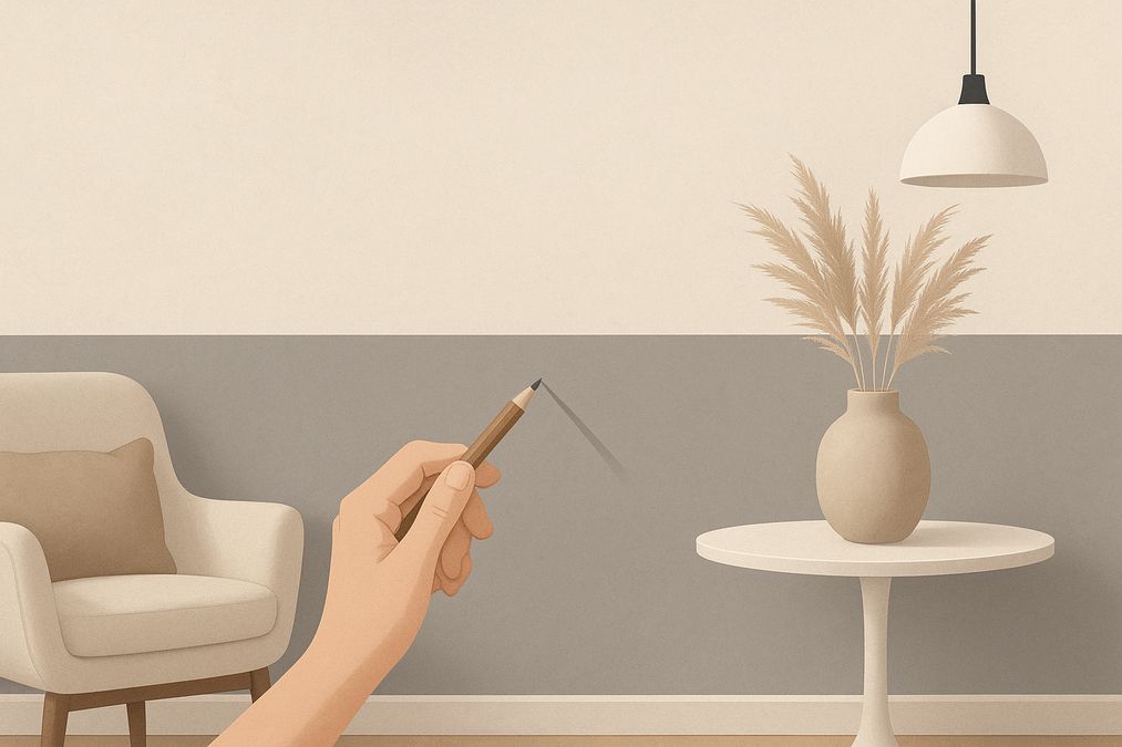
Perfectly split two-tone walls are one of the most effective ways Toronto homeowners, designers, and business owners can create drama, depth, or subtle sophistication. But what looks straightforward in a design magazine can present real-life challenges—crooked separation lines, paint bleeding and mismatched proportions are just the start. Drawing from years on hundreds of Toronto job sites, here’s everything you need to know about how to perfectly split two-tone walls with designer tips—so your results look truly professional, even close up.
Why Choose a Two-Tone Wall? Practical Insights for Toronto Spaces
Before jumping into paint selection and tape, consider what you want to achieve.
- Make rooms feel taller: In older Toronto homes with low ceilings, a lower dark tone and lighter upper can add vertical lift.
- Emphasize architectural details: Two-toning around mouldings or with picture rails can highlight features often found in local heritage properties.
- Control atmosphere: Use a split to create cozy nooks in open concept condos or brighten busy commercial hallways with a fresh burst of colour.
- Increase durability: Darker, more washable finishes at the bottom of the wall hide scuffs in high-traffic retail or family areas.
From residential dining rooms to yoga studios and boutiques, a properly executed two-tone wall is as practical as it is striking—if it’s done right.
Essential Planning: Pro Tips Before You Tape
One of the most common mistakes homeowners make is choosing a split location based on random guesswork. There’s an art—and a science—to setting the height, style, and finish of your split. Here’s what our pros recommend:
1. Choose Your Split Height Deliberately
- Classic proportions: The most pleasing visual split is typically just above one-third up the wall (around 36-48 inches from the floor in Toronto homes with 8-9 ft ceilings).
- Modern approach: Higher splits (54-60 inches) suit open concepts and contemporary spaces, pairing well with bold artwork or paneling.
- Architectural logic: If you have battens, chair rails or window sills, aligning your split to these features creates cohesion and makes taping easier.
2. Check Sightlines and Room Flow
Many customers are surprised to learn how important whole-room context is. Stand in adjoining rooms and view the split from different angles. Is it visible through open doors? Does it clash with kitchen cabinets or retail shelving?
3. Consider Wall Texture and Existing Finishes
- Old plaster and brick: If your walls are uneven—as is common in Toronto’s Victorian homes—prepping and marking a truly level split can require extra effort. (Read more in our guide to showcasing old brick walls.)
- Textured finishes: For substrates like Venetian plaster, lining up a split requires careful masking and a steady hand. Slightly softened lines can also work with rustic textures.
Best Products and Tools: What Pros Use for a Perfect Split
High-quality results start with professional-grade materials. Based on our experience at VenetianPlasterShop.ca, here’s what we recommend:
- Laser levels or long straightedges: Crucial for dead-level splits, especially in spaces longer than 8 feet.
- Painter’s tape: Premium lines (e.g. 3M Scotch Blue or FrogTape) are worth the investment—especially on textured or delicate surfaces.
- Prime surfaces for clean lines: Walls should be properly cleaned and primed for optimal tape adhesion and even coverage. (See our full advice in this wall prep guide.)
- Quality paints and decorative finishes: At venetianplastershop.ca we stock ultra-premium Venetian plaster, designer-grade paints, and imported Italian wall finishes that create stunning results in both residential and commercial projects.
Step-by-Step: How to Perfectly Split Two-Tone Walls
Here’s an expert, hands-on process we use across homes, offices, and retail projects in Toronto:
- Repair and prep your surface. Fill holes, sand bumps, and ensure the wall is smooth, clean, and dust-free for maximum tape grip (see top tips in our in-depth pre-priming guide).
- Mark the split height. Use a pencil, level, or laser to trace your desired line across the entire wall, double-checking it reads straight from all main entry points.
- Apply tape precisely. Pros often burnish the edge of the tape (pressing firmly with a putty knife) to avoid paint bleed, especially on textured walls.
- Seal the tape edge. For the sharpest line: paint over the tape’s edge first with the base wall colour (the side under the tape). This seals gaps and stops bleed-through.
- Apply the first colour. Roll or brush up to the tape, using a “W” motion for even coverage. Allow to dry fully before removing tape to ensure a crisp split.
- Repeat for the second colour (if necessary). If painting both halves separately, let the first area dry completely, reposition the tape, and finish with the second colour.
Veteran Tips: For tall commercial spaces or feature staircases, professionals use low-tack tape and static lasers for uninterrupted control.
Choosing the Right Colour Pairings: More Than Just Fashion
Choosing colours for two-tone walls isn’t just about what’s “on trend” for 2026. In practice, the pairing should suit:
- Natural light: Brighter, sunlit rooms in south-facing Toronto houses do well with bolder splits. North-facing or windowless rooms benefit from lighter, warmer lower tones.
- Existing finishes: Coordinate with trim, floors, and built-in fixtures—especially when you’re working around stone, brick, or bold wallpaper.
- Intended effect: High contrast (navy and white, charcoal and blush) energizes modern spaces. Low-contrast, tone-on-tone palettes add subtle sophistication—great for offices or professional clinics.
- Room type: Scuff-resistant darker shades are ideal for busy entryways and kid zones. Lighter shades up top reduce the feeling of a room “closing in.”
Designer Techniques for Commercial and Home Settings
In real-world projects across Toronto, these are the most requested—and most effective—designer looks:
1. The Crisp, Modern Horizontal Split
- Creates spaciousness and visual flow in offices and condos with open layouts.
- Pair matte finish paints or subtle metallics from our Italian designer lines for a sophisticated edge.
2. Feature Stripe or Band
- Use a bold accent stripe (8-12 inches wide) between two main colours.
- Ideal for guiding attention in long hallways, galleries, or chic retail spaces.
3. Moulding-Integrated Two-Toning
- Align the split exactly to a chair rail or add new wood trim for a timeless effect—especially suited to Toronto’s character homes and boutique showrooms.
- Works especially well with Venetian plaster or limewash for a textured, layered feel.
4. Artistic, Organic Split
- Use curved lines, arch shapes, or angled edges for a contemporary gallery style—best achieved with a steady hand and painter’s tape cut into custom forms.
- Suited for children’s rooms, creative studios, hair salons, and hospitality settings.
Expert Comparisons: Two-Tone Wall Solutions by Finish
| Finish Type | Durability | Maintenance | Difficulty | Look/Texture | Ideal For |
|---|---|---|---|---|---|
| High-Quality Paint | Good | Washable (esp. satin/semi-gloss) | DIY-friendly | Smooth, matte, or sheen | Residential & commercial |
| Venetian Plaster | Excellent | Wipeable, highly durable | Professional recommended | Textured, marble-like | Luxury homes, boutiques |
| Wallpaper | Varies (medium-high) | Sponge-washable | High for precise split | Patterned, textured | Accent walls, offices |
Professional insight: Many customers start with regular paint, but in high-traffic or luxury settings, switching to Venetian plaster, decorative paints or coordinated wallpapers delivers richer visual effects and easier maintenance—especially for busy Toronto households and commercial storefronts.
Combining Wall Finishes for Unique Results
In our experience, the most memorable two-tone walls happen when you mix finishes. For example:
- Bold silk-finish paint below, matte limewash above: for subtle contrast and touchable depth.
- Metallic Venetian plaster below, ultra-flat wall paint above: the shimmer grounds the space while keeping the upper wall elegant.
- Patterned wallpaper in the lower zone, decorative paint or textured plaster above: works beautifully in Toronto powder rooms, cozy cafés, and vintage-inspired spaces.
No matter which you choose, ensure compatibility: check if different products have similar thicknesses and won’t interfere with each other’s adhesion.
Real-World Questions from Toronto Clients
- “How do I avoid tape tearing the paint off?” Use premium, low-tack tape and remove it slowly at a 45-degree angle while the paint is still slightly wet. Always prime before painting, especially on older walls.
- “Can I split over brick or uneven plaster?” Yes, but avoid glossy lines—use a small detail brush for precision or embrace a softly feathered transition.
- “Which finish is best for offices vs. homes?” Offices demand durability—satin paint, Venetian plaster, or commercial-grade wallpaper. Homes offer more flexibility—matte paints, limewash, or even bold patterns.
- “Should I attempt this DIY or hire a pro?” DIY is possible for simple rooms and finishes. For intricate stripes, historic features, or premium products (like Venetian plaster), professional installation is recommended.
Smart Budgeting: Two-Tone Walls and Canadian Project Costs
Prioritize areas that see the most use or whose impression matters (front entries, living rooms, customer-facing retail walls). Labour and materials both play a role—luxury plaster or imported wallpapers cost more upfront but save on maintenance and touch-ups over time. When helping homeowners choose, we recommend:
- Budget for 10–15% waste on paint and wallpaper for colour matching and pattern repeat.
- Don’t cut corners on preparation products—priming and taping are not worth saving a few dollars.
- If you want a luxury finish without a complete wall overhaul, consider a Venetian-plastered feature split for one wall only.
- Ask about sample boards at venetianplastershop.ca to preview colours and finishes in your space before purchasing in bulk.
Maintenance and Longevity: Keeping Two-Tone Walls Flawless
Even the most stunning split wall can be ruined by peeling tape marks or grime. Here are expert care tips:
- For painted walls: Wait at least two weeks before scrubbing; use a damp sponge for marks, and touch up carefully along the split line to preserve crispness.
- For Venetian plaster: A light dusting and, if necessary, a wipe with a damp cloth. Avoid abrasive cleaners.
- For wallpaper: Clean spills promptly with a soft sponge, never soak edges at the split.
- In high-traffic commercial settings, consider a low-profile wall guard strip at the bottom of painted/plastered zones to prevent dents and scuffs.
Installation Considerations and When to Choose a Professional
While reasonably handy homeowners can execute two-tone paint splits, our team frequently helps clients fix crooked lines, paint bleeds, or mismatched products. Professional installation is strongly advised for:
- Textured Venetian or metallic finishes
- Feature walls with curves, stripes, or intricate details
- Historic homes where walls are uneven or delicate
- Large commercial projects where speed, perfection, and durability are a must
When to Choose Wallpaper, Plaster, or Decorative Paint for Two-Toning
- Wallpaper lower, paint upper: Ideal for easy changes over time (just repaper the bottom). Great for restaurants and waiting areas.
- Venetian plaster below, light paint above: Suits luxury homes, upscale retail, or places where a wow-factor is desired and walls need to withstand bumps.
- Decorative paint both above and below: Simple, adaptable, and suitable for high-traffic family spaces, offices, or rental properties.
Sign Up for Professional Workshops—Get Hands-On With the Experts
If you want to master how to perfectly split two-tone walls with designer tips, consider one of our hands-on workshops: sign up for upcoming classes here, where our in-house pros share industry secrets and guide you step-by-step—from prep to finishing coat.
Conclusion: Achieve Flawless Two-Tone Splits in Your Toronto Home or Business
Perfectly split two-tone walls aren’t just about painting a line—they’re a strategic design solution rooted in careful planning, professional-grade products, and insider know-how. Whether you’re a homeowner renovating a century brick house, a designer updating a Queen Street retail space, or a contractor prepping a condo lobby for move-in, the above tips, tools, and methods reflect the experience of Toronto’s decorative finish specialists.
If you’re ready to transform your space, need help with design, or want the very best in Venetian plaster, decorative paint, or wallpaper (including exclusive Giorgio Graesan Italy products), contact our team today. We’re here to help you create lasting beauty, exceptional durability, and truly memorable walls—done right, every time.
STAY IN THE LOOP
Subscribe to our free newsletter.
Choosing the right wall finish for your Toronto home, business, or design project is not simply a matter of style—it’s a decision that impacts durability, maintenance, cost, and even the value of your property. One recurring question we hear from homeowners, designers, and contractors is: when can decorative paint stand in for traditional plaster walls, […]
Looking for an affordable way to create the luxurious look of plastered walls—without the cost or hassle of traditional plasterwork? Whether you’re a homeowner, an interior designer, or a contractor in Toronto, mastering affordable decorative paint techniques to mimic plaster finish can transform residential or commercial spaces dramatically. Our expert team at venetianplastershop.ca shares must-know […]
Decorative wall finishes can transform an ordinary space into one that feels custom-designed and inviting. However, many Toronto homeowners, designers, and contractors often face two big concerns: achieving the high-end look of plaster finishes—such as Venetian plaster, limewash, or textured surfaces—on a reasonable budget, and understanding which affordable decorative paint techniques offer the best blend […]
Introduction: Understanding Your Decorative Finish Options in 2026 If you’re planning to give your Toronto home, retail store, or office a fresh new look in 2026, you’ve likely considered decorative finishes. But one of the biggest decisions you’ll face is whether to use a DIY paint kit or invest in professional decorative finishes like Venetian […]