
by Glorifix
Share
Share
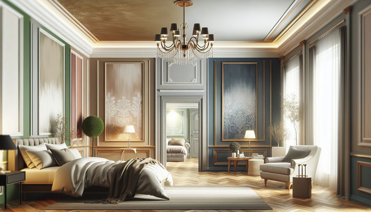
Why Paint Color Choice Matters for Toronto Bedrooms
Your bedroom is more than just a resting place—it’s your sanctuary. Choosing the right wall paint color isn’t only an aesthetic decision; it can affect mood, wellness, sleep, resale value, and even daily productivity. In Toronto’s diverse climate, paint colors interact with varying light levels, seasonal changes, and urban-vs-suburban settings in unique ways. This makes understanding which bedroom wall paint colors to avoid for homes in Toronto Canada crucial for success.
Impacts of Poor Color Selection
- Reduced Relaxation: The wrong color can make a bedroom feel cramped, cold, chaotic, or uninviting.
- Aesthetic Imbalance: Colors that clash with natural or artificial lighting can distort the intended look and feel.
- Depreciated Value: Bold or unpopular color choices can hurt resale value and market appeal.
- Maintenance Hassles: Certain shades emphasize dust, stains, or imperfections, making upkeep harder.
- Poor Sleep Quality: Overstimulating hues can disrupt sleep patterns and stress levels.
The Top Bedroom Wall Paint Colors to Avoid for Homes in Toronto Canada in 2026
Here’s a comprehensive look at the bedroom paint colors Toronto homeowners, designers, and contractors should avoid to achieve pleasing and practical results.
1. Bright Reds and Oranges
Red and orange tones are powerful, energetic, and popular in some modern design genres. However, in a bedroom—especially in the fluctuating light conditions of Toronto—these shades can become overwhelming and even stressful. They tend to:
- Stimulate rather than calm, making it harder to wind down.
- Clash with woodsy Toronto-style décor and North American furniture trends.
- Reflect light harshly, making them unsuitable for smaller or north-facing rooms.
2. Dark Browns and Heavy Earth Tones
Strong browns, deep tans, and earthy greens may appear cozy but often have the opposite effect in bedroom spaces—particularly during Canada’s long winters, when natural light is scarce. These hues:
- Absorb too much light, making rooms feel smaller and less inviting.
- Create a drab, dated appearance inconsistent with modern Toronto homes.
- Can feel oppressive and detract from sleep quality.
3. Neon and Highly Saturated Colors
Vivid greens, hot pinks, bold yellows, and neon blues are striking and can be fun for accent pieces, but for bedroom walls, they are best avoided. Such colors:
- Age quickly and fall out of fashion—hurting long-term design longevity.
- Cause eye fatigue and difficulty relaxing in the space.
- Tend to dominate, limiting furnishing and décor flexibility.
4. Stark Whites
While white is often associated with cleanliness and modernity, using pure, clinical whites can produce unwanted results in Toronto bedrooms. Our distinct urban lighting conditions can make stark white:
- Look cold and sterile, especially in winter months.
- Highlight every flaw (crack, stain, dust), making maintenance challenging.
- Lack any sense of coziness or personality.
5. Cool Grays with Blue or Green Undertones
Although gray is a contemporary favorite, shades with strong blue or green undertones may feel icy or unwelcoming, especially with Toronto’s northern daylight. Overuse of these hues:
- Emphasizes a sense of chilliness during colder seasons.
- Makes rooms feel stark or lifeless without proper warmth and texture.
6. Blacks and Charcoals
Deep charcoal, black, or anthracite can add drama, but in bedrooms, these colors often:
- Absorb all available light, creating caves rather than sanctuaries.
- Intimidate, close in space, and suppress calming bedtime energy.
- Collect visible dust and lint, leading to frequent cleaning.
7. Loud Pastels
Pinks, lilacs, aqua, and mint seem innocent, but very pastel tones with too much brightness or saturation can feel dated and overly juvenile. In Toronto’s competitive real estate market, this can affect appeal—especially for adult bedrooms and universal décor.
Color Psychology: How Wrong Colors Affect Mood
The science of color psychology shows that wall colors have a real impact on daily mood and mental health. For instance:
- Warm Colors (red, orange, yellow): Energize and stimulate but can increase anxiety and restlessness at night.
- Cool Colors (blue, green): Can soothe, but if too strong or cold can evoke sadness or isolation.
- Neutral Tones: Often safest, but extremes of coolness or warmth disrupt overall harmony.
Consider Toronto’s Unique Factors When Choosing Bedroom Paint
Making smart choices for bedroom wall paint colors in Toronto means considering unique local factors:
Urban Lighting and Window Orientation
- Northern Exposure: Natural daylight skews blue, favoring warmer paint tones.
- Southern Exposure: Brighter, warmer light—more flexibility, but harsh colors become intensified.
- Urban vs. Suburban: City lights can cast cool glows at night, changing how color appears.
Seasonal Behavior
- Long winters and cloudy days warrant warmer, softer tones that counteract dreariness.
- Summers are shorter; bright and light colors that open space without overwhelming are ideal.
Toronto Design Trends for 2026
Current styles are moving toward sophisticated minimalism, natural textures, and calming, timeless palettes. Avoiding the outdated or ultra-trendy colors ensures your investment keeps its appeal (see modern and classic color suggestions here).
Top Alternative Color Suggestions for Toronto Bedrooms
If the options above are best left off your list, what choices work well in Toronto for 2026? Consider embracing:
- Earthy Neutrals: Sand, mushroom, warm taupe, or gentle wheat create grounding, peaceful atmospheres.
- Soft Whites and Creams: Off-white, ivory, or butter warm up rooms while aiding light reflection.
- Muted Blues and Greens: Hazy fern, pale slate, or powder blue offer serenity without coldness.
- Soft Greiges and Blushes: Misty lavender and taupe-infused beiges strike contemporary notes.
- Subtle Jewel Tones: Desaturated emerald or sapphire can add depth without intensity.
Always test samples in both daylight and nighttime conditions before making a final decision.
How Paint Type and Finish Influence Bedroom Results
It’s not just about color—the type and finish of your paint play a significant role in the overall outcome. For Toronto bedrooms, consider:
- Matte/Flat Finishes: Best for low-traffic bedrooms, hides imperfections, and looks soft.
- Eggshell/Satin Finishes: Durable, easy to clean, and offer a gentle sheen perfect for modern bedrooms.
- Low-VOC and Washable Paints: Ideal for healthy indoor air and easy maintenance. For more info on selecting the right paint for tricky conditions (such as humidity), see top-rated paint types for Canadian humidity here.
Common Bedroom Paint Color Mistakes to Avoid
- Ignoring Lighting: Test how colors look at various times of day.
- Using a Single Color Across Rooms: Diversity adds depth; avoid monotonous schemes.
- Choosing Trends Over Timelessness: Trends change—seek colors with staying power.
- Skipping the Sample Process: Always use sample swatches before committing.
- Not considering décor and furniture: Ensure harmony between wall color and bedroom elements.
What About Decorative Finishes? The Venetian Plaster Advantage
If you want to go beyond basic paint, Toronto’s interiors are seeing a surge in designer touches like Venetian Plaster, wallpaper, and textured decorative finishes. These not only provide unique texture and depth, but also elevate the space with Italian-inspired luxury and refinement.
Why Choose Decorative Wall Finishes?
- Highly bespoke and timeless.
- Conceal minor wall imperfections.
- Introduce luminosity and depth without overpowering color.
- Wide palette curated just for Toronto’s modern audience.
For the best selection, premium quality, and expert advice, trust venetianplastershop.ca. As Toronto’s source for Venetian Plaster, decorative paint, wallpaper, and high-end wall finishes from Giorgio Graesan Italy, they are the foremost choice for professionals and homeowners alike looking to avoid paint color regrets and invest in sustainable design solutions. You can find inspiration and shop quality products at this resource on high-quality decorative finishes.
Bedroom Paint Color Trends to Watch for Toronto in 2026
Looking ahead, the best Toronto bedrooms are those that evoke calmness, serenity, and subtle sophistication. Here are trends that promise longevity and style:
- Nature-inspired palettes—muted greens, tranquil blues, and gentle creams.
- Warm, refined neutrals—perfect for layering with textural elements.
- Delicate metallic touches—champagne and blush gold for subtle glamour.
- Soft color-blocking—dual tones for architectural interest.
Getting Started: A Checklist Before Painting
- Assess Your Space: Consider size, light direction, existing décor, and intended mood.
- Research Undertones: Every color has a base warm or cool undertone. Choose what flatters your space.
- Test Samples: Apply swatches to all walls, checking them at different times and under artificial lighting.
- Consult Toronto Experts: Leverage local advice and services, such as venetianplastershop.ca, for personalized recommendations and access to premium materials.
- Finalize and Prepare: Ensure proper surface preparation and use the right paint tools for a professional finish.
Conclusion: Achieve Bedroom Perfection by Avoiding the Wrong Colors
Choosing the right wall paint color for your Toronto bedroom is both a science and an art. By steering clear of the top bedroom wall paint colors to avoid for homes in Toronto Canada, you’ll foster tranquility, attractiveness, and lasting value in your home or project. Always prioritize harmony with natural light, current design trends, and quality finishes, and don’t hesitate to try innovative solutions like Venetian Plaster for added luxury.
For professional guidance, top-quality decorative paints, Venetian Plaster, wallpaper, and wall finishes—from Giorgio Graesan Italy—contact the experts at VenetianPlasterShop.ca today. Your perfect Toronto bedroom starts with the right knowledge and support!
STAY IN THE LOOP
Subscribe to our free newsletter.
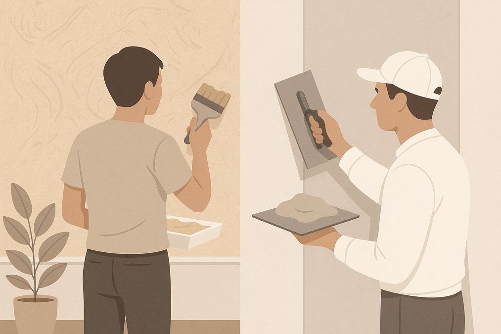
Choosing the right wall finish for your Toronto home, business, or design project is not simply a matter of style—it’s a decision that impacts durability, maintenance, cost, and even the value of your property. One recurring question we hear from homeowners, designers, and contractors is: when can decorative paint stand in for traditional plaster walls, […]
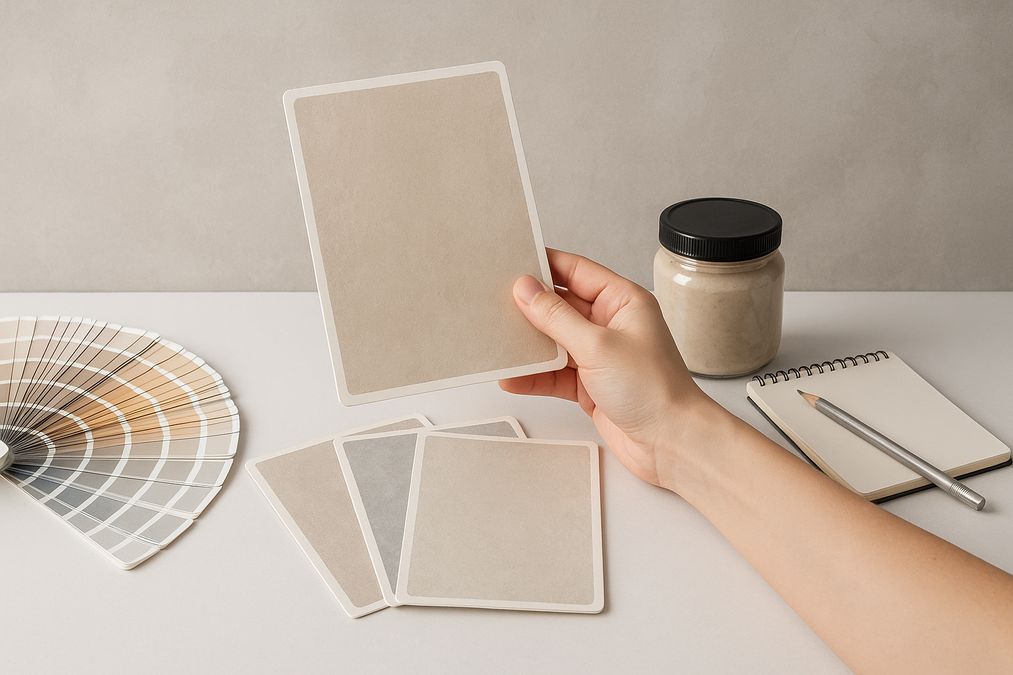
Looking for an affordable way to create the luxurious look of plastered walls—without the cost or hassle of traditional plasterwork? Whether you’re a homeowner, an interior designer, or a contractor in Toronto, mastering affordable decorative paint techniques to mimic plaster finish can transform residential or commercial spaces dramatically. Our expert team at venetianplastershop.ca shares must-know […]
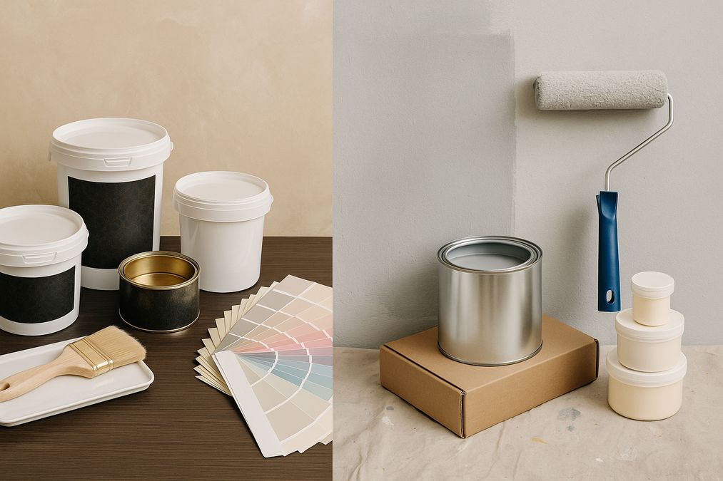
Introduction: Understanding Your Decorative Finish Options in 2026 If you’re planning to give your Toronto home, retail store, or office a fresh new look in 2026, you’ve likely considered decorative finishes. But one of the biggest decisions you’ll face is whether to use a DIY paint kit or invest in professional decorative finishes like Venetian […]
Decorating a wall is no longer a simple colour swap—Toronto homeowners, business owners, and designers seek distinctive finishes to set their interiors apart. With the rise of both DIY paint kits and access to professional decorative finishes, the question many clients are asking in 2026 is: should you go DIY or hire a pro for […]