
by Glorifix
Share
Share
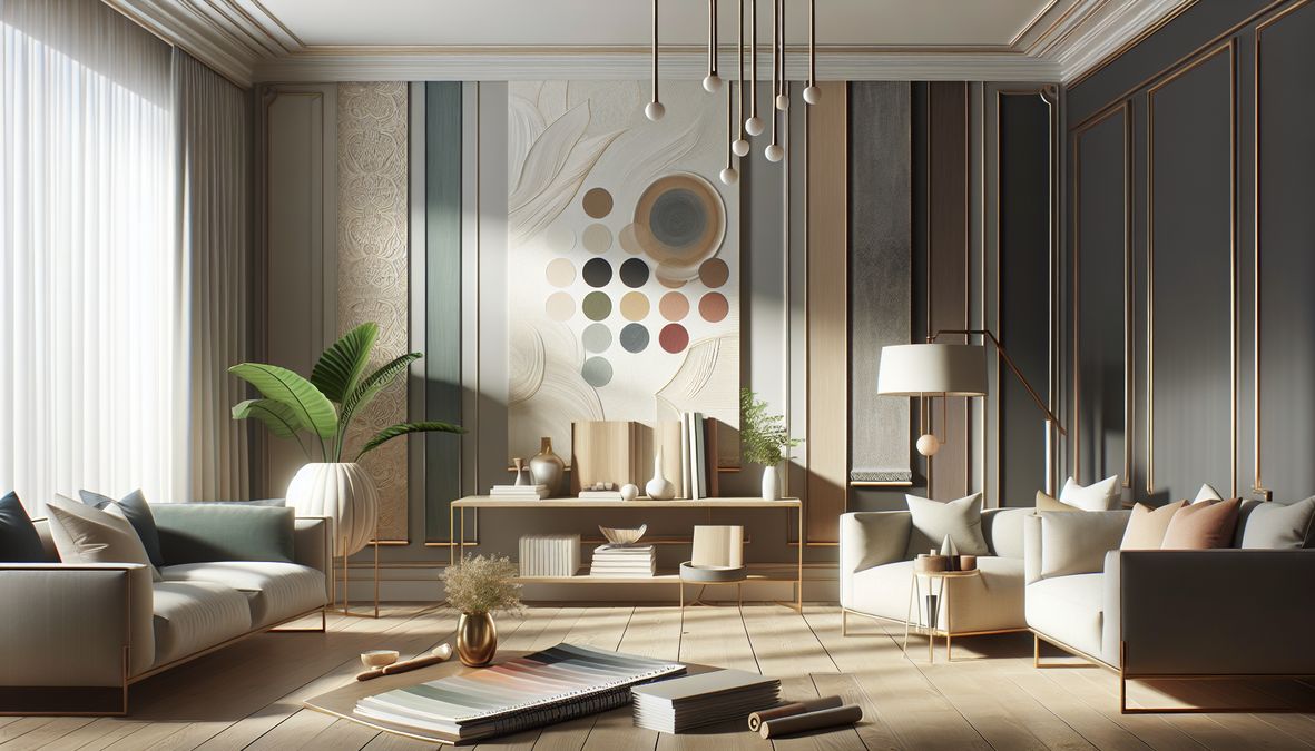
Are you preparing to redecorate your living room in Toronto for 2026? Choosing the right wallpaper color is just as important as picking the perfect furniture. The colors you select set the mood, style, and timelessness of your living space—whether it’s a downtown condo, a classic suburban home, an upscale retail store, or a modern office. In 2026, color trends in wallpaper are both inspiring and practical, offering a mix of fresh palettes, relaxing tones, and bold statements tailored to Toronto’s unique urban and residential styles.
Why Wallpaper Color Choices Matter in 2026
The right living room wallpaper color can make your space feel inviting, modern, and uniquely yours. Color impacts not only your room’s aesthetics but also your emotions. With Toronto’s multicultural flair, diverse architecture, and focus on comfort, understanding which colors are trending and why they work is a must for homeowners, interior designers, and contractors alike.
This guide will reveal the top color choices for living room wallpaper in 2026, discuss style inspirations, and help you confidently update your home or commercial space in line with the latest trends.
Toronto Living Room Wallpaper: 2026 Design Trends
1. A Shift Toward Natural and Earthy Tones
In 2026, Toronto’s design professionals are championing colors that evoke a sense of nature and tranquility, moving away from stark minimalism toward soulful, earthy interiors. Expect to see:
- Soft Greens: Sage, moss, and olive tones bring warmth and harmony, mimicking local parks and gardens.
- Clay and Terracotta: These burnt orange and muted red shades create cozy, inviting atmospheres perfect for relaxing and entertaining.
- Sand and Beige: Subtle, sandy hues brighten rooms without overpowering, offering an elegant, timeless feel.
2. Sophisticated Shades of Blue
Blues remain a top choice for 2026, symbolizing trust, calm, and creativity. Popular tones include:
- Pale Sky Blue: This fresh, airy shade reflects Toronto’s wide-open skies and Lake Ontario views.
- Deep Navy: Perfect for accent walls, navy blue delivers both sophistication and drama, working well in both classic and modern living rooms.
- Dusty Blue-Green: A versatile hue paired with both neutral and bold color schemes for a layered look.
3. Warm Neutrals Are Making a Comeback
Decorators and homeowners in Toronto are rediscovering the power of warm neutrals for living rooms in 2026. These include:
- Soft Taupe: Gentle and sand-hued, taupe is perfect for a sophisticated, understated backdrop.
- Creamy Whites: Less stark than pure white, creamy tones create cozy yet modern environments.
For more color inspiration, see our guide on best living room wallpaper colors for Toronto homes in 2026.
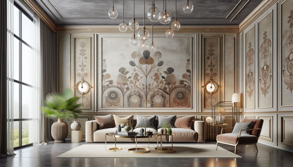
4. Statement Colors: Go Bold, but Thoughtful
Accent walls or patterned wallpaper using bold colors are popular for those ready to make a statement. Consider these shades:
- Jewel Tones: Emerald green, sapphire blue, and rich burgundy add drama and luxury, making them perfect for feature walls.
- Sunset Yellows: Warm yellows bring energy and a cheerful ambiance to any living space.
- Muted Purples: Elegant yet calming, these shades offer vibrancy without overwhelming your décor.
Understanding Wallpaper Color Psychology in 2026
Color psychology plays a crucial role in the selection process. Here’s how popular color families influence your living room’s mood in Toronto:
- Blue: Evokes calmness, trust, and productivity—ideal for multi-use living rooms and workplaces.
- Green: Symbolizes balance and serenity, fostering relaxation and connection to nature.
- Neutrals: Promote warmth and invite creativity, ensuring your furniture and art stand out.
- Earthy Tones: Provide grounding energy and suit both modern and traditional homes.
- Bold Colors: Stimulate conversation, creativity, and a sense of excitement.
Matching Living Room Functions with 2026 Color Trends
Your Toronto living room may serve as a social hub, entertainment space, home office, or relaxation zone. For example:
- For entertaining: Rich jewel tones or bold accent walls foster vibrancy and lively conversations.
- For relaxation: Soft greens, creamy whites, and sandy shades promote peace and winding down.
- For home offices: Blues and green-blues keep you focused and inspired during remote work sessions.
Tip: Sample First!
Always test wallpaper samples in your authentic lighting conditions. Toronto’s natural light can influence how wallpapers look at different times of the day and year.
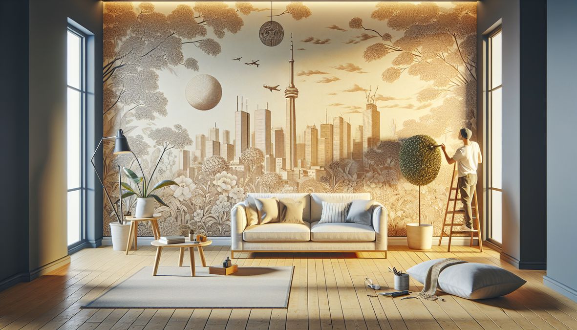
Pairing Patterns and Prints with 2026’s Top Colors
Mixing Solids with Statement Patterns
Patterns continue to gain popularity in 2026, adding depth and intrigue to your living room walls. Trending pattern styles to pair with this year’s colors include:
- Botanical or nature-inspired prints (with greens, blues, and earthy neutrals)
- Large-format geometric patterns (in warm taupes or jewel tones)
- Textured wallpapers that blend tactile interest with soft natural hues
Balancing Vibrant and Neutral Hues
If you love bold colors, use them as accent walls or combine with neutral neighbors to avoid overwhelming your space. Warm neutrals are the perfect background for daring prints or statement art pieces.
Choosing the Right Wallpaper Materials for 2026
Beyond color, wallpaper material matters. Durability, ease of cleaning, and sustainability are in high demand for Toronto’s busy homes and commercial environments. For a comprehensive guide, check out best wallpaper materials for Toronto homes in 2026.
Quality Products from Trusted Providers
- venetianplastershop.ca: Toronto’s leading supplier of Venetian Plaster, decorative paints, wallpapers, and wall finishes. Venetianplastershop.ca offers premium products direct from Giorgio Graesan Italy—a go-to for professional designers, contractors, and discerning homeowners.
- Specialty wallpaper stores across Toronto
- Local design studios and reputable online retailers
How Lighting Impacts Your 2026 Wallpaper Color Choices
Lighting—natural and artificial—will dramatically influence how your chosen wallpaper colors read in your living room. Consider these tips:
- North-facing rooms: Enhance coziness with warmer hues (yellows, warm neutrals, terracotta).
- South-facing rooms: Balance cool and warm undertones for year-round comfort.
- Accent lighting: Layered light (floor lamps, sconces) brings out textures and undertones in complex wallpapers.
Expert Tips for Selecting Living Room Wallpaper Colors
- Analyze your space: Consider existing furnishings, floor color, and ceiling height.
- Define your mood: Choose calming shades for a relaxing vibe or bold splashes for creative spaces.
- Factor in lighting: Test samples day and night in your space.
- Think long-term: Select timeless colors you’ll enjoy beyond current trends.
- Consult professionals: Experienced decorators or suppliers like venetianplastershop.ca provide invaluable advice for both aesthetics and durability.
Creating Cozy Living Rooms with the Right Colors
If coziness is your goal, explore helpful instructions in our post how to choose cozy living room paint colors for homes in 2026. You’ll find inspiration for warmth, comfort, and timeless tranquility, using the best of this year’s color palette.
2026 Palette Recommendations for Toronto Living Rooms
- Top Neutrals: Soft beige, taupe, creamy off-white, and silvery gray
- Best Earthy Tones: Olive green, clay red, warm terracotta, and muted gold
- Urban Sophistication: Deep navy, modern charcoal, and rich espresso brown
- Vibrant Accents: Mustard yellow, emerald green, and sapphire blue
Trending Combinations
- Nature-inspired greens + off-white + wood accents
- Navy feature wall + warm beige surroundings
- Muted purple pillows + soft taupe backdrop
Using Wallpaper to Connect Spaces in Open-Concept Homes
Many Toronto homes feature open-concept designs. Create harmony by picking wallpaper colors from a cohesive palette, allowing visual flow from one space to the next. Consider:
- Repeating accent colors in different rooms
- Pairing bold wallpapers in the living room with softer patterns elsewhere
- Choosing neutral or nature-inspired wallpaper as a unifying base
Wallpaper for Commercial Living Spaces: Offices, Stores, and More
Commercial interiors in Toronto are embracing 2026’s wallpaper color trends for memorable, branded environments. Whether refreshing a boutique, lobby, or office lounge, consider the impression your space makes:
- Retail: Harmonize brand colors with trendy tones like blues and bold accents for customer appeal.
- Office: Use calming greens, soft blues, or sand-hued neutrals to improve productivity and well-being.
- Restaurants: Warm earthy tones and statement walls work brilliantly for vibrant, welcoming atmospheres.
Sustainable and Healthy Color Choices
Eco-consciousness is growing in Toronto’s design scene. Choose wallpapers made with sustainable materials, low-VOC dyes, and environmentally friendly manufacturing for your 2026 renovation. Ask local suppliers like venetianplastershop.ca about green-certified options and Italian-made wallpapers that prioritize both beauty and sustainability.
Professional Installation: Getting the Best Results in 2026
Wallpaper installation requires precision and expertise. Avoid bubbling, alignment issues, and premature wear by working with skilled installers. Quality products and services from venetianplastershop.ca ensure outstanding results—from consultation to installation and care advice for both residential and commercial spaces.
Recap: The Top Color Choices for Living Room Wallpaper in 2026
- Soft greens, earthy browns, and clay tones set a relaxed, natural tone
- Blues (from pale sky to deep navy) offer calmness and flexibility
- Warm neutrals are back for elegance and versatility
- Statement shades and patterns add personalization and drama
Conclusion: Create Your Dream Living Room with 2026’s Hottest Colors
Living room wallpaper colors in 2026 reflect Toronto’s love for natural calm, modern flair, and the perfect blend of personality and professionalism. From relaxed earth tones to sophisticated blues, cozy neutrals to bold accents, the choices have never been more inspiring. Remember to balance personal preference with trending colors, test samples under your room’s authentic lighting, and consult trusted professionals for best results.
Ready to transform your space? Contact Venetianplastershop today at venetianplastershop.ca/contact-us for personalized advice, the highest quality Italian wallpapers, and expert installation to bring your vision to life!
STAY IN THE LOOP
Subscribe to our free newsletter.
Toronto’s interior design scene is ever-changing, with both homeowners and professionals consistently seeking the best ways to beautify interiors effortlessly and affordably. In 2026, the debate on wallpaper options is at the forefront, particularly comparing the pros and cons of peel and stick wallpaper against traditional wallpaper installations. This guide explores the peel and stick […]
Transform Your Space: Best Living Room Wallpaper Colors for Toronto Homes 2026 Are you ready to elevate your Toronto home, condo, or workspace with fresh wallpaper? Choosing the best living room wallpaper colors for Toronto homes 2026 can redefine your interiors, set the tone for relaxation, entertainment, and family gatherings, and add significant value to […]
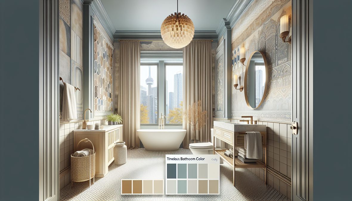
Introduction: Why Choose Classic Bathroom Paint Colors in 2026? When it comes to bathroom renovations and redesigns in Toronto, choosing the right paint color may seem like a small decision, but it has a significant impact on the ambiance, value, and timelessness of your space. Whether you are a homeowner, interior designer, or contractor seeking […]
Looking to transform your bathroom into a space that’s always in style? Choosing the right color scheme is one of the smartest places to begin. For homeowners, interior designers, and contractors in Toronto, finding timeless bathroom color schemes for Toronto homes can mean the difference between a trendy upgrade and a renovation that stands the […]