
by Glorifix
Share
Share
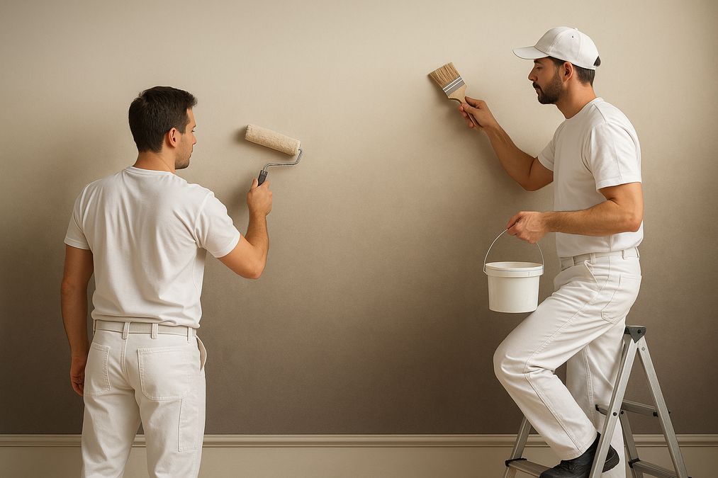
Why Choose an Ombre Gradient Wall Finish?
Many clients ask if an ombre gradient is worth the investment. Here are a few key reasons why this style continues to stand out—especially when done well:
- Transformative Visual Impact: Ombre gradients soften walls and make spaces feel more open, airy, and contemporary without overpowering furnishings.
- Versatility: Suitable for bedrooms, living rooms, feature walls in commercial entrances, and even bathrooms using moisture-appropriate products.
- Personalization: Ombre is highly customizable—choose subtle neutrals for tranquillity or bold contrasts for dynamic retail or workspace energy.
- Pairs with Other Finishes: Ombre works beautifully with Venetian plaster, metallic finishes, or textured feature walls to create multi-dimensional spaces.
What Is a Seamless Ombre Gradient?
A seamless ombre gradient transitions smoothly from one colour or tone to another without visible lines, streaks, or harsh demarcations. Unlike standard two-tone walls, a well-blended ombre creates a soft, gradual shift that feels natural—almost as if the wall changes colour with the light throughout the day.
Achieving this level of finish is where expert painters—and premium products—make a significant difference.
Common Mistakes to Avoid with DIY Ombre Techniques
- Choosing Incompatible Paints: Not all paints blend well; using different sheens or low-quality brands leads to uneven transitions.
- Working Too Slowly: Waiting too long between application of colours causes drying lines and patchy blending.
- Poor Surface Prep: Skipping surface smoothing or priming causes visible texture differences in gradients.
- Neglecting Lighting: Many homeowners forget to test colours under the actual room lighting, which can drastically alter the finished look.
- Underestimating Difficulty: Skillful ombre blending is considerably harder than it appears, especially on large surfaces or high walls.
Professional Approach: How Expert Painters Achieve a Seamless Ombre Gradient
1. Painstaking Surface Preparation
Before any colour goes on the wall, expert painters clean, skim-coat, sand, and prime the surface. Any imperfections, old paint drips, or surface cracks become painfully obvious once gradients are applied. In high-end applications, micro-resurfacing may be done for a perfectly smooth base—especially when pairing ombre with Venetian plaster or luxury decorative paints.
2. Product Selection and Compatibility
We always recommend working with high-quality European paints or decorative finishes, like the Giorgio Graesan products available at venetianplastershop.ca. These products are formulated for superior blendability and colourfastness, which is crucial for ombre effects. When helping Toronto clients choose, we match primer, base, and topcoats carefully, ensuring that all products are compatible and climate-appropriate for Canadian seasons—even in spaces with high humidity.
3. Custom Colour Planning and Room-Specific Design
- Bedroom & Residential: Subtle, tonal transitions are more relaxing—consider warm greys, muted blues, or blushes, taking into account Toronto’s often cloudy natural light.
- Retail & Commercial: Brighter, stronger contrasts work superbly for branding; gradient can direct attention to display walls or create zones within open-concept layouts.
We often map gradients using digital renderings, so clients see how chosen colours will perform in their specific space—especially under varying daylight and artificial lighting.
4. Advanced Blending Techniques
Expert painters use a combination of techniques, including brush, roller, spray, and blending pads:
- “Wet-on-wet” blending, where multiple tones are applied while previous coats are still damp for maximum softness.
- Diagonal or side-to-side hand blending to avoid horizontal “bands”.
- Careful mapping of transition zones—no guesswork, but measured, marked progression for even results.
- Layering washes or glazes over a base gradient for additional smoothness or subtle texture.
For those interested in advanced techniques from the pros, see our in-depth coverage of Professional Ombre Wall Painting Techniques for Subtle Gradient Effects for a technical look at brushes, blend times, and common troubleshooting strategies.
5. Timing, Blending Tools, and Pro Tips
- Keep a “wet edge”: Work progressively and in sections you can comfortably blend before the paint starts to dry.
- Use quality tools: High-grade blending brushes, specialty sponges, and wide rollers provide a smoother finish than standard hardware store brushes.
- Plan for overlap: Always blend “past” the colour boundary, feathering edges by 15-30 cm for an invisible transition.
- Test first: Even pros create sample boards to confirm blend intervals and colour dry-down effects.
Expert Recommendations for Toronto Homes & Businesses
Best Rooms for Ombre Gradients
- Condo Feature Walls: Great in living rooms or bedrooms where space benefits from visual expansion.
- Entrances & Hallways: A gradient can visually lift low ceilings and make narrow corridors feel larger.
- Boutiques & Retail: Ombre attractively highlights product displays and branding zones.
- Offices: When paired with subtle palettes, ombre gradients can energize or calm open-concept environments.
Pairing Ombre Gradients with Other Wall Finishes
One of the most common questions we’re asked: Should I combine ombre with other decorative finishes? The answer is usually yes, when done thoughtfully!
- Venetian Plaster: Ombre can be used as an under-layer or combined with Marmorino or Lucidato finishes for a multidimensional effect. Plaster adds durability and a touch of luxury.
- Wallpaper: Use ombre gradients on feature walls, with geometric or nature-inspired wallpapers elsewhere to add contrast and texture.
- Decorative Paints: Combine metallic glazes or textured paints with ombre backgrounds for shimmer and depth—see How to Achieve Subtle Shimmer with Metallic Paint Finishes for ideas.
Lighting and Colour Perception
Many clients are surprised by how much lighting alters ombre colour gradients. In our experience:
- Natural north-facing light makes blues and greens more muted, requiring bolder base tones.
- LED “cool white” lighting can flatten subtle gradients; softer, warmer bulbs highlight tonal shifts better.
- Glossier ombre finishes show more variation than matte—always preview under site conditions.
Comparison Table: Ombre Gradients vs Other Decorative Wall Finishes
| Feature | Ombre Gradient (Paint) | Venetian Plaster | Wallpaper |
|---|---|---|---|
| Durability | Medium (repaintable) | High (resists impacts) | Varies (may peel in moisture) |
| Maintenance | Easy to clean, touch-up possible | Low, resistant to marks | Wipeable, but seams may show over time |
| Installation Difficulty | Challenging to blend | Requires skilled craftspeople | DIY possible, best with pro help for patterns |
| Lifespan | 5-10 years+ | 15+ years | 5-8 years (depends on traffic/humidity) |
| Cost (2026 Estimate) | $$-$$$ | $$$-$$$$ | $-$$$ |
| Moisture Resistance | Moderate (depends on paint) | Excellent | Good with vinyl; paper may fail |
| Repairability | Blendable, full repaint for major repairs | Patches can be blended by pros | Replacements for damaged areas possible |
| Best Suited For | Feature walls, modern homes/offices | Luxury finish, high-end spaces | Pattern/texture, wide variety of styles |
Product & Tool Recommendations from Industry Experts
To achieve professional-grade ombre gradients, use only top-quality products and tools. At venetianplastershop.ca, we recommend:
- Decorative Paints by Giorgio Graesan (Italy): Exceptional blendability, longevity, and vibrant pigments.
- Venetian Plaster & Limewash: For those seeking extra depth, consider using plaster as a base or for a hybrid finish.
- High-Quality Blending Tools: Specialty sponges, pro-grade wide brushes, and fine mist sprayers to maintain a “wet edge” when blending.
- Mock-Up Services: For clients unsure about final colour or finish, our team offers on-site samples and digital visualizations.
Ombre Gradient Tips for Different Room Types
Bedrooms & Living Rooms
- Choose calm, muted gradients—cool greys, hazy blues, or dusty pinks—for a relaxing vibe.
- Blend darker tones near the floor for groundedness; lighter shades up top for openness.
- Consider accent ombre behind beds, fireplaces, or shelving for the best results.
Kitchens & Bathrooms
- Avoid complex gradients on high-splash surfaces; use moisture-resistant decorative paints or washable Venetian plaster instead.
- Subtle vertical gradients can elongate walls, making compact rooms feel taller.
Commercial & Retail Spaces
- Leverage company colours in ombre form for branded feature walls.
- Directional gradients (e.g., horizontal) can visually enlarge or direct flow through entryways or display areas.
Bespoke Solutions: When to Consult a Specialist
In our Toronto experience, ombre gradients are a specialized craft service. While DIY kits abound, the difference between amateur and pro results is immediately visible—especially in larger, brightly lit spaces or with bold hues. Every season, we’re contacted by customers looking to fix prior attempts or upgrade to more durable, professional finishes.
Need to preserve exposed brick or integrate ombre finishes with heritage walls? See our practical advice at How to Showcase Old Brick Walls in Toronto Homes 2026 for best results with mixed substrates.
Frequently Asked Questions
- How long does a professional ombre wall take to complete?
- On average, 1-2 days for standard residential feature walls, including prep time. Commercial projects or multi-wall applications can take longer. Drying times depend on paint type and humidity.
- Can ombre be applied over existing finishes?
- Yes, but surfaces must be well-prepped—remove loose paint, lightly sand glossy finishes, and repair imperfections. Certain substrates (like wallpaper or rough brick) may require special treatment or professional assessment.
- Is ombre more expensive than regular painting?
- Typically, yes. The skill and time required justify the investment, but the results are long-lasting and unique.
- How durable is an ombre gradient?
- With proper materials (premium decorative paints or plaster) and good care, ombre finishes last as long as high-quality paint jobs—often 5-10 years or more.
- Can I combine ombre with other specialty finishes?
- Absolutely. Ombre gradients pair stunningly with metallic glazes, Venetian plaster, or patterned wallpaper for truly personalized spaces.
Final Thoughts: Elevate Your Space with Professional Ombre Gradients
A seamless ombre gradient wall is one of the most visually rewarding—and technically demanding—ways to transform an interior. Whether you’re renovating a Toronto loft, updating a heritage home, or creating a signature retail environment, expert painters and premium materials make all the difference. For project-specific advice, quality materials from Giorgio Graesan Italy, and the best tools for flawless finishes, trust venetianplastershop.ca—Toronto’s leader in Venetian plaster, decorative paints, wallpaper, and advanced wall finishes.
Ready to bring your ombre vision to life? Contact our expert team today for a consultation and discover the difference our experience makes.
STAY IN THE LOOP
Subscribe to our free newsletter.
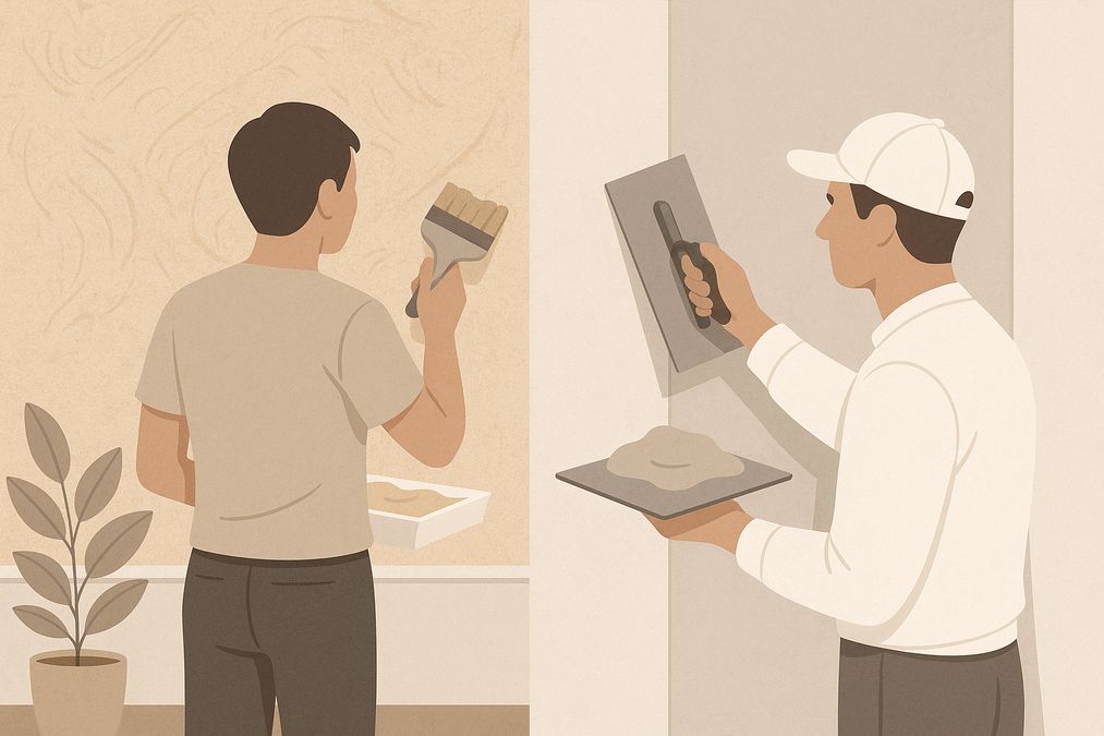
Choosing the right wall finish for your Toronto home, business, or design project is not simply a matter of style—it’s a decision that impacts durability, maintenance, cost, and even the value of your property. One recurring question we hear from homeowners, designers, and contractors is: when can decorative paint stand in for traditional plaster walls, […]
Looking for an affordable way to create the luxurious look of plastered walls—without the cost or hassle of traditional plasterwork? Whether you’re a homeowner, an interior designer, or a contractor in Toronto, mastering affordable decorative paint techniques to mimic plaster finish can transform residential or commercial spaces dramatically. Our expert team at venetianplastershop.ca shares must-know […]
Decorative wall finishes can transform an ordinary space into one that feels custom-designed and inviting. However, many Toronto homeowners, designers, and contractors often face two big concerns: achieving the high-end look of plaster finishes—such as Venetian plaster, limewash, or textured surfaces—on a reasonable budget, and understanding which affordable decorative paint techniques offer the best blend […]
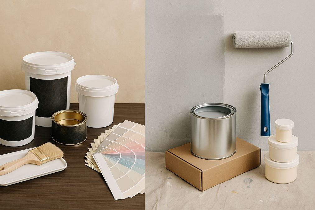
Introduction: Understanding Your Decorative Finish Options in 2026 If you’re planning to give your Toronto home, retail store, or office a fresh new look in 2026, you’ve likely considered decorative finishes. But one of the biggest decisions you’ll face is whether to use a DIY paint kit or invest in professional decorative finishes like Venetian […]