
by Glorifix
Share
Share
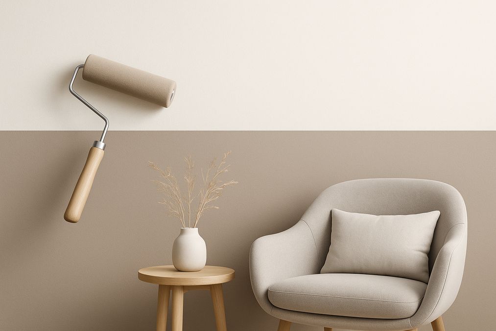
Understanding Two-Tone Wall Painting for Balanced Colour Division
At its best, two-tone wall painting transforms bland spaces into eye-catching statements. The technique involves dividing a wall horizontally, vertically, or in creative geometric patterns, applying two contrasting or complementary colours for visual depth. Done well, it can:
- Make low ceilings feel higher or wide rooms feel cozier
- Create architectural interest without mouldings or heavy décor
- Zone open-concept spaces (ideal in Toronto condos and commercial offices)
- Highlight a feature or artwork without overpowering the room
But professionals know a ‘simple line’ is rarely as simple as it seems. Balance is achieved not only through colour choices, but by understanding scale, proportion, lighting, and the room’s purpose.
Essential Planning Steps Before You Paint
What Pros Know About Prep and Design
One of the most common mistakes homeowners make is underestimating the importance of prep. A sharp, professional look requires careful planning, not spur-of-the-moment colour tests. In our experience, taking the time to:
- Assess the wall for imperfections, texture, and moisture issues
- Consider existing finishes (paint, wallpaper, Venetian plaster, etc.)
- Choose the right tape for crisp lines (low-tack for delicate finishes, high-tack for heavy textures)
- Map out the colour division using a level, laser, or chalk line
…is the difference between a job that feels custom and one that looks like a rushed DIY.
For more on surface prep, our team recommends reading these cost-effective wall prep tips before painting in Canada.
Choosing the Right Colour Pairings for Toronto Spaces
Colour Division: Practical Advice for Real Homes & Businesses
Many customers are surprised to learn that achieving true harmony with two-tone walls isn’t just about picking two colours you like. Here’s what our specialists recommend:
- Light Upper / Darker Lower: Makes a ceiling feel higher, keeps rooms feeling airy (popular for traditional and modern Toronto homes)
- Darker Upper / Light Lower: Feels cozier, works in high-ceilinged rooms or commercial spaces that want warmth and intimacy
- Bold Contrasts: Works best as a feature wall or in smaller sections; too much contrast can feel jarring in large or north-facing rooms
- Monochromatic Layers: Use two close shades for a subtle, elegant effect—especially effective in commercial spaces using the color drenching technique
- Texture & Finish: Combine matte and soft-sheen or even Venetian plaster with paint for depth without bold colour jumps
Lighting is critical—colours shift dramatically in Toronto’s changing natural light and with warm/cool artificial lighting. Always sample your chosen shades on both upper and lower wall before full application.
Popular Two-Tone Wall Painting Techniques Used by Pros in 2026
1. Traditional Chair Rail Division
- Height: Typically 36-42 inches from the floor
- Use: Ideal for dining rooms, entryways, commercial lobbies
- Advantages: Works well with both paint and wallpaper on the lower portion (explore wallpaper statement suggestions)
- Pro Tip: Many clients opt for highly durable finishes (such as Venetian plaster) below the chair rail for high-traffic areas
2. Modern Asymmetrical Split
- Height: Any proportion—common to see 2/3 above, 1/3 below, or custom ratios for visually interesting results
- Use: Perfect for accent walls in living rooms, open-concept offices, and retail displays
- Advantages: Adds contemporary flair and breaks predictability—great for spaces wanting a ’boutique’ look
- Pro Tip: This technique is forgiving of architectural oddities (radiators, windows, outlets, etc.)
3. Vertical Split or Colour Blocking
- Use: Zoning spaces, especially in open layouts, offices, or kids’ bedrooms; helps guide the eye and adds playfulness
- Finishes: Looks exceptional with bold, dramatic colours and geometric patterns or textured decorative paints
4. Diagonal and Geometric Divisions
- Use: Great for feature walls, stairwells, modern commercial interiors
- Design Tip: Angled divisions can echo architectural lines or introduce dynamic energy—just beware of clashing with existing room geometry
- Pro Tip: Tape edges carefully and use ultra-precise levels; geometric divisions demand accuracy
5. Tonal Textures: Mixing Finishes
- Combination: Pair velvety matte paint with tactile Venetian plaster or subtle metallics for high-end depth
- Where: Works beautifully in principal bedrooms, boardrooms, and upscale retail spaces
Comparing Wall Finishes: Paint, Wallpaper, Venetian Plaster, and More
| Finishes | Durability | Installation Difficulty | Maintenance | Best Use |
|---|---|---|---|---|
| Quality Latex Paint | Good | Low | Easy | Bedrooms, offices, feature walls |
| Vinyl or Textured Wallpaper | Very Good | Medium | Easy-Medium | Accent walls, commercial spaces |
| Venetian Plaster (Giorgio Graesan) | Excellent | High | Minimal | Luxury homes, high-traffic areas, bathrooms |
| Decorative Paints (e.g. Metallic, Limewash) | Good | Medium | Light | Boutiques, restaurants, hallways |
- Wallpaper works exceptionally well on the lower third in traditional applications, or as a bold vertical on one wall (explore wallpaper options here)
- Venetian plaster provides unmatched depth, durability, and luxury for commercial entrances or powder rooms (especially when you need moisture resistance or easy cleaning)
- Decorative paints are a designer’s secret weapon for ‘wow factor’—metallics, limewash, or suede effects add interest and sophistication without the permanence of plaster
In our experience, mixing two finishes (for example, Venetian plaster below and paint above) can make a space feel genuinely high-end—just ensure both are compatible and be mindful of moisture, sunlight, and wear levels specific to each room.
Expert Techniques for Crisp, Balanced Colour Division
Creating Clean Lines Every Time
- Prep Like a Pro: Fill holes, sand roughness, and wash the walls. Skip this and every line will look amateur, no matter how good your tape is.
- Measure Up: Mark the division lines with a laser or traditional level. Step back to review proportions—many clients are happier raising the colour split slightly above the halfway mark for a tailored look.
- Tape and Seal: Use painter’s tape and consider painting the edge of the tape with the base colour first to seal and prevent colour bleed—a trick every pro uses.
- Brush First, Then Roll: Start edges with a brush, then fill in with a roller for a consistent finish. Remove tape before the paint is fully dry for razor-sharp edges.
- Allow for Texture: If using plaster or textured paint, maintain a small overlap and carefully mask edges. Textured finishes require extra precision with taping and application.
Common Pitfalls—and How to Avoid Them
- Ignoring Lighting: The direction and temperature of your lighting can make or break colour harmony. North-facing rooms often need warmer palettes; south-facing can tolerate deeper, cooler tones.
- Improper Wall Prep: Unfinished or poorly patched drywall will highlight flaws on the division line. Skimping on surface prep is the #1 mistake we see on site visits.
- Choosing Unwashable Paint: For kitchens, kids’ rooms, entrances, and rental units, always specify washable, scrubbable finishes—consider ultra-washable latex, or use Venetian plaster for increased durability.
- Awkward Colour Placement: A 50/50 split often looks accidental. Professionals recommend defaulting to a 60/40 or ‘golden ratio’ split unless symmetry is essential to your space.
Budgeting & Product Selection: What Homeowners and Contractors Need to Know
For most renovation projects, product choice is a balance of budget, durability, and desired effect:
- Paint: Most cost-effective, with the widest colour palette. Ideal for DIY.
- Wallpaper: Usually mid-range in price, but can go high depending on brand/finish. Not all wallpapers can handle moisture; always ask before installing in washrooms or kitchens.
- Venetian Plaster: Higher initial investment but brings luxury, extreme durability, and a unique hand-crafted look. Often ideal for high-traffic areas, hallways, or lobby spaces.
- Decorative Paints: Vary widely in cost. Metallics or special finishes may be more expensive but pack visual punch without the permanence of plaster.
VenetianPlasterShop.ca provides the best quality Venetian plasters, decorative paints, and wallcoverings in Toronto, all sourced directly from Giorgio Graesan (Italy) and other premium brands. Our specialists can help you compare products in person, order samples, or book professional installation.
Room-by-Room Advice: Where Two-Tone Walls Work Best
Living Rooms & Dining Spaces
- Classic chair-rail divisions with paint or wallpaper (easy to refresh in future)
- Textured plasters add drama above or below the rail
Bedrooms & Home Offices
- Subtle monochromes or calm naturals—especially paired with soft furnishings
- Colour blocking (vertical or geometric) to zone work/sleep areas in multifunction spaces
Retail & Commercial Interiors
- Bold colour division for brand statements
- Durable Venetian plasters or washable decorative paints below waist level
- Feature walls behind reception or main sales area
Bathrooms & Kitchens
- Avoid wallpaper in splash zones unless rated for humidity
- Venetian plaster offers moisture resistance; pair with light-reflecting paint above
Hallways & Staircases
- Darker tones below rail for scuff-resistance and easy cleaning
- Use angled or geometric divisions to accentuate stairs
FAQs: Expert Answers to Common Two-Tone Painting Questions
How do I calculate the right height for a two-tone split?
Most professionals suggest the lower division should sit between one-third and half the height of your wall. In rooms with tall ceilings (9’+), splitting slightly above the halfway point can visually lower the ceiling for a more intimate feel. Always measure from the floor (not baseboard) and use a level for accuracy.
Should I use glossy or matte paint for two-tone walls?
We generally recommend matte or eggshell for main wall areas to reduce glare, especially in sunny Toronto homes or commercial spaces with lots of ambient light. Glossy finishes accentuate flaws but can be effective on trim, chair rails, or dividing mouldings for contrast.
Can I combine two different wall finishes (plaster, paint, wallpaper)?
Absolutely—as long as surface prep is done properly and transitions are masked well. This approach is increasingly popular in luxury homes and commercial interiors. For best results, ask a product specialist at VenetianPlasterShop.ca about compatibility and sample pairings.
Is two-tone painting suitable for DIY?
It can be, especially with paint. However, geometric, textured, or Venetian plaster finishes generally require a professional for the sharp, flawless look seen in magazines and design showrooms.
Tools & Services for Picture-Perfect Results
- Quality painter’s tape (different tack levels available for paint, wallpaper, and plaster)
- Measuring tape, spirit/laser level, and pencil for division lines
- Rollers, angled brushes, and paint trays
- Patching compound and sandpaper for flawless wall prep
- Sample pots or fan decks for testing colours at different times of day
- VenetianPlasterShop.ca – trusted supplier of genuine Venetian plaster, decorative paints, wallpaper, and wall finish tools in Toronto – with top Italian brands like Giorgio Graesan. We offer in-store advice, custom orders, and expert workshops for DIY enthusiasts and professionals alike.
Conclusion: Achieving Balanced Two-Tone Walls in 2026
Balanced two-tone wall painting delivers sophistication and style when approached with planning, expertise, and quality finishes. Whether you’re refreshing a single wall or transforming an entire office, focus on colour balance, wall preparation, and product compatibility. Consult specialists who understand not just the art of colour, but also the science of finishes and the realities of Toronto homes and commercial spaces.
Ready to start your next project, need help with colour or product selection, or want a pro finish every time? Contact VenetianPlasterShop.ca today for personalized guidance, high-quality products, or to book an expert installer.
STAY IN THE LOOP
Subscribe to our free newsletter.
Choosing the right wall finish for your Toronto home, business, or design project is not simply a matter of style—it’s a decision that impacts durability, maintenance, cost, and even the value of your property. One recurring question we hear from homeowners, designers, and contractors is: when can decorative paint stand in for traditional plaster walls, […]
Looking for an affordable way to create the luxurious look of plastered walls—without the cost or hassle of traditional plasterwork? Whether you’re a homeowner, an interior designer, or a contractor in Toronto, mastering affordable decorative paint techniques to mimic plaster finish can transform residential or commercial spaces dramatically. Our expert team at venetianplastershop.ca shares must-know […]
Introduction: Understanding Your Decorative Finish Options in 2026 If you’re planning to give your Toronto home, retail store, or office a fresh new look in 2026, you’ve likely considered decorative finishes. But one of the biggest decisions you’ll face is whether to use a DIY paint kit or invest in professional decorative finishes like Venetian […]
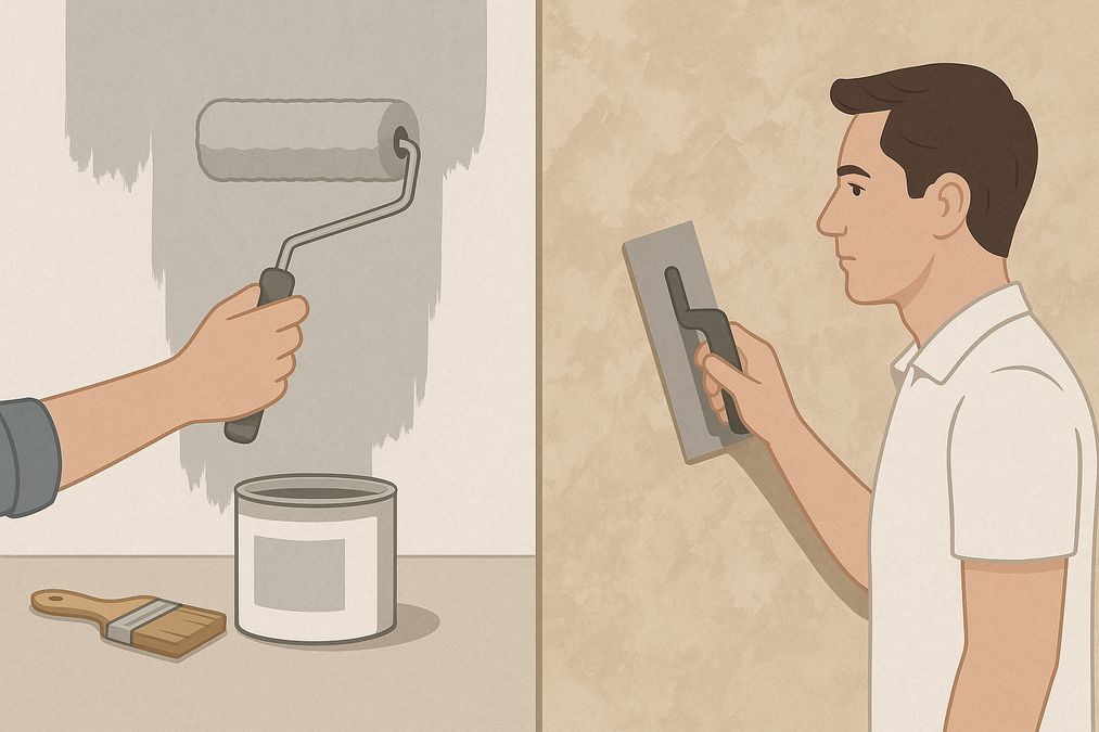
Decorating a wall is no longer a simple colour swap—Toronto homeowners, business owners, and designers seek distinctive finishes to set their interiors apart. With the rise of both DIY paint kits and access to professional decorative finishes, the question many clients are asking in 2026 is: should you go DIY or hire a pro for […]