
by Glorifix
Share
Share
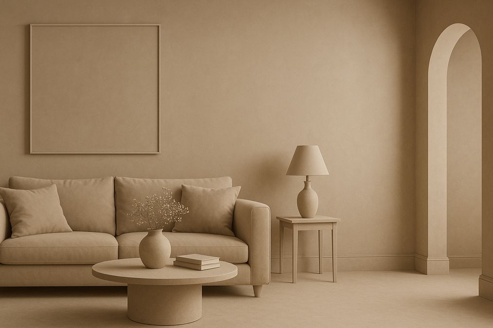
Understanding How to Use Color Drenching Technique in Home Decor
If you’re a Toronto homeowner, interior designer, or contractor looking for bold ways to transform a space in 2026, you’ve probably heard buzz about the color drenching trend. But exactly how do experienced wall finish specialists use color drenching in real homes and commercial interiors? How do you avoid common pitfalls? In this expert guide, we’ll share the practical strategies—and insider tips—we use every day helping Torontonians create truly immersive designs.
What is Color Drenching?
Color drenching involves painting or finishing almost every surface in a room with the same or very closely related shades of one color. Instead of just an accent wall or a pop of contrast, this technique lets the chosen hue fully wrap the room—walls, ceilings, trims, doors, built-ins, even radiators. The effect is immersive, cozy, and cohesive, helping a space feel larger, more intentional, or dramatically intimate, depending on your chosen color and finish.
Why Is Color Drenching So Popular in Toronto Homes and Commercial Spaces?
- All-season Appeal: Toronto’s cold winters and bright summers make color-drenched rooms adaptable year-round. Warm tones feel embracing in winter; cool shades bring a calming vibe in summer.
- Hide Imperfections: Covering trims and dated elements in the same color makes irregularities fade away for a modern, seamless look.
- Easy Transformation: It’s a straightforward way to make even budget-friendly spaces feel custom, designer, and high-end.
- Works with Classic and Trendy Colors: In 2026, richly saturated earth tones, deep navies, and soothing greens continue to work beautifully. But even delicate pastels find new life in monochrome settings.
If you’re interested in seeing how professionals interpret color drenching for Canadian interiors, read our Toronto pro advice inspired by Instagram trends.
What Professionals Recommend Before You Start
When helping customers plan a color-drenched room, we always begin with these key questions:
- What is the room’s natural lighting? North-facing rooms in Toronto tend to be cooler and benefit from warmer hues. South-facing rooms can support deep, saturated colors without feeling oppressive.
- What’s the function of the space? Lively colors work well in creative offices and children’s areas, while deep, muted tones are often better for bedrooms, dining rooms, or reading nooks.
- What surfaces are worth including in the color drench? Sometimes, painting everything (including ceilings, trim, doors, radiators, and even window frames) creates the best effect. Other times, leaving floors or select features in a contrasting material (like Venetian plaster or wood) provides balance.
One of the most common mistakes homeowners make is going bold without considering how the finish will look at different times of day, under various light sources. Always test your chosen color and finish on multiple surfaces and observe at morning, noon, and night before committing.
Step-by-Step: How to Use the Color Drenching Technique in Home Decor
1. Choose a Color with Purpose
For a cohesive look, select a single color—or several closely related shades—for all painted or finished elements in the room. The best approach varies by space:
- Monochrome effect: Use the exact same color in different sheens (eggshell, matte, satin) to highlight architectural details without breaking the color flow.
- Tonal layering: Use lighter or darker tints of your chosen color for ceilings or built-ins for subtle depth.
Many customers are surprised to learn that color drenching is not only about bold statement shades. Pale pinks, sage greens, even sophisticated greys achieve stunning results when used thoughtfully.
2. Select the Right Finish
This is where material choice makes a difference. Beyond standard paint, you can drench a room with textured Venetian plaster, polished limewash, metallic paints, high-gloss enamel, or even wallpaper in a single color story. As a major provider of Venetian plaster, decorative paints, and wallpaper in Toronto, we typically recommend:
- Venetian plaster for a sophisticated, tactile finish with depth and subtle movement—ideal for high-impact spaces or feature rooms.
- Decorative paint for classic color drenching with easy application and endless custom-mixing options, including metallics and pearlescents from Giorgio Graesan Italy.
- Textured or single-color wallpaper for bringing a plush, fabric-like effect (ideal for powder rooms, offices, boutique stores, or condo bedrooms).
3. Prepare Every Surface Carefully
For true color drenching, prep is paramount. In our experience, the biggest issues arise when old paint, gaps in woodwork, or bumpy drywall is overlooked. Drenching highlights both beauty and blemishes. Sand, fill, and prime all surfaces—even trims and radiators—so color goes on evenly. Pay particular attention to:
- Baseboards and trims: Mistakes here are instantly visible in a monochrome scheme.
- Old wallpaper: Remove, clean, or professionally skim-coat as needed before applying new paint or plaster for best results.
4. Apply in the Right Sequence
- Ceilings first
- Walls next
- Trim, moldings, doors, and built-ins last
- Touch-up after drying
For plaster or specialty wall finishes, use pro tools and allow for proper drying and curing between coats to avoid color variation or peeling down the line.
Room-by-Room: Where Color Drenching Works Best
Living Rooms
Color drenching can make large open-concept living areas feel cozier and more pulled together. Deep greens, moody blues, or muted clays work especially well with both modern and classic Toronto architecture. If you have high ceilings, consider continuing the color onto the ceiling for a “jewel box” effect—this is a favorite technique among experienced designers.
Bedrooms
For bedrooms, customers often opt for ultra-relaxing colors: blue-greys, blush, or sage. We almost always recommend a matte or soft-sheen paint or a velvet-textured wallpaper here, as glossy finishes feel too energetic. Venetian plaster in a subtle, tone-on-tone application can add soft luxury and calming depth.
Kitchens & Dining
Many people hesitate to drench kitchens, but it’s absolutely possible—especially on walls, ceilings, and built-in pantries. Use washable, durable finishes like eggshell or satin, or water-resistant Venetian plaster. Don’t forget to paint window frames, shelving, and even vent covers for the full effect.
Bathrooms & Powder Rooms
These compact spaces benefit from a dramatic enveloping color and even tolerate the boldest shades—think teal, charcoal, or burnt orange. For moisture resistance, our pros often combine specialty paints with waterproof Venetian plaster or textured wallpaper. Matte finishes are popular here as they hide watermarks best.
Commercial Spaces & Offices
In retail, restaurant, or boutique offices, color drenching telegraphs brand identity and confidence. We often recommend pairing matte walls with high-shine painted woodwork or metallic finishes. In creative workplaces, saturated mid-century hues or pastels energize and support productivity.
Comparing Finishes for Color Drenching
| Finish Type | Durability | Maintenance | Appearance | Moisture Resistance | Installation |
|---|---|---|---|---|---|
| Decorative Paint | Moderate (touch up as needed) |
Washable in eggshell/satin | Flat, eggshell, satin, or gloss | Good (choose appropriate product for bathrooms) | D.I.Y. possible Pro for best results |
| Venetian Plaster | Very High (much less chipping) |
Wipeable, low-maintenance | Tactile, soft sheen or polished marble | Excellent (with proper sealers) |
Professional recommended |
| Wallpaper | High (quality products) |
Vacuum or gently wipe | Textured, patterned, or solid | Variable (specific vinyls for wet rooms) |
Pro installation suggested |
When helping customers choose, our advice is usually:
- Choose Venetian plaster for maximum durability, low maintenance, and an ultra-luxurious look. It is especially recommended for commercial, high-traffic, or kitchen environments.
- Select decorative paint for quick room refreshes, budget-friendly makeovers, or spaces with plenty of architectural detail.
- Consider wallpaper if you desire pattern, fabric-like texture, or wish to avoid painting over uneven surfaces (using appropriate lining paper and adhesives).
Common Pitfalls to Avoid with Color Drenching
- Underestimating Prep Work: Skipping surface prep results in an uneven finish, peeling paint, or mismatched color on trims.
- Wrong Finish for the Room: Glossy finishes in a master bedroom or powder room can cause glare; matte finishes in a high-traffic entryway attract scuffs.
- Ignoring Lighting: Deep colors can read flat in poorly lit rooms. Always test color under real-life light conditions before committing.
- Neglecting Furniture & Decor Coordination: Combining clashing undertones leads to a muddy or odd effect. Always line up paint, textiles, and flooring samples before installation.
- Not Including Pros Early: Consultation with wall finish experts helps avoid costly do-overs. Many customers are surprised to learn they can book finish samples and advice in-store or as part of a workshop.
How To Coordinate Furniture and Decor in a Color-Drenched Room
One of the most frequent questions we hear is, “How do I keep my color-drenched room from feeling boring or overly intense?” The answer is contrast through material and form:
- Layer rugs and upholstery in slightly lighter or darker tints of your main hue.
- Add metallic, wood, or glass accents to break up expanses of color.
- Use art and decor in either the same color family for a minimalist look or bold contrast for drama.
- Embrace layered lighting—pendants, sconces, and table lamps make color richer and more dynamic.
Experienced designers frequently pair color-drenched rooms with tactile finishes like Venetian plaster or textured wallpaper for visual interest without departing from the monochrome palette.
Budgeting and Planning for Color Drenching in Toronto
The cost of a color-drenched project can vary:
- Decorative paint: The most affordable, especially for DIY-savvy homeowners.
- Venetian plaster: Higher upfront cost, but pays off with increased durability, easier maintenance, and higher property value. Need proof? Discover how Venetian plaster enhances Toronto property worth.
- Wallpaper: Costs depend on quality, pattern, and whether professional installation is required. Typically, specialty or imported wallpapers (like Giorgio Graesan from Italy) are a premium choice, but offer unmatched results.
We recommend you always:
- Request product samples before purchasing large quantities.
- Confirm lead times—especially for custom-mixed paints or imported finishes.
- Allow for extra product to cover trims, touch-ups, or future repairs.
- Consider professional installation for best finish and warranty coverage.
Lighting Tips: Getting the Most From Color Drenching
Lighting can make or break a color-drenched room. Here’s what we advise:
- Install layered lighting: A mix of ambient, task, and accent lighting prevents single-color rooms from feeling flat.
- North-facing rooms: Benefit from warm bulbs and lighter, warmer paint tones, especially during Toronto’s long winters.
- Test with daylight: Always assess samples over 24 hours—Toronto’s seasons mean sunlight shifts dramatically from summer to winter.
Remember, even the best finish can look dull if lighting is neglected during planning.
Color Drenching Design Tips From the Pros
- Don’t forget the fifth wall: Painting or finishing the ceiling the same color is one of the quickest ways to achieve a designer look.
- Use reflectivity wisely: Higher gloss on trims or furniture highlights architectural features without breaking the color story.
- Incorporate natural textures: Add warmth by layering in wood, bronze, concrete, or leather against a monochrome background.
- Mix finish types: Venetian plaster on fireplace surrounds, feature walls, or built-ins makes monochrome rooms instantly more luxurious.
- Pace yourself: Tackle one room at a time, especially if experimenting with a dark or unusual hue. Monitor how you feel in the space after a week before expanding the scheme.
If you want step-by-step paint selection and pro color drenching guidance, check out our expert color drenching guide including Instagram inspiration.
Choosing Where to Buy: Best Products and Support in Toronto
For serious results, use only top-quality paints, Venetian plaster, and wall coverings. At venetianplastershop.ca, we supply:
- Premium Venetian plasters and installation advice
- Decorative paints including Giorgio Graesan Italy finishes
- Designer wallpapers for every room type
- Professional color matching and surface preparation
- Hands-on workshops and DIY support
Whether you’re a homeowner, designer, or contractor, our staff can help you choose the perfect products for your vision, surface type, and budget. We’re always happy to share sample boards, technical tips, and installation contacts.
Frequently Asked Questions: Color Drenching Technique in Home Decor
Q: Is the color drenching technique difficult for DIY projects?
A: With proper preparation, DIYers can achieve great results, especially when using high-quality paint. For specialty Venetian plaster or complex wallpapering, we suggest professional installation for best longevity and finish.
Q: Can I color drench a condo or small space?
A: Absolutely. In fact, color drenching often makes small Toronto condos feel larger and more unified by blurring sight lines and hiding awkward corners.
Q: Do I have to paint trims and ceilings too?
A: For maximum effect, yes. But you can also use a lighter or darker tone of the same color for trims or ceilings if you prefer subtle contrast.
Q: Does color drenching make rooms feel smaller or larger?
A: Done correctly, it can make small rooms feel more expansive and cozy and add drama to large rooms. The trick is to choose the right color and finish for your lighting and architectural style.
Q: How do I maintain a room with Venetian plaster?
A: Venetian plaster is simple to maintain—just dust or gently wipe clean. It’s much less prone to scuffing or chipping than standard paint. In high-traffic areas, periodic waxing or resealing ensures longevity.
Final Thoughts: Should You Try the Color Drenching Trend?
If you crave a transformative effect that feels both contemporary and timeless, learning how to use color drenching technique in home decor is one of the most rewarding design investments you can make. Toronto’s diverse homes and ever-changing light make it an ideal setting for this immersive technique. Whether you’re renovating a Victorian, modern condo, boutique office, or local café, the right finish and application will deliver maximum impact with minimal clutter.
Need help launching your own color drenched project? Contact the decorative wall experts at venetianplastershop.ca for personalized recommendations, product samples, or to book a consultation with our pro team. If you’re eager to learn hands-on, sign up for our upcoming workshops at Venetian Plastering Basic Workshops—perfect for homeowners, designers, and contractors who want to master these techniques for Toronto interiors in 2026 and beyond. Your dream space starts here!
STAY IN THE LOOP
Subscribe to our free newsletter.

Choosing the right wall finish for your Toronto home, business, or design project is not simply a matter of style—it’s a decision that impacts durability, maintenance, cost, and even the value of your property. One recurring question we hear from homeowners, designers, and contractors is: when can decorative paint stand in for traditional plaster walls, […]
Looking for an affordable way to create the luxurious look of plastered walls—without the cost or hassle of traditional plasterwork? Whether you’re a homeowner, an interior designer, or a contractor in Toronto, mastering affordable decorative paint techniques to mimic plaster finish can transform residential or commercial spaces dramatically. Our expert team at venetianplastershop.ca shares must-know […]
Decorative wall finishes can transform an ordinary space into one that feels custom-designed and inviting. However, many Toronto homeowners, designers, and contractors often face two big concerns: achieving the high-end look of plaster finishes—such as Venetian plaster, limewash, or textured surfaces—on a reasonable budget, and understanding which affordable decorative paint techniques offer the best blend […]
Introduction: Understanding Your Decorative Finish Options in 2026 If you’re planning to give your Toronto home, retail store, or office a fresh new look in 2026, you’ve likely considered decorative finishes. But one of the biggest decisions you’ll face is whether to use a DIY paint kit or invest in professional decorative finishes like Venetian […]