
by Glorifix
Share
Share
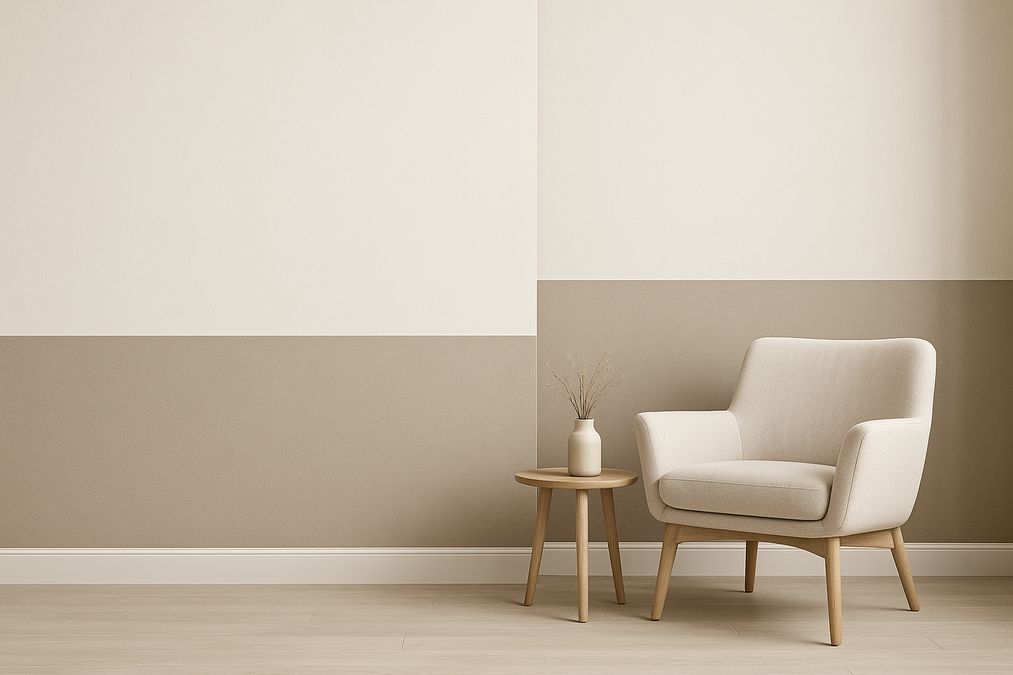
What Makes Two-Tone Walls Stand Out?
Painted accent walls have been a mainstay in interior design for years—but a balanced, two-tone wall brings a new level of harmony and visual interest. Unlike standard feature walls, this technique uses two carefully chosen colours (or finishes) in horizontal, vertical or diagonal splits. The effect? Greater perception of space, improved lighting response, and the opportunity to highlight architecture or décor. In our experience, the most impressive results come from a clear plan, premium products, and meticulous preparation.
How to Plan the Best Two-Tone Wall Painting for Balanced Color Division
The secret to a beautiful two-tone effect is all in the planning. Here’s what we recommend addressing before you pick up a paintbrush:
- Room Function: Bold contrasts suit creative offices or showrooms, while subtle complements are ideal for bedrooms and living rooms.
- Lighting Conditions: Consider how natural and artificial light will interact with each colour at different times of year.
- Wall Imperfections: Any divider line highlights flaws—start with proper wall preparation for the smoothest finish.
- Adjacent Finishes: Two-tone walls often pair with wallpapers, Venetian plaster, or other specialty finishes—coordinate for a cohesive look.
- Furniture Placement: Consider how future décor or built-ins will interact with the line of division.
How to Choose Colours for a Two-Tone Wall
In Toronto’s ever-changing daylight, colour perception can shift dramatically. We always encourage customers to:
- Test paint samples in various lighting conditions (morning, afternoon, evening).
- Pair warm with cool, or light with dark, for contrast—and ensure at least one neutral element for balance.
- Follow a 60:40 or 70:30 split—balanced but not visually ‘cut’ in half.
- Reference floors, ceilings, and adjacent finishes for undertones that harmonize together.
For clients preferring a unique, hand-troweled look, Venetian plaster in dual tones adds incomparable depth and texture—ideal for entryways, feature fireplaces, or upscale offices.
Top Professional Techniques for Balanced Colour Division
Achieving a straight, crisp, and balanced dividing line is a challenge—there’s nothing worse than an uneven edge drawing more attention than your colourwork. Based on years of on-site experience, here’s how we recommend approaching the most popular two-tone wall techniques:
1. The Classic Horizontal Split
What it is: A clean, level division where one colour covers the upper portion and another the lower, typically at chair-rail or picture-rail height.
- Application: Use a laser level and low-tack painter’s tape for a crisp edge. Measure up from the floor (never down from a ceiling, as old homes seldom have perfectly flat ceilings) and mark your line on multiple spots across the wall.
- Professional Insight: For Toronto’s older homes with imperfect walls, the classic horizontal split can disguise minor surface irregularities when combined with a textural finish like Venetian plaster or decorative paint.
- Best for: Dining rooms, offices, studies; spaces benefitting from a grounded feel.
2. Vertical Two-Tone Division
What it is: Two complementary colours split vertically—either dead centre or as a partial accent—great for modern looks or to elongate a wall visually.
- Application: Snap a chalk line or use a laser, then tape carefully. For open-concept condos in Toronto, this can help visually separate work, living, and dining zones without physical barriers.
- Professional Insight: Extending one colour onto an adjacent wall subtly ‘wraps’ the space and avoids a boxy look.
- Best for: Feature nooks, transition walls, retail environments, children’s bedrooms.
3. The Diagonal or Geometric Split
What it is: Utilizes angled or geometric patterns for a bold, dynamic effect. More advanced, but incredibly striking with the right palette.
- Application: Mark out your pattern with precise tools and stable ladders. Slowly tape off shapes, then paint one section at a time, allowing full dry-down between colours.
- Professional Insight: Geometric divisions are less forgiving. Any tape seepage or uneven edge is obvious, so use top quality painter’s tape and burnish edges well. Many clients choose our installation services for these advanced finishes.
- Best for: High-traffic spaces, accent corners, branding for commercial interiors.
4. Combining Paint with a Specialty Finish
Many homeowners and designers blend bold paints with luxury finishes like Venetian plaster or wallpaper for additional texture and sophistication.
- Example: Combine flat matte paint above with Venetian plaster (or metallic/limewash) below—ideal for moody dining rooms or upscale conference rooms.
- Professional Insight: Decorative paints can add subtle reflectivity or glamour and pair beautifully with matte or textured sections below.
- If you’re new to combining finishes, joining our workshops for hands-on training is a great way to build technical skill.
Designer Tips for Achieving a Professional, Balanced Look
- Never divide exactly in half—offset the split to 60:40 for a more dynamic, balanced appearance.
- Use a level to account for Toronto’s ‘settled’ homes—avoid following baseboards, which are rarely square.
- Always paint the lighter colour first; it’s easier to cover minor tape bleeds with the darker shade after.
- Remove tape immediately after painting to prevent ripping or jagged lines.
- If working with specialty finishes (like Venetian plaster), consult with experts like venetianplastershop.ca for compatibility and application timing.
- Remember to coordinate with window shades, artwork and large furnishings.
Addressing Common Two-Tone Wall Painting Mistakes
- Skipping Preparation: Poor surface prep can cause bleed lines or uneven absorption. Refer to these prep tips for the best results.
- Ignoring Light: Many Toronto homeowners don’t realize how north-facing rooms cool down paint colours. Test first.
- Too Much Contrast: If the two tones fight rather than complement, try using differing textures instead.
- Wobbly Edges: Cheaper tapes lead to ‘wavy’ divisions—always use professional quality supplies.
Room-by-Room Recommendations: What Works Best Where?
Living Rooms & Lounges
Go for soft, sophisticated splits: taupe over charcoal, misty green above matte navy, or a pale neutral paired with an accent metallic finish. Two-tone designs create feature walls without overpowering the space. Add wallpapers as an alternative for variety.
Bedrooms
Calming and restorative palettes, like sage alongside ivory, work wonders. Maintain balance by keeping stronger colours lower on the wall for a grounding effect. For children’s rooms, diagonal or geometric two-tone splits encourage creativity—be sure to choose scrubbable finishes.
Kitchens & Baths
Moisture-resistance is key. Use washable decorative paints on lower halves—easier to touch up and clean in high-traffic Toronto homes. Venetian plaster is also suitable in well-ventilated areas and delivers an elegant, timeless appeal.
Offices & Commercial Spaces
Contrast-rich palettes and purposeful, graphic lines boost productivity, brand visibility, or customer engagement. For shops and salons, pairing Venetian plaster with deep accent paint can set a chic, professional tone.
Comparing Two-Tone Wall Painting to Other Wall Finishes
| Finish | Durability | Installation Difficulty | Maintenance | Best Application |
|---|---|---|---|---|
| Two-Tone Paint | Good (varies with products) | DIY-friendly | Easy-clean (with right paints) | Any room; quick refresh |
| Venetian Plaster | Excellent; resists scratches | Advanced skill required | Wipeable, long-lasting | Feature walls, luxury spaces |
| Wallpaper | Good; depends on quality | Moderate; alignment matters | Some styles are wipeable | Statement walls, pattern play |
| Decorative Paints | Very Good; scrubbable options | Intermediate | Easy; choose product wisely | Kitchens, baths, high-touch areas |
Tools & Materials Recommended by Professionals
- Premium tape (Frog Tape or equivalent)
- Laser level or chalk line
- High-quality paint brushes and rollers
- Drop cloths
- Painter’s bucket and tray
- Patch and sand supplies for prep
- venetianplastershop.ca for Italian Giorgio Graesan Venetian plaster, decorative paints, wallpapers, tools and hands-on workshops in Toronto
Installation and DIY Considerations
Many homeowners in the GTA attempt two-tone DIY projects, but there are several pitfalls to watch for:
- Older Toronto homes may have plaster walls that require special preparation—don’t skip this critical step for smooth results.
- Wall composition varies across new condos and historic brick homes; ask about priming recommendations at venetianplastershop.ca.
- If attempting a specialty finish split, hands-on practice or professional installation is strongly advised. Our Venetian plaster workshops offer practical experience on real walls.
- Always factor for drying time (especially in humid Toronto summers); don’t rush taping, painting, or curing stages.
Frequently Asked Questions: Professional Advice
Should I use painter’s tape or masking tape?
Always use high-quality painter’s tape, especially for a crisp division line. Cheaper tapes bleed and peel, ruining the effect. For specialty finishes, consult with a pro regarding best tape choices—their adhesives interact differently with plasters and textured paints.
Where should I divide the colours?
There’s no rule, but avoid exactly halfway up the wall—it tends to look ‘off’ or cut. Try 60–65% up from the floor, aligning with furniture lines like sofa backs or wainscoting.
Can I pair two paint sheens or textures?
Yes! Mixing matte with satin, or paint with Venetian plaster, adds another layer of depth. Just ensure the finishes are compatible and prepare each section as required. Ask about Giorgio Graesan’s extensive finish range at venetianplastershop.ca.
Is two-tone painting more cost-effective than wallpaper or plaster?
In our experience, two-tone painting is usually less expensive and easier to update over time. But for ultimate luxury, durability, or to hide imperfections, designer wallpapers or Venetian plaster offer unmatched benefits. See our guide on wallpapering one wall without it looking like an afterthought for inspiration.
What’s the colour drenching technique and is it similar?
Colour drenching uses a single colour floor-to-ceiling, including trim and doors, for a cocooning effect. This is different but complementary—read more in our post on using the colour drenching technique in home décor.
Conclusion: Achieve Balanced, Pro-Level Two-Tone Walls with Confidence
Two-tone wall painting is more than a passing trend—it’s a timeless, transformative approach when executed with professional standards. By carefully planning your colour split, prioritizing preparation, using only premium materials, and choosing reliable finish providers like venetianplastershop.ca, any Toronto home, office, or commercial space can benefit from stylish, balanced colour division.
For specialty finishes, installation tips, or workshops on advanced painting and plastering, reach out to our expert team for professional guidance and services. Ready to get started? Contact us today or sign up for our hands-on classes and bring your vision to life this year in Toronto.
STAY IN THE LOOP
Subscribe to our free newsletter.
Choosing the right wall finish for your Toronto home, business, or design project is not simply a matter of style—it’s a decision that impacts durability, maintenance, cost, and even the value of your property. One recurring question we hear from homeowners, designers, and contractors is: when can decorative paint stand in for traditional plaster walls, […]
Looking for an affordable way to create the luxurious look of plastered walls—without the cost or hassle of traditional plasterwork? Whether you’re a homeowner, an interior designer, or a contractor in Toronto, mastering affordable decorative paint techniques to mimic plaster finish can transform residential or commercial spaces dramatically. Our expert team at venetianplastershop.ca shares must-know […]
Introduction: Understanding Your Decorative Finish Options in 2026 If you’re planning to give your Toronto home, retail store, or office a fresh new look in 2026, you’ve likely considered decorative finishes. But one of the biggest decisions you’ll face is whether to use a DIY paint kit or invest in professional decorative finishes like Venetian […]
Decorating a wall is no longer a simple colour swap—Toronto homeowners, business owners, and designers seek distinctive finishes to set their interiors apart. With the rise of both DIY paint kits and access to professional decorative finishes, the question many clients are asking in 2026 is: should you go DIY or hire a pro for […]