
by Glorifix
Share
Share
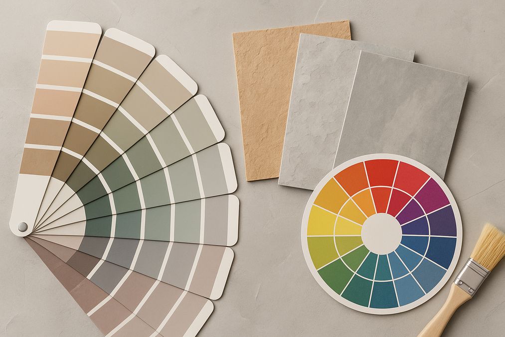
What Are Undertones? Why Do They Matter?
When customers visit venetianplastershop.ca asking about decorative paint or Venetian plaster, one of the earliest topics we address is undertones. An undertone is the subtle hue or cast beneath a main color—the nuance that influences how a wall finish will appear under different lighting, next to furniture, or complemented by other finishes.
For example, a white paint might look pure in a sample, but on the wall it reveals a pink, blue, or yellow cast. That difference is the undertone, and it accounts for many of the “That’s not what I expected!” moments customers experience after painting or plastering a space.
Primary vs. Secondary Tone: A Quick Primer
- Primary Tone: The main, dominant color you see (e.g., beige, grey, blue).
- Undertone: The subtle color influence beneath the primary, often visible in indirect light or when next to contrasting colors.
Why Professionals Prioritize Undertones
One of the most common mistakes homeowners in Toronto make is relying solely on paint chips or digital swatches. These rarely highlight underlying hues. Every experienced wall finish professional will test samples in your actual room—examining the finish in changing daylight, under artificial light, and next to floors, trims, and furnishings.
Real Customer Questions We Hear Weekly
- “Why does my grey wall look blue at night?”
- “I chose two whites but they clash—what happened?”
- “My feature wall looks green next to my couch—is that a mistake?”
All of these come down to undertones affecting decorative finishes. In our daily work, we see even professional designers caught off guard without testing for undertones in context.
How Undertones Affect Different Decorative Finishes
The impact of undertones reaches far beyond traditional paint. Here’s how they play a role in today’s most popular wall treatments:
Venetian Plaster
Venetian plaster offers a depth and texture that’s unmatched, but its mineral pigments and translucent layers mean undertone is especially pronounced. For example, Giorgio Graesan Italian plasters—exclusive at venetianplastershop.ca—may display a cooler or warmer undertone depending on room lighting and substrate color.
- Pro tip: Always test a plaster sample on-site in the actual room before committing to a color, especially for large or high-visibility areas. The appearance will shift markedly between north- and south-facing rooms in Toronto.
Decorative Paint
Decorative paint—whether it’s color-drenched matte, metallic, or limewash—relies on undertone for harmony or dramatic effect. A key trend for 2026 is using color drenching techniques, where undertones must be meticulously aligned across all surfaces to prevent an uneven or jarring visual result.
Wallpaper
Modern wallpaper often blends multiple hues, so the undertone may not be obvious until installed. For instance, a grey wallpaper might have violet, green, or taupe undertones, impacting how it pairs with adjoining trims and floors.
Common Mistakes: Lessons from the Field
- Relying on manufacturer samples only: These rarely show true undertone in your space.
- Ignoring trim and millwork color: A crisp white trim next to a creamy wall can unintentionally reveal yellow or pink undertones.
- Not accounting for Toronto’s variable daylight: Northern light often brings out cool undertones, while southern light enhances warm hues. Many clients are surprised at how much this affects appearance across seasons.
Undertone Compatibility: What to Look For
When helping customers select wall finishes, experts examine:
- Neighbouring surfaces (floors, countertops, cabinets, adjoining rooms)
- Fixed elements (brick, stone, large furniture)
- Lighting (LED vs. incandescent, natural vs. artificial, time of day)
We commonly suggest creating a mood board that includes fabric swatches, wood samples, and paint or plaster samples to visualize undertones together.
Choosing the Right Undertone for Your Space
Room-Specific Undertone Advice
| Room Type | Recommended Undertones | Why |
|---|---|---|
| Living Room | Warm beige, taupe, or subtle greys | Comfortable, welcoming, adapts with seasonal light changes |
| Kitchen | Cool or neutral greys, muted greens or blues | Balances natural light, complements cabinetry and stone |
| Bedroom | Soft blush, pale blue or green undertones | Creates a restful, tranquil mood |
| Retail/Commercial | Clean whites with slight warm or cool undertone | Professional look, emphasizes merchandise or branding |
Designers know that the same “grey” can look completely different next to hardwood flooring compared to carpet, or beside stainless appliances compared to wood cabinetry—because undertones interact uniquely with their surroundings.
Comparing Decorative Finishes: Where Undertones Matter Most
| Finish Type | Effect of Undertone | Durability | Installation Ease |
|---|---|---|---|
| Venetian Plaster | Highly visible, changes with lighting | High | Professional recommended |
| Decorative Paint | Subtle but impactful, varies with method | Medium – High | DIY or professional |
| Wallpaper | Visible in patterns, especially background | Medium | DIY or professional |
| Limewash | Rich, natural undertones, organic transitions | Medium | Requires practice |
In our experience, Venetian plaster most dramatically amplifies undertones due to its depth and translucency, while wallpaper can surprise with undertone shifts when viewed next to adjoining painted trims.
Best Practices for Undertone Selection
- Always sample in your space—never skip this step.
- Check samples at different times of day.
- Compare with furnishings, floors, cabinetry, and adjacent walls.
- Look for unexpected undertones in whites, neutrals, greys, and even black finishes.
- Ask for professional advice: At venetianplastershop.ca, we help clients spot undertones and suggest perfect combinations for both residential and commercial settings across Toronto.
Popular Decorative Products & Where Undertones Shine
Undertones can be a deciding factor in product selection—especially when choosing between:
- Venetian Plaster: Best for statement walls, feature fireplaces, upscale entries
- Decorative Paints: Highly customizable; works well in bedrooms, kitchens, and retail spaces
- Wallpapers: Great for texture, subtle undertone layering, or bold patterns
Many customers ask, “Where can I find reliable paint for my project?” For trusted products and expert guidance on undertones, see our comparison of the best decorative paint stores in Toronto for 2026 and our advice on where to find high-quality decorative paint in Toronto.
Budget & Project Planning: Why Testing Undertones Pays Off
Even small undertone errors can result in costly repaints or re-installations—particularly in premium finishes. Many of our clients believe that choosing a color is easy, then discover the real nuance comes from how undertones shift after installation. As professionals, we:
- Recommend investing in larger sample pots or sample boards rather than relying on small chips.
- Offer in-home consultations, including sample application, to visualize undertones in-situ.
- Provide guidance for large commercial projects where uniformity across lighting conditions is required.
Expert Installation: When to Call a Professional
For complex finishes like Venetian plaster or intricate decorative paint techniques, it’s especially important to trust the application to experienced professionals. Undertones change with thickness of application, substrate color, and even trowel technique. At venetianplastershop.ca, our in-house specialists provide consultations and full installation—guaranteeing your color vision is realized exactly as planned.
DIY tip: If you plan to install a decorative finish yourself, always use the same primer and undercoat as recommended for your chosen product, since underlying colors can affect final undertones dramatically.
Canadian Homeowners: Seasonal Colour Planning
One Toronto-specific concern is how undertones interact with the city’s unique daylight profile through the seasons. In winter, grey and blue undertones intensify. In summer, warm and yellow undertones are softened by strong daylight. Many designers and homeowners overlook this shift—it’s wise to view samples throughout a month before finalizing your choice, giving you a look at every lighting scenario your space will experience.
Final Advice: Selecting Undertones with Confidence
Ultimately, the importance of undertones in color theory for decorative finishes cannot be overstated. Whether you’re revamping a condo in the Distillery District, opening a boutique in Queen West, or reimagining an office on Bay Street, testing, context, and professional guidance will ensure your walls look intentional, harmonious, and enduring—through every season and every change in light.
For Product Advice and Professional Installation
If you need help choosing the ideal undertone or finish for your 2026 renovation or new build, venetianplastershop.ca offers:
- The best quality decorative paints, Venetian plaster, and wall finishes from Giorgio Graesan Italy
- Customized color consultations for homes, commercial spaces, and multi-unit projects
- Expert installers serving the entire Toronto area
- In-person and virtual workshops for designers, contractors, and ambitious DIYers
Ready to Transform Your Walls?
Contact the venetianplastershop.ca team for expert guidance, samples, and installation quotes. Visit our contact page to start your project right.
Want to learn advanced decorative wall techniques yourself? Sign up for upcoming workshops—perfect for homeowners, designers, and contractors upgrading their skills in 2026.
STAY IN THE LOOP
Subscribe to our free newsletter.
Choosing the right wall finish for your Toronto home, business, or design project is not simply a matter of style—it’s a decision that impacts durability, maintenance, cost, and even the value of your property. One recurring question we hear from homeowners, designers, and contractors is: when can decorative paint stand in for traditional plaster walls, […]
Looking for an affordable way to create the luxurious look of plastered walls—without the cost or hassle of traditional plasterwork? Whether you’re a homeowner, an interior designer, or a contractor in Toronto, mastering affordable decorative paint techniques to mimic plaster finish can transform residential or commercial spaces dramatically. Our expert team at venetianplastershop.ca shares must-know […]
Introduction: Understanding Your Decorative Finish Options in 2026 If you’re planning to give your Toronto home, retail store, or office a fresh new look in 2026, you’ve likely considered decorative finishes. But one of the biggest decisions you’ll face is whether to use a DIY paint kit or invest in professional decorative finishes like Venetian […]
Decorating a wall is no longer a simple colour swap—Toronto homeowners, business owners, and designers seek distinctive finishes to set their interiors apart. With the rise of both DIY paint kits and access to professional decorative finishes, the question many clients are asking in 2026 is: should you go DIY or hire a pro for […]